Neostrata is a dermatologist-backed skincare brand. I redesigned the product detail page to remove friction in the buying journey, achieving a 68% conversion lift in 3 months and validating a scalable template across the brand catalog.
Role
Lead UX/UI Designer
🧩 Led research, design and testing on a cross-functional team
👩🏻💻 Owned end-to-end experience from audit to launch

Results
Tracked with GA4 and HotJar


The problem
Outdated design in a competitive market
Neostrata's product detail page hadn't been updated in years. The brand team flagged it as outdated, especially as skincare competitors launched sleeker, more conversion-optimized experiences. With high operational costs and a growing catalog, the business needed a scalable solution that could improve conversions without requiring custom work for every SKU.
The challenge:
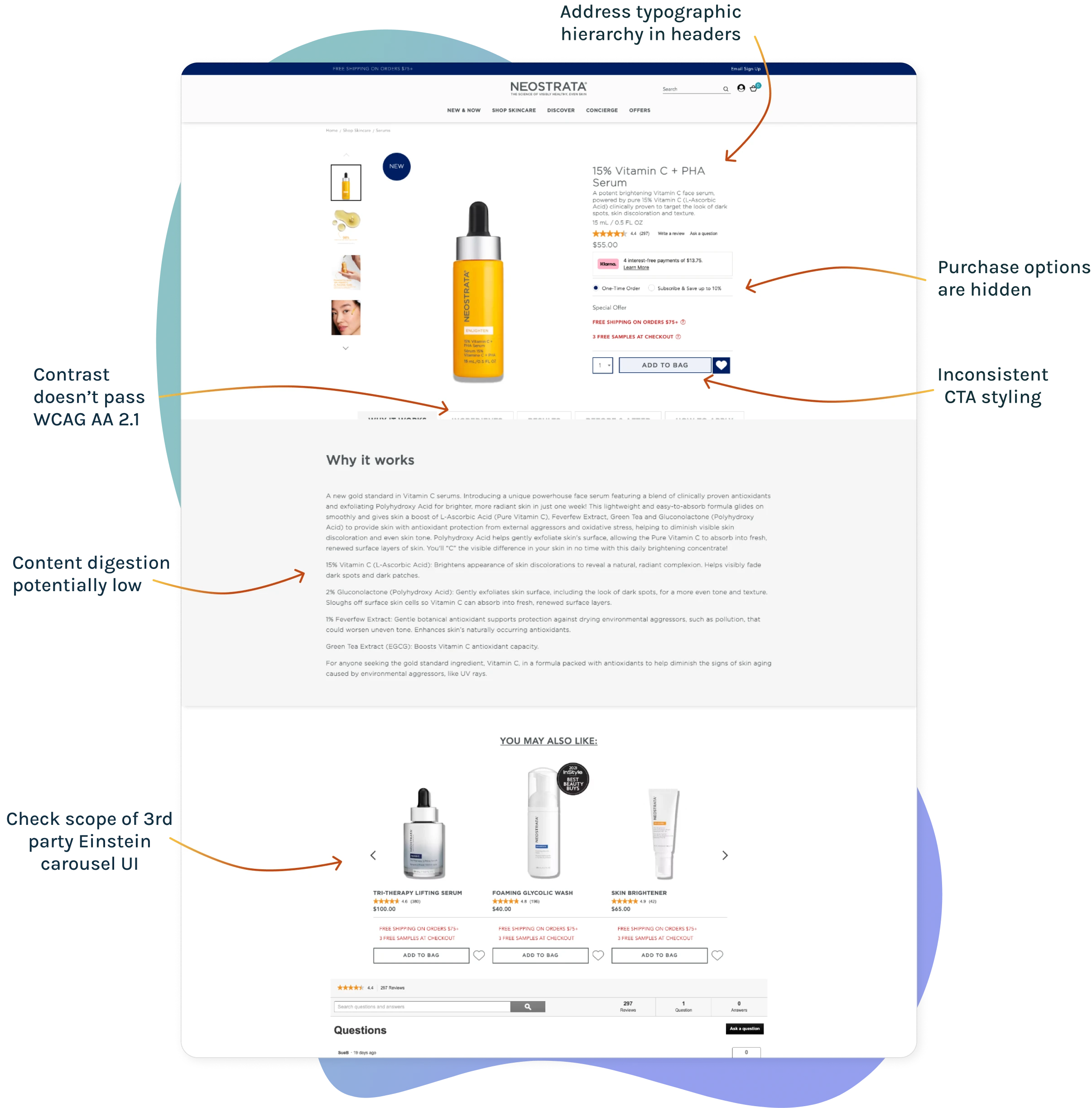
- The existing page had accessibility issues, failing WCAG AA 2.1 standards
- Cluttered hierarchy made key information hard to find
- Purchase modules weren't surfacing subscription options effectively
- Mobile experience (73%+ of traffic) felt especially outdated
I was brought in to lead the redesign and had the rare opportunity to conduct research before jumping to solutions.
Research & Discovery
3 layers of research to reveal the real problems
With research budget available, I took a layered approach, starting broad and then getting progressively deeper to validate what actually needed fixing.
Layer 1: Visual audit for quick validation
I started with a heuristic audit to identify obvious issues. This was fast and surfaced clear problems:
- Inconsistent font weights and sizes created visual noise
- Weak typographic hierarchy made content hard to scan
- Contrast issues failed WCAG 2.1 AA standards
- Interactive elements (buttons, accordions) were difficult to see or use

Layer 2: Heatmap analysis for behavioral data
Using HotJar, I analyzed user behavior patterns: clicks, scrolls and engagement zones.
Key findings:
- 75% of mobile users scrolled beyond the fold, indicating good engagement
- 39% interacted with accordion modules. indicating moderate engagement
- Key purchase modules didn't draw attention as expected, a friction point
This validated the visual audit but raised a question: were users finding what they needed or just looking harder?
Layer 3: Unmoderated user testing for buried truths
Before our UserZoom account closed, I ran task-based testing with 15 participants. While 93% completed tasks successfully, session recordings revealed hidden friction.
- Over half missed important content or misunderstood groupings
- Several hesitated or second-guessed their choices
- The structure required more cognitive effort than expected
The insight
High task completion masked real usability issues. Users could complete tasks, but it took unnecessary effort. The page needed better hierarchy, clearer groupings and more accessible purchase options.

Design Strategy
Designing for clarity, accessibility and scale
The approach
Rather than redesign everything, I focused on high-impact changes that could be validated on one product, then scaled across the catalog. This reduced risk and ensured we were solving real problems, not just making it "look better".
Key design decisions
1. Standardize hierarchy and visual structure
Resolved inconsistencies in typography, spacing and visual weight to create a scannable layout that worked across screen sizes. This addressed the cognitive load issue from testing.
2. Fix accessibility and interaction
Adjusted contrast, labels and button styling to meet WCAG AA standards. This wasn't just compliance, it directly improved usability, especially on mobile.
3. Rework purchase modules
Refined the purchase section's layout and visibility based on heatmap data and stakeholder input. Made subscription options easier to compare and access, addressing the low engagement we saw in research.
4. Design for progressive validation
Launched on a flagship SKU first to prove ROI before scaling. This gave us real performance data and reduced risk across the 200+ product catalog.
5. Collaborate through iteration
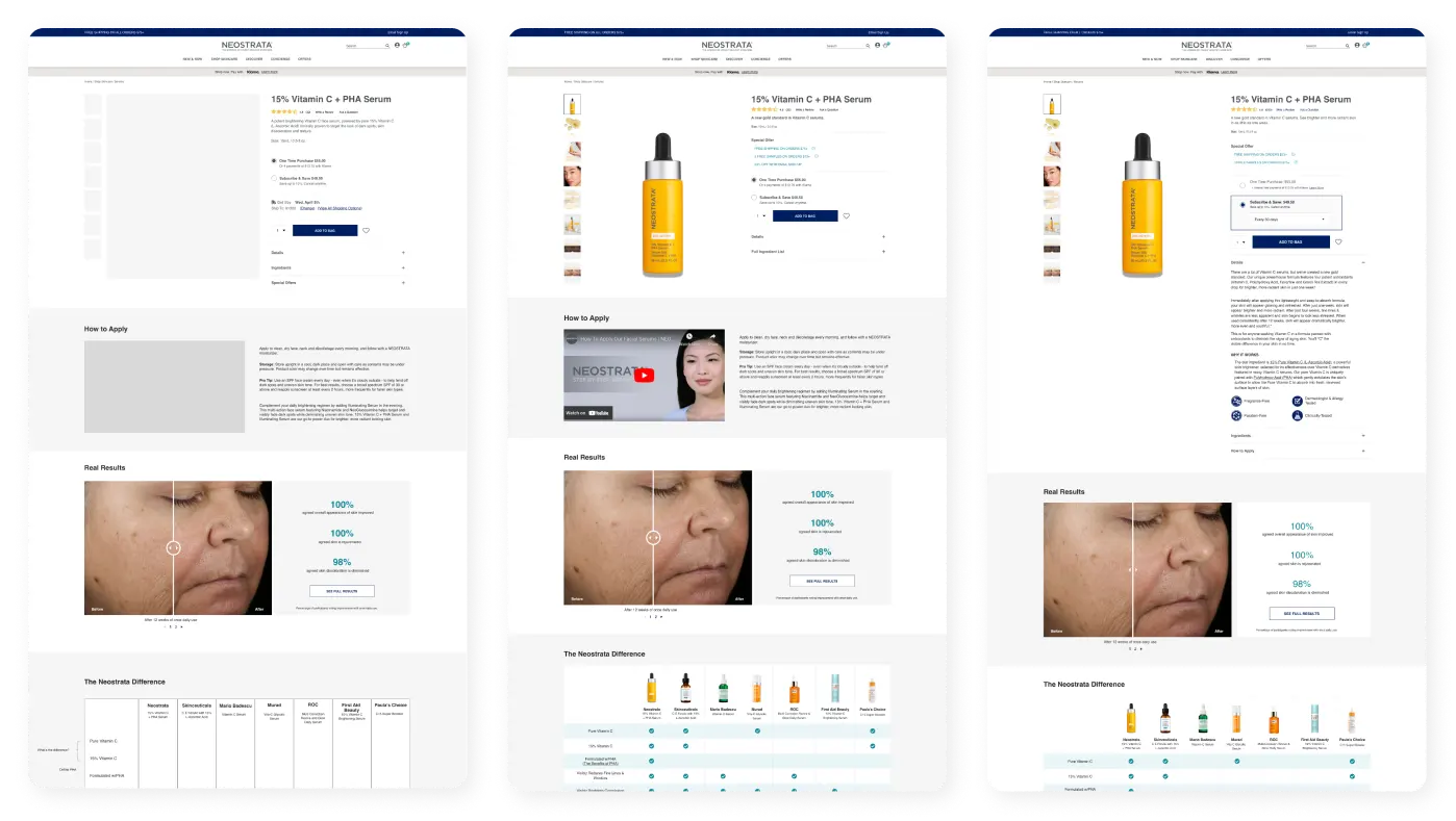
Led weekly reviews with 8-person cross-functional team, shared iterative mockups in Figma and adjusted designs based on technical constraints and business goals.
The rationale
Every decision prioritized impact and scalability. By validating on one product first, we built confidence in the approach and created a repeatable system for future optimizations.

Fast high-fidelity iterations made it easier for stakeholder buy-in
Final Design
From cluttered to conversion-optimized
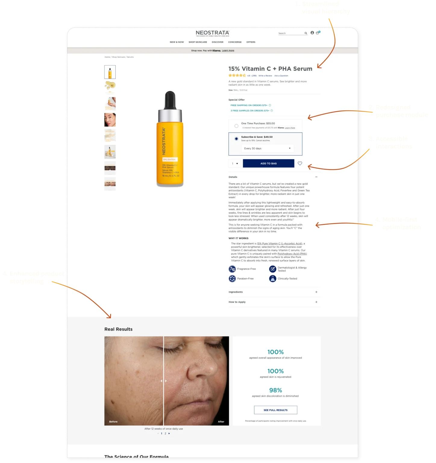
1. Streamlined visual hierarchy
Standardized typography, spacing and content groupings to reduce cognitive load. Users can now scan and find information without re-reading or hesitation.
2. Redesigned purchase module
Refined layout and visibility of subscription options based on heatmap data. Made it easier for users to compare plans and add to bag.
3. Accessible interactions
Adjusted contrast, button styling and labels to meet WCAG AA 2.1. Interactive elements are now visible and easy to use, especially on mobile.
4. Mobile-first optimization
Vertical content stack, touch-friendly interactions and collapsible sections to maximize screen real estate for the majority of users.
5. Enhanced product storytelling
Highlighted clinical results with larger images and emphasized stats users care about (before/after, ingredient benefits). Made the value proposition clearer.

Post-launch iteration
User feedback showed preference for closed accordions by default. We adjusted to keep it closed, then scaled the template across the entire catalog.
The Results
Validated, iterated, scaled
Performance after 3 months
👍🏼
-5% time on page
users found info faster
Less friction = quicker purchase decisions
🛍️
74% add-to-bag improvement
from 152% at launch
Strong engagement maintained over time
✨
68% conversion rate increase
on flagship SKU
Sustained lift after initial 40% spike at 1 month
What this meant for the business
The redesign didn't just improve one product, it created a scalable template. After validating performance, we ran a quick comparison study, iterated based on user feedback, and rolled the template across Neostrata's entire catalog.
Long term impact
- Repeatable optimization system for current or future DTC brands at Kenvue
- Reduced custom work per SKU (scaled template vs. one-off designs)
- Accessibility compliance across portfolio
Reflection
What layered research and iteration taught me
1. High success rates can hide real problems
93% task completion looked great on paper, but session recordings revealed hesitation and extra cognitive effort. Always dig deeper than surface metrics.
2. Accessibility isn't just about compliance
Fixing WCAG issues didn't just check a box, it directly improved conversions and usability. Accessible design is good design.
3. Validate before you scale
Testing on one SKU before rolling out to a 200+ product portfolio reduced risk and gave us room to iterate based on real performance. Progressive adoption is smarter than big-bang launches.
What I'd do differently
Run the comparison study earlier, user preference for closed accordions would have been caught before the initial launch. Earlier validation loops make iterations cheaper.
Designing for systems, not just screens
This project reinforced that design isn't just about making individual pages look good, it's about creating scalable solutions that improve outcomes and can be adopted across portfolios.
Versalie Care Directory
Designing a care provider directory that validated a business pivot