After Kenvue's Shopify migrations, I built design systems for 4 DTC brands, improving consistency and reducing QA issues.
Role
Lead UX/UI Designer


Results
Measured through team feedback


🖼️ Improved design-to-dev fidelity

The problem
No shared system, lots of inconsistency, and constant rework
After the 2024 Shopify migrations wrapped, I had time to look at our design process across 4 DTC brands. What I found was chaotic:
Each brand had inconsistent UI
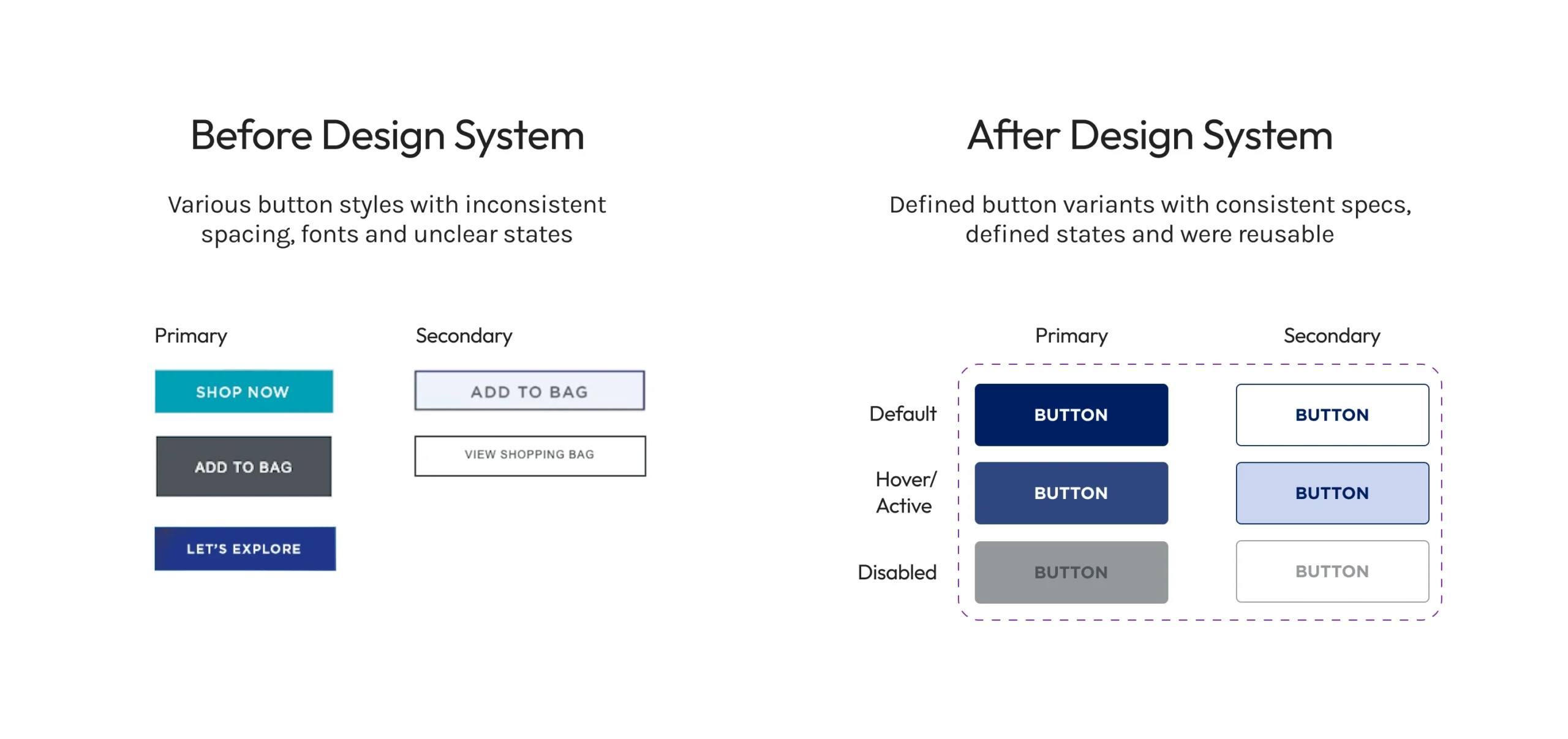
- Buttons varied in size, padding and style, even within the same brand
- Typography wasn't standardized (font sizes, weights, line heights)
- Spacing was arbitrary, there was no systematic approach to layout
- Even brand colors weren't consistently applied
Every project started from scratch
- Designers recreated components for each new page or feature
- No shared libraries or reusable patterns
- Design files lived in silos, sometimes it was hard to find reference work
Handoff was unpleasant
- Developers constantly asked for design spec clarification
- QA cycles were heavy with design-related feedback
- I was spending lots of time answering questions about inconsistencies instead of design
Inconsistent definition of 'design system'
- Some teams thought it was just a brand style guide (colors, logos)
- Others thought it was just a component library
- There wasn't a shared understanding of structure, tokens or documentation
The constraint: Each brand had its own dev team and tech stack. A single unified system across all 4 brands wouldn't work, they would need separate systems that shared structure and principles but allowed for brand flexibility.
The challenge: Build 4 design systems that improved consistency and efficiency without forcing brands into a one-size-fits-all solution.

An example of buttons before and after the establishment of a design system.
Research & Discovery
Finding patterns in chaos, with an audit
Understanding what we had
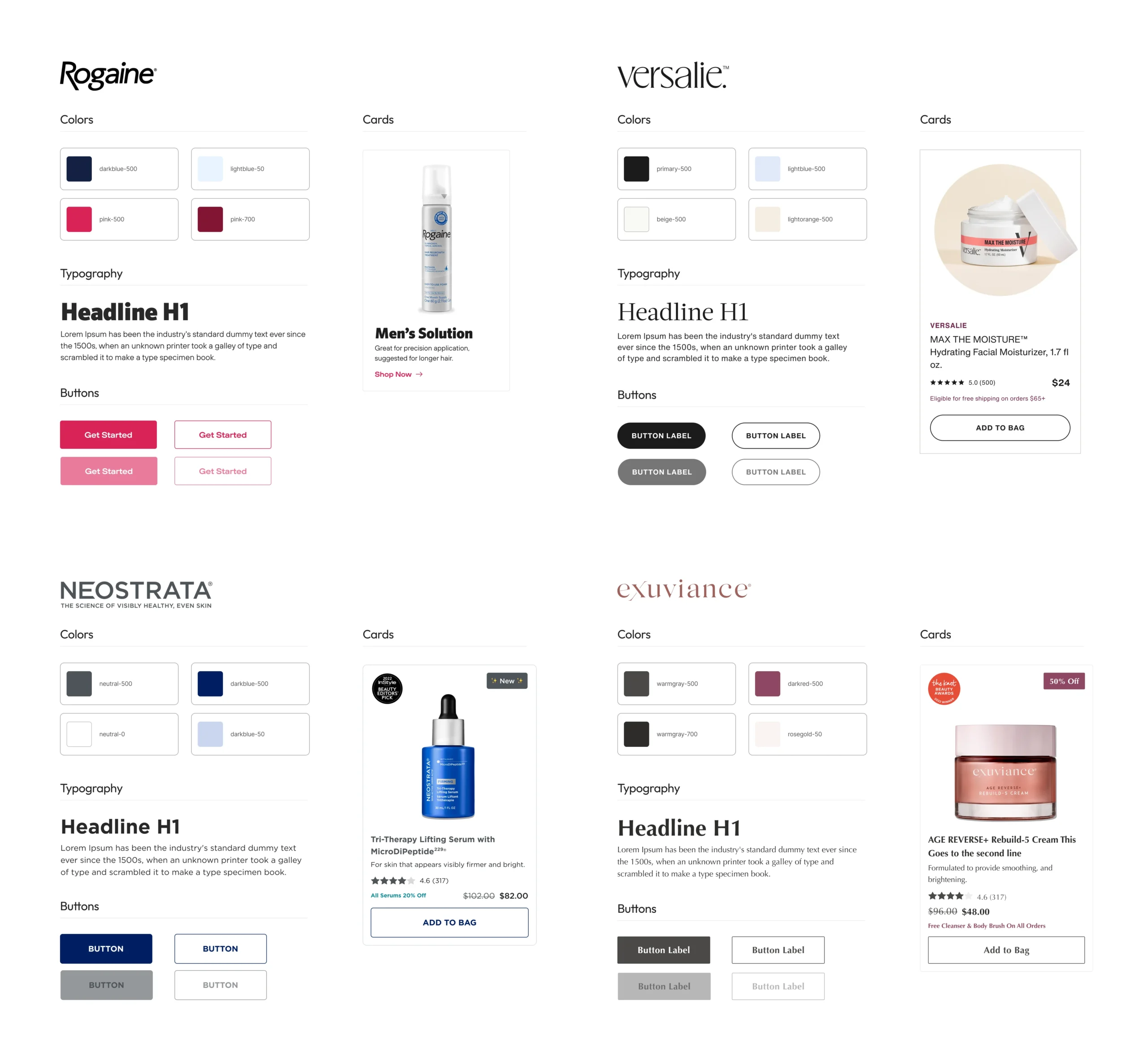
I audited existing UI patterns across all 4 brands (Rogaine, Neostrata, Exuviance and Versalie) documenting:
- Every button style, size and state across brands
- Typography scales
- Spacing patterns
- Color usage
- Common components
What I found
Brands weren't wildly different, they just lacked systematization. Buttons might have 3-4 variations within one brand when they only needed 1-2. Spacing mainly followed 8px increments but it wasn't enforced.
The opportunity
If I could systematize what already existed and create structure, I could reduce variation without changing brand identity.
Understanding team needs
I talked to PMs and engineers across brands to understand their pain points:
- Developers wanted specs they could trust
- PMs wanted faster iteration
- Everyone wanted fewer QA issues and cleaner handoffs
Benchmarking structure
I researched Atomic Design principles and other mature design systems (Material Design, Carbon, Shopify Polaris) to understand how to structure tokens, components and documentation.
The insight
Each brand needed its own system but all 4 should follow the same structure. This would make onboarding easier, reuse more natural and future consolidation possible.
Design Strategy
Building 4 systems with shared structure
The approach
Rather than force all 4 brands into one unified system, I built 4 separate design systems that followed the same organizational structure. This respected brand identity and dev team autonomy while creating efficiency through consistency.
The atomic design structure example
Foundations (Atoms)
- Colors
- Typography
- Spacing
- Border radius, shadows and other visual properties
Components (Molecules)
- Buttons
- Cards
- Input Fields
- Tooltips
Patterns (Organisms)
Defined as a full width section or row
- Card Carousel
- Header
- Footer
Templates (Page layouts)
Defined as full reusable page structures
For each brand, I created
One system component file and one page template file.
Key decisions
1. Separate systems, shared structure
Each brand got its own Figma library, but all followed the same Atomic Design hierarchy. This made adoption easier, so if you understood one system, you'd understand all four.
2. Build over time, not all at once
I built systems as I worked on projects, starting with Neostrata and Exuviance, then Rogaine during a rebrand and Versalie which had the lightest lift because of a very aligned lead developer.
3. Partner with open minded champions
Partnering with PMs and devs who were open to learning the value of a design system made it easy to drive adoption. Rogaine's PM helped with setting up meetings and Versalie's dev was already aligned and eager for a better structure.
4. Document as I go
I didn't wait for a perfect system before sharing, I documented components in Figma and constantly collaborated with engineers for feedback as I built.
The rationale
Building 4 systems sounds like more work, but it was faster than fighting for one unified system across different dev teams. The shared structure created efficiency without forcing uniformity.
Neostrata's design system file showing a few foundation pages, variables and font styles
Rogaine's updated design system file, showing the atomic design structure divided via pages
Rogaine's newly created template file, some pages displaying rebranded and older branded pages
The Results
Adoption drove measurable efficiency
Brands that adopted the systems saw
⛷️
Reduced friction
in dev to design handoffs
Fewer questions from devs during implementations, clearer specs and documented states, with reusable patterns
✨
Cleaner QA cycles
related to design feedback
Significantly less design-related feedback during staging. Components matched mocks more closely
🐎
Faster iterations
of new pages and features
New pages and features shipped faster because we didn't have to recreate components from scratch
👯
More consistency
overall for branding
Final builds preserved intended UX and brand integrity. Less drift between design and development happened
What this meant for the business
Design systems created a scalable foundation for Kenvue's DTC brands. Teams that adopted the systems shipped faster, with fewer issues and better consistency. The systems positioned brands for future platform migrations and demonstrated the value of systematic design thinking.
Reflection
What building 4 design systems taught me
1. Separate systems can be the right call
Initially I wasn't sure about building 4 systems instead of 1 unified system, but separate systems allowed brand autonomy and dev team differences while the shared structure created efficiency. Sometimes the typical 'scalable' solution isn't one massive system, rather it's multiple aligned systems.
2. Adoption is everything
A design system only works if people use it. Two brands adopted fully because I had champions onboard. Two others lagged because their dev teams were overwhelmed with backend issues from migrations. The lesson here was that adoption requires advocacy, not just documentation.
3. Build systems in context, not in a vacuum
I didn't build all 4 systems upfront and then try to get adoption. I built them as I worked on real projects, building in context meant the systems solved real problems, not hypothetical ones.
4. Perfect is the enemy of good
I shipped components before they were 'perfect' and always invited feedback. This approach got teams using the systems faster, systems evolve.
5. Platforms change, systems adapt
Two brands are moving to new platforms which will make the design systems I built nearly obsolete. Although it does hurt a little, it's ok, systems serve the business need at the time.
What I'd do differently
Pushed harder and earlier for design system adoption, meet teams where they are, even if it's harder.
The big takeaway
Design systems aren't about perfection, they're about making teams more efficient. Building 4 systems taught me that systematic thinking matters more than system scale. A small, well-adopted system beats a massive unused one and knowing when to consolidate, sunset or evolve a system is just as important as building them in the first place.
Tiny launches
I also build websites in my spare time.