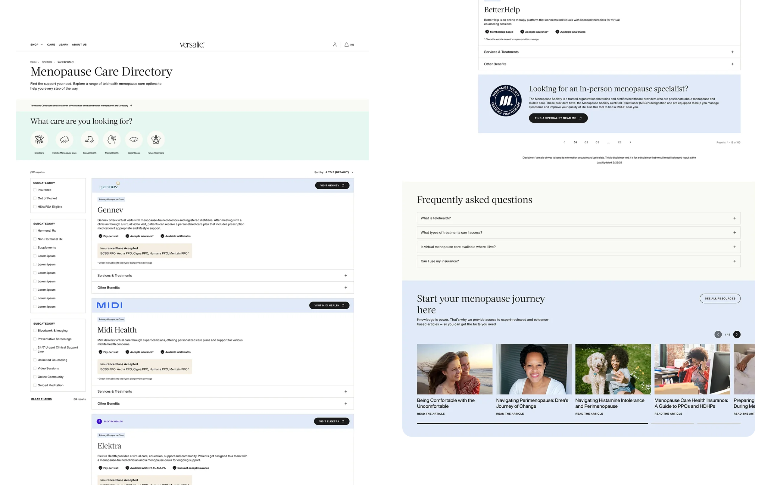
Versalie is a menopause care brand. I designed a provider directory that enabled a pivot from in-house telehealth to partnerships in 6 weeks—achieving 30% CTR and validating a new revenue model.
Role
Lead UX/UI Designer
🧩 Set conversion strategy and success metrics with Product Manager
👩🏻💻 Owned end-to-end design across cross-functional team

Results
Tracked with GA4 and Microsoft Clarity


The problem
Pivoting from failed telehealth to a provider marketplace
Versalie originally offered in-house telehealth services, but usage was extremely low, fewer than 10 users subscribed. With high operational costs and minimal engagement, the service wasn't sustainable. The business decided to pivot to a partnership model that would reduce overhead while positioning the brand for growth.
The challenge:
- The existing site had no infrastructure for listing partners
- Users needed help exploring care options and comparing providers
- We had to communicate the change in model while maintaining trust
I needed to design an experience from the ground up that clearly communicated the pivot, guided users to relevant providers, and reinforced credibility in the new care offering.
The goal
Balancing user needs with business sustainability
Not just a redesign, this was a test of whether the partnership model could work. Success meant users engaging with providers and the business seeing early "conversion" signals.
 User Goal
Find a care provider that fits my needs.
🎯 Success signals:
- Scroll depth on directory (engagement)
- Time spent comparing providers
💼 Business Goal
Drive clicks to partner sites and validate the model

- CTR from landing page to directory
- Clicks on partner CTAs (exit site)
Research & Discovery
Understanding what users needed and trusted
The approach
With the Product Manager and Content Lead, we collaborated in a FigJam session to quickly align on what mattered most. We synthesized insights from the existing telehealth program and mapped out:
User pain points
- Couldn't choose their own provider
- Unclear about costs and insurance coverage
- Didn't know what to do after finding a provider
Opportunities
- Let users browse and compare providers on their terms
- Surface trust signals: credentials, specialties, insurance
- Make filtering intuitive (specialty, insurance, location)
User flow
Landing page → Directory → Filter by need → Provider card → Exit to partner site
Competitive inspiration
ZocDoc and Nerdwallet showed us that scannability, filtering and trust signals were the foundation of successful directories.
The insight that drove design
Users needed control and transparency, not another assigned care experience.
- A single inspiration example that demonstrated simplicity in provider comparison
FigJam sessions made it easy to cross-collaborate remotely.
Design Strategy
Designing for trust, speed, and validation
The approach
Considering our limited dev resources, we decided to repurpose the existing care landing page and build one new directory page. This allowed us to ship faster while still solving core user and business needs.
Key design decisions
1. Landing page = Trust-building
Introduce the new model, explain the shift from our in-house partner, and set expectations. The goal was to reduce skepticism before users even reached the directory.
2. Directory page = Comparison and conversion
Let users filter by symptom, specialty, and insurance. Let users browse provider cards with key info above the fold, and click through to partner sites.
3. Provider cards = Scannability over detail
Show just enough information to help users compare (specialty, insurance, states served) without overwhelming them. "Visit 'Company' " CTAs reduced pressure vs. "Book Now".
4. Mobile-first layout
70% of traffic was mobile, so filtering and cards had to work seamlessly on small screens.
The rationale
Every decision was prioritized for speed to ship and reducing user friction, because the faster we could validate the model, the sooner we'd know if the pivot worked.

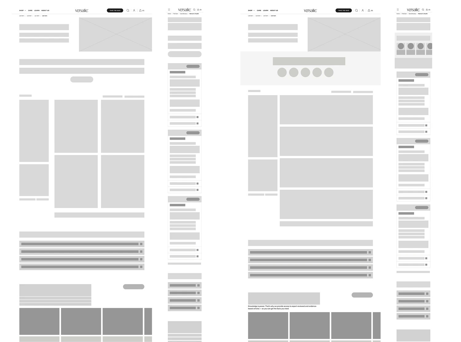
Early wireframes showing content layout and card structure that would scale as we added providers
Final Design
A directory built for trust and scalability
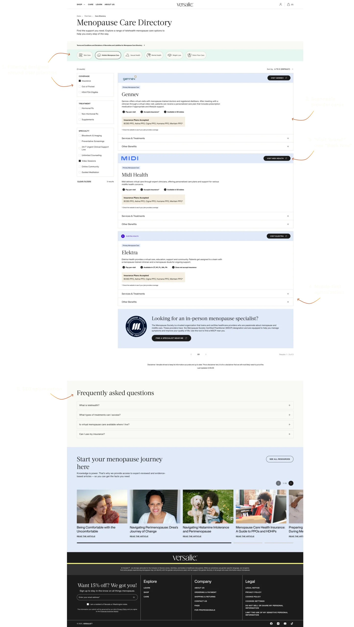
1. Filtering designed around user priorities
Based on research, symptom, specialty and insurance coverage were the top criteria users needed. I designed filters that were visible on desktop and easily accessible via a drawer on mobile.
2. Scannable provider cards
Each card surfaces the essentials, provider name, specialty, insurance accepted, and states served. Additional details were nested within the drawers.
3. Visit 'Brand' over Book Now
Instead of pushing users directly to the 3rd party's booking page, CTAs invited them to explore provider profiles first. This would reduce pressure and help build trust in an unfamiliar model.
4. Mobile-first optimization
With 70% of traffic being on mobile screens, I designed a vertical card stack with collapsible drawers to maximize screen real estate.
5. SEO optimization
Optimized FAQ content was placed at the bottom of the page to capture organic traffic.

The Results
Proving the model worked, fast
Early performance metrics
30% CTR
from landing page to directory
Industry benchmark for healthcare directories: 15-20%
✅
23 exit clicks
in the first 2 weeks
Validated user intent to engage with partners
👀
80% scroll depth
on directory page
Users explored listings deeply vs. bouncing
What this meant for the business
The partnership model showed early signs that it was working. Users were willing to explore external providers, and engagement metrics exceeded expectations. The project gave Versalie a path forward without the costly in-house telehealth service.
Reflection
Why this project mattered
1. Imperfect action beats perfect planning
I didn't have time for formal research or endless iteration. I had just a few weeks and that constraint forced me to focus on what mattered, proving whether or not the new model worked. The MVP wasn't flawless, but it gave us real data to work with.
2. Efficient design requires being on the same page
The FigJam session wasn't just about user needs, it was about getting alignment between the PM, Brand Mgr and Copywriter. That collaboration saved us from building the wrong thing.
3. Flexibility for scaling
I designed with scaling in mind because I wanted to account for the growth of the provider list.
What I'd do differently
Push for lightweight usability testing on filtering logic and A/B test CTA language. Small validation loops would have sharpened the final design.
Designing through ambiguity
Navigating a foggy and vague territory means leading with clarity, even when you don't have all the answers. This project reminded me that design can give teams the confidence to move forward, even when the path isn't set.
Cart & Checkout Redesign
Optimizing the purchase journey
