Sun Kissed Yoga
redesign of a local yoga studio's website.
Sun Kissed Yoga
redesign of a local yoga studio's website.
Sun Kissed Yoga is a locally owned yoga studio located in Old Town Camarillo, California. Their mission is to create a strong yoga community in Camarillo by bringing people together. Offering a wide range of classes from a relaxing stretch class to the challenging and sweaty vinyasa flow they invite a 'come-as-your-are' mentality. The company is unique in its identity and only 1 of 2 studios in all of Camarillo.
challenge.
challenge.
As the sole designer for this 4 week project, I was excited to work with the two young stakeholders on this project. My overall goals for this project:
- Design a responsive website that would attract and convert new clients looking for a yoga studio in Ventura County.
- Portray the company's friendly and simple 'come-as-you-are' branding.
Sun Kissed Yoga has a vision of expanding to a second location in the future with a hot yoga studio, something I wanted to keep in mind during the project.
research.
research.
The questions I started with in the beginning at first framed around current members of the yoga studio. I had originally thought that discovering the pain points of the current user base would guide my way. However, there were actually no pain points mentioned to the stakeholders so I decided to shift the research to instead focus on potential new clients.
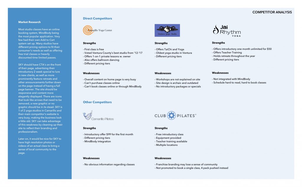
To get a better idea of the dedicated studio market, I looked at Sun Kissed Yoga's competitors and doing some market research revealed that most studios offered some kind of introductory special to entice a new client and then featured it on their front page. Majority also used an integration with MindBody, a popular class booking application downloadable on mobile.
goals.
goals.
With the market research complete, I had some clear goals.
- Who primarily takes studio classes?
- What convinces a new client to sign up for a class/membership?
- How long until a new client becomes a member?
- What do visitors look for on a studio website?
interviews.
interviews.
Within the limited time frame I was able to interview 5 participants both male and female, mainly within the age range of 26-30 years old. It was interesting to learn that all of my participants commented that part of the reason why they switched to taking different studio classes was to diversify their workouts. Many mentioned that they felt like they had plateaued, and a major selling point for membership, outside of convenient location, was that the studio offered different types of classes.
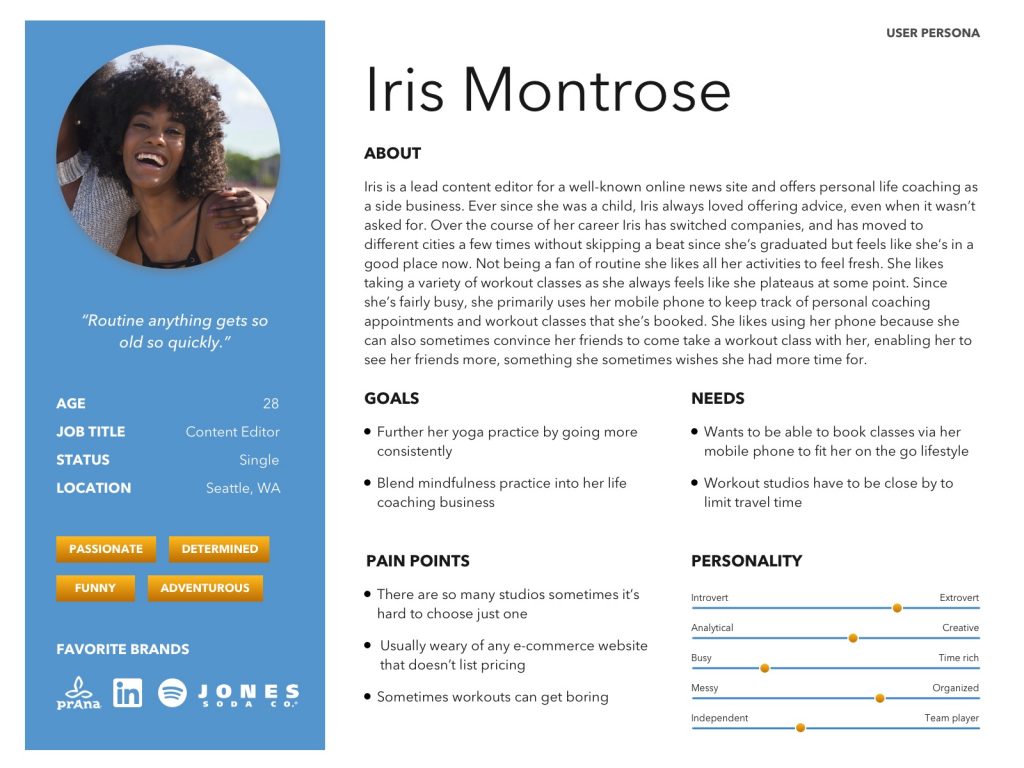
Gathering all that I learned, I formed a user persona, Iris Montrose. Iris is 28 years old and is constantly seeking variety in her workouts. She wants to further her yoga practice by going more consistently and needs to find a studio that is close by to limit her travel time. Iris primarily books classes using her mobile phone and likes when any booking channel easily integrates with her phone calendar.
data results.
data results.
From my interviews, surveys, and also analyzing the site's Google Analytics it was clear that the two items that must be easy to find were classes and pricing.
User flow analysis over the span of a week:
- Of 501 sessions, 191 started on the home page or classes page.
- From the home page 138 of the 191 sessions went to the classes page.
- 33 of those 191 sessions went to the prices page.
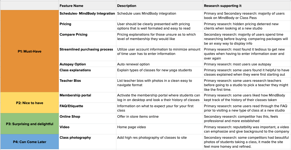
I was surprised to find that some of the items like FAQ and the Membership Portal were pushed down the priority list, as it saw little to no traffic. With the results of the compiled data I put together a product roadmap to list which features were most important and why.
wireframes.
wireframes.
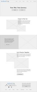
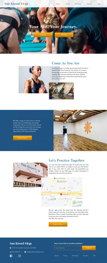
After some preliminary sketches, I developed my first and second round of wireframes. At first I ran into some trouble trying to expand and organize the existing copy so the site would look more thorough. However, after some brainstorming I decided to use the About page copy on the Home page instead. This way, the studio's personality and story could be showcased right up front, enticing users to interact with the site.
After a quick usability test with a couple of users to ensure I didn't need to make any major structural changes I moved on to my favorite part, the UI.
ui.
ui.
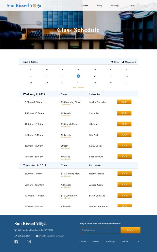
I integrated the existing logo colors into the site, using the gold/orange as the highlight color against the calming blue, to bring about a sense of friendliness and approachability. I was able to use some existing photography pulled from their Instagram and mixed it in with some stock photography to really breathe some life into the pages.
Class Schedule Page
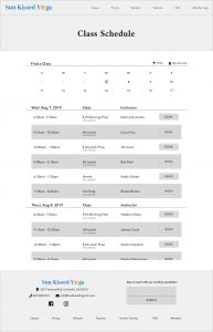
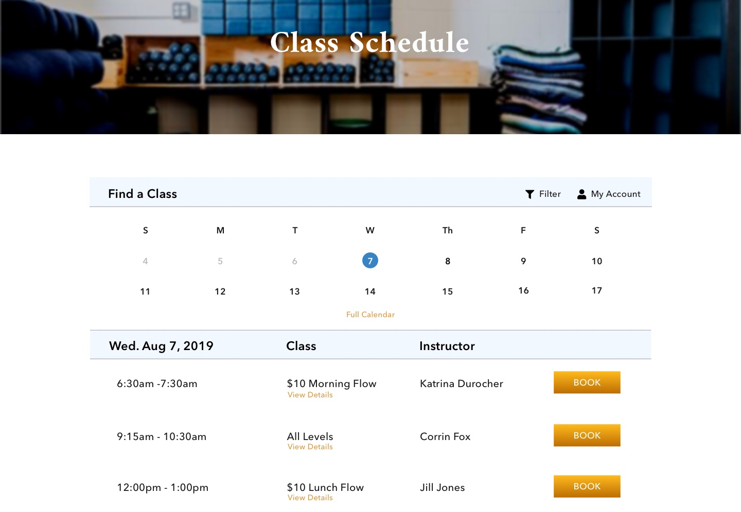
For the Class Schedule page I kept the MindBody Integration, and just updated the colors to match the rest of the site and the branding.
Pricing Page
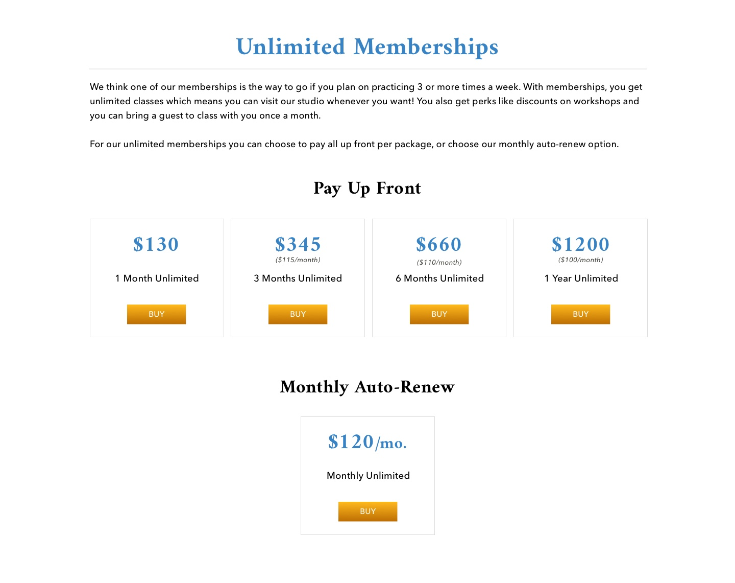
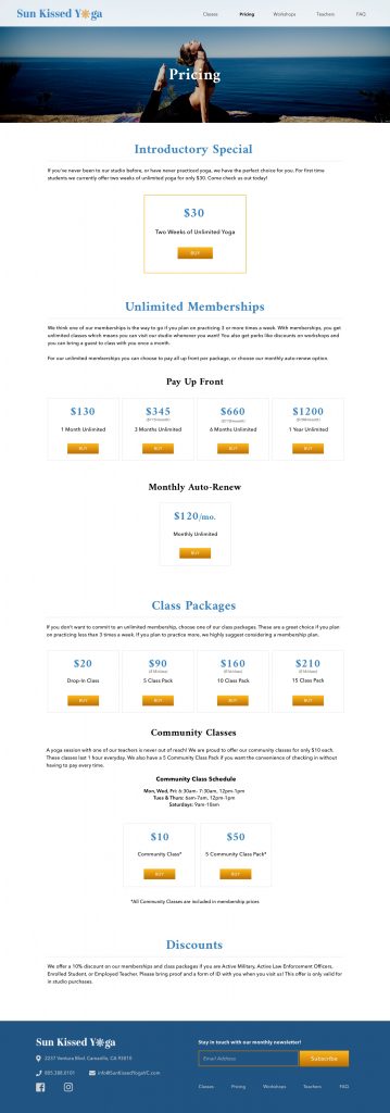
Although overall the pages came together easily, I ran into some trouble organizing the Pricing page. There are two different ways to pay and there are two different priced classes. The current page just lists all the prices, with only classes and membership subsections. So I ended up breaking these sections into more subsections to illustrate these differences with visual hierarchy more clearly.
Basic UI Kit
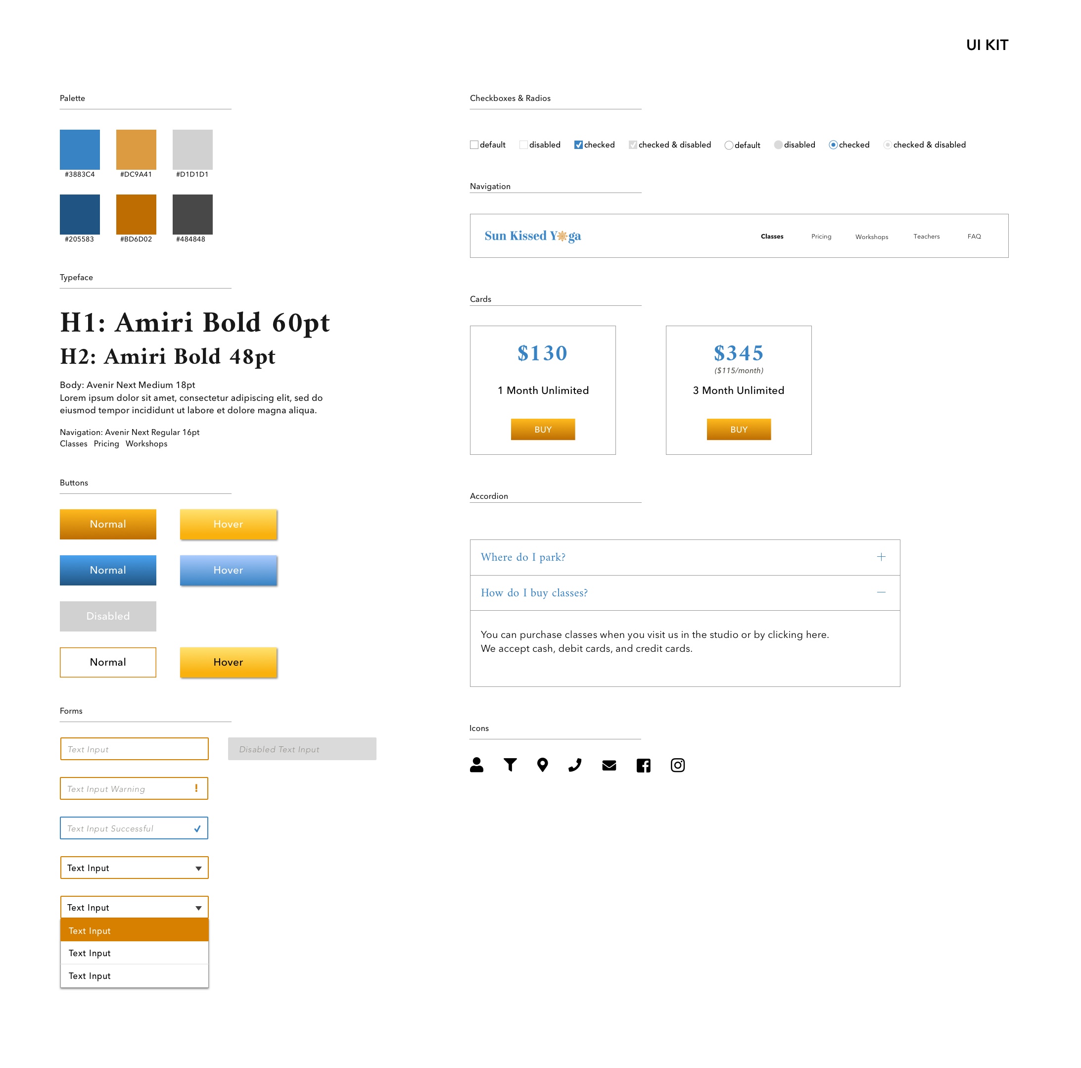
With an already existing logo and colors, I picked typography that would be complimentary but would still bring an updated look to the site. Amiri kept it complimentary to the logo font and Avenir Next with its soft Sans Serif look made it a bit more modern. The following UI Kit shows a compilation of patterns and some branding items to be used throughout the site.
testing.
testing.
Using Invision to create my prototype I proceeded to start testing with the following questions in mind:
- How is the overall quality and ease of use of navigation and flow?
- Are users are able to complete their tasks without difficulty?
- How easily can a user book a class?
In order to answers these questions, I tasked my participants with two tasks:
- Find a specific class.
- Book that specific class.
To check out my prototype:
Results
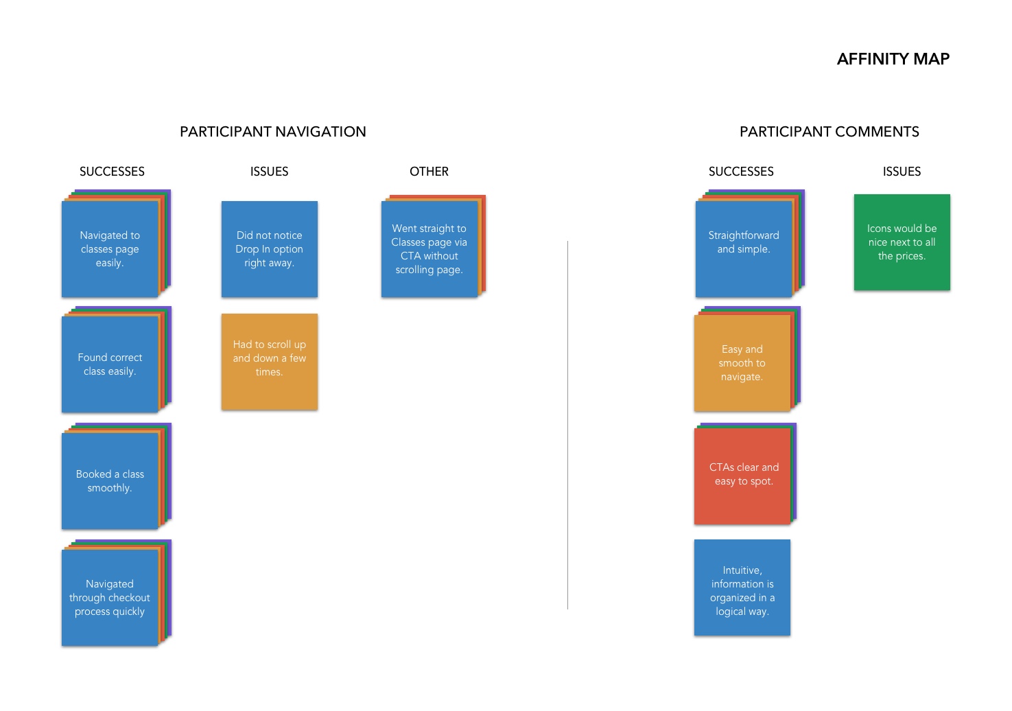
Overall the testing went well with a 100% completion rate and 80% error-free rate. 88% of testers rated the design and ease of use a 7/10 or higher. Using an affinity map I was able to summarize the following.
PROS
- Design easy to navigate
- Straightforward, easy and simple
- Intuitive
CONS
- Drop-In Class option wasn't immediately noticed
- Would like icons next to prices
finale.
finale.
At the end 4 weeks I feel that I successfully designed a site that would help attract and convert potential clients. I did this by bringing out the studio's friendly branding, expanding on their existing logo colors and showcasing their story on the home page.
I learned that although a design has gotten away with being usable (ie. Pricing page), it doesn't mean that it is actually optimal.
Looking forward I plan to continue to work with the owners, as long as they'll have me, to see if we can bring this design into implementation.

