Kenvue: eCommerce Checkout
case study.
Kenvue: eCommerce Checkout
case study.
Kenvue's premium skincare range, Neostrata, emerged as the pioneer brand within the company's multi-million dollar direct-to-consumer portfolio. Their ambitious goal involved a comprehensive redesign of the checkout experience, aiming to set new standards and overcome challenges in the realm of online customer transactions.
This is my account of how I was able to bring their vision to fruition.
in a nutshell.
in a nutshell.
As the sole product designer, I solved key usability issues and revamped the visual style by utilizing competitive market and user testing research to improve conversion rates. Within the first year, the new design decreased cart abandonment by 28% and increased the conversion rate by 28%. After successfully piloting the design on Kenvue's luxury skincare brand, Neostrata, the experience was soon applied across the whole direct-to-consumer portfolio.
the client.
the client.
Kenvue is an American consumer health company. Formerly known as the Consumer Healthcare division of Johnson & Johnson, Kenvue is the proprietor of well-known brands like Neutrogena, Rogaine, Tylenol, and many more.
the challenge.
the challenge.
The Request: Design a checkout experience that increases conversion rates on Neostrata's DTC website, Neostrata.com.
Starting out there were two hurdles in place:
- The project had already been ongoing: aka - tight timeline.
- Two designers had been on the project previously: aka - dissatisfied stakeholders.
My immediate thoughts centered around cart abandonment, a KPI we could use.
- How can we decrease cart abandonment to improve conversion?
- How can we provide a seamless experience for consumers?
my role.
my role.
I led the design of the checkout experience and worked alongside a Product Manager, a third party development team, and assisted with Quality Assurance. I started and handed the designs off in August 2022, and was part of final review post development. The redesigned experience was launched for Neostrata in November 2022.
research.
research.
Basic Goal: Figure out why users were abandoning their carts. A straightforward ask with so many possible answers. With a timeline of 2 weeks I wanted to seek out whatever low hanging fruit I could pick. For the first 2-3 days I worked with the Technical Product Owner, looked over the research she did before I came onto the project, and combined it with my own.
don't reinvent the wheel.
Looking at the top reasons why users ditch their carts from a list provided by Baymard Institute:
- 49% : Extra costs too high (ie shipping, tax, fees)
- 24% : Site requires account creation
- 19% : Delivery times were too slow
- 18% : Checkout process too long or complicated
- 17% : Didn't trust the site
- 17% : Unclear on the total cost
Other reasons that were interesting to note but were definitely not within the scope of the project were:
- Returns policy wasn't great
- Website crashed or had errors
- There weren't enough payment methods
- Credit Card declined
finding the weak spots.
Then I collected screenshots of the checkout experience, and in conjunction with my Technical Product Owner's research, highlighted areas that we thought were potential pain points.
- Long checkout flow
- Site requires account creation
- Unclear on total cost
Although preferred, I didn't have time to do an in-depth look with the Data Analyst, nor did the team have access to user tracking applications, so I picked out features that I knew could be improved based on competitor analysis and the research compiled by reliable 3rd party sources like the Baymard Institute.
flow analysis.
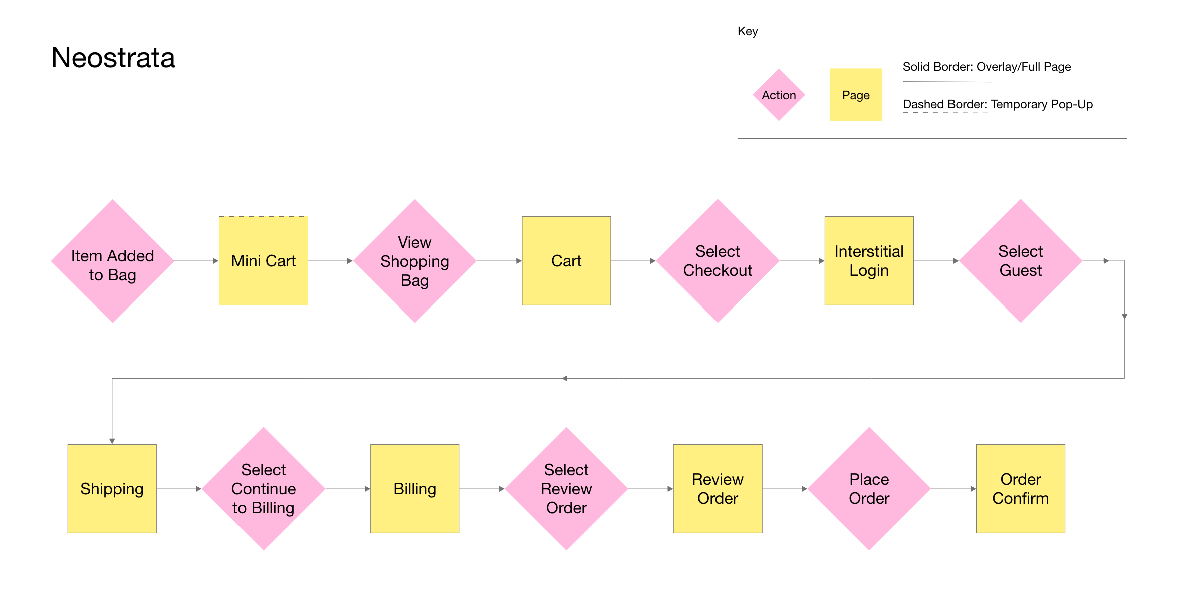
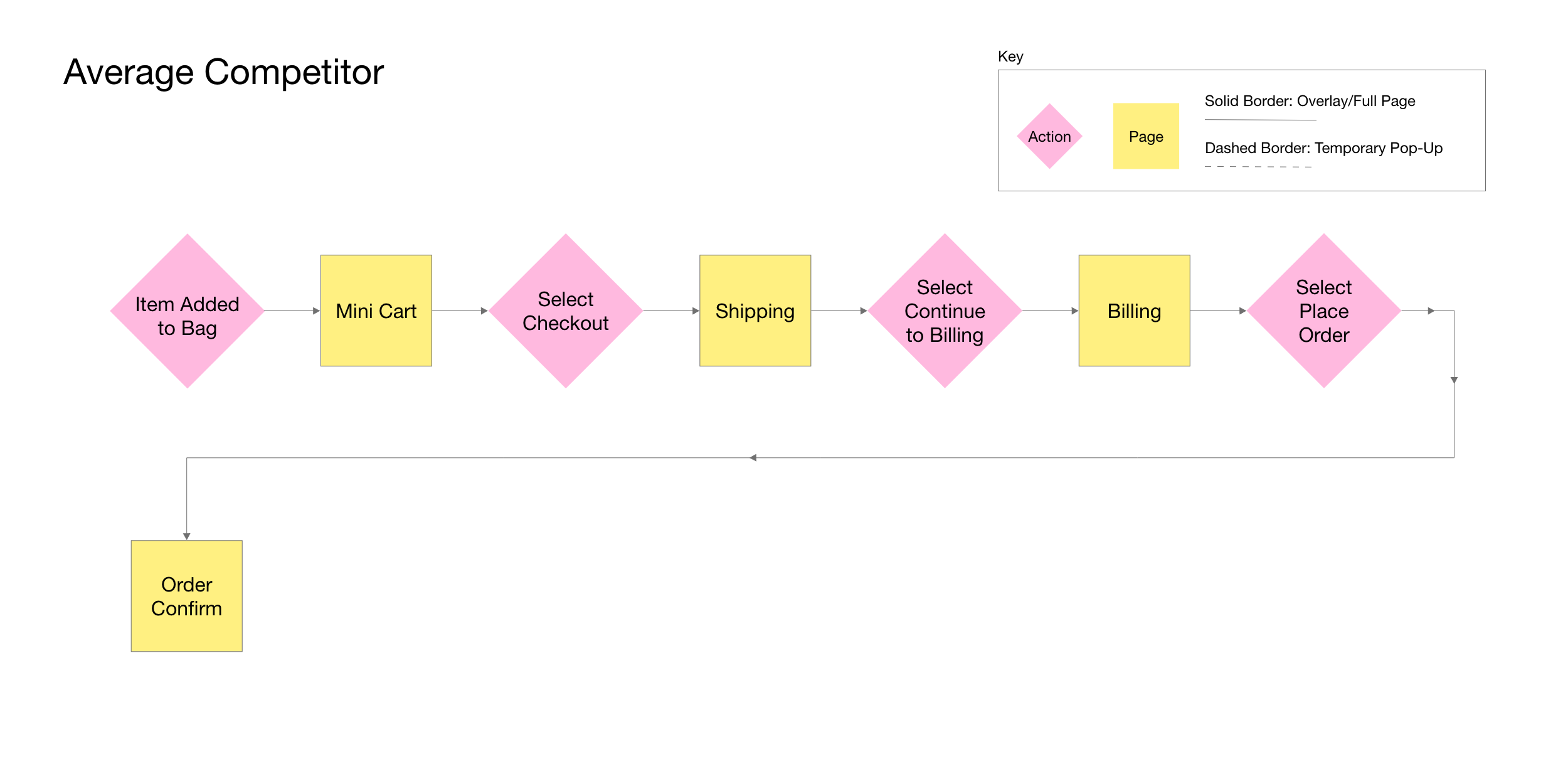
Utilizing a flow chart, I was able to present to the business that Neostrata's checkout flow was nearly twice as long as some of our major competitors'.
There was also an interstitial login that appeared whenever a user went to checkout, even if that user was just a guest user. Since the business did not require account creation to checkout for single purchases, I hypothesized that this could be a potential friction area for users.
the design.
the design.
After 2-3 days of research, I spent the rest of the first week sketching wireframes and creating high-fidelity mocks. I needed to present to my stakeholders and TPO for feedback as soon as possible so I could start iterating.
the shopping bag.
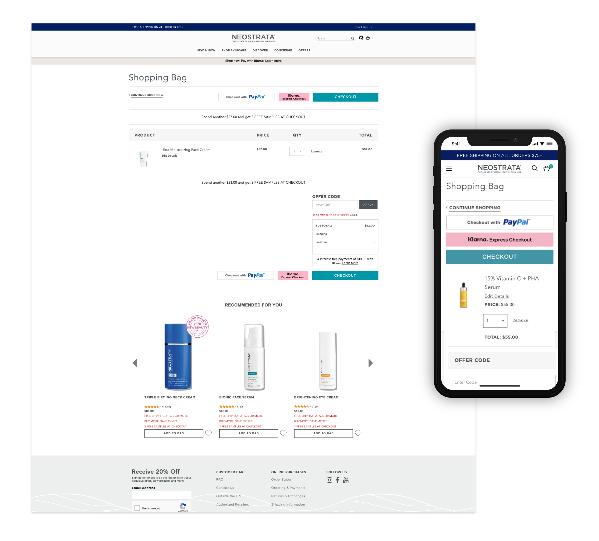
Pain Points:
- Total price not obvious on mobile.
- Various forms of express payment could be more prominent.
- UI did not match current branding, making the shopping bag feel out of place with the rest of the website.
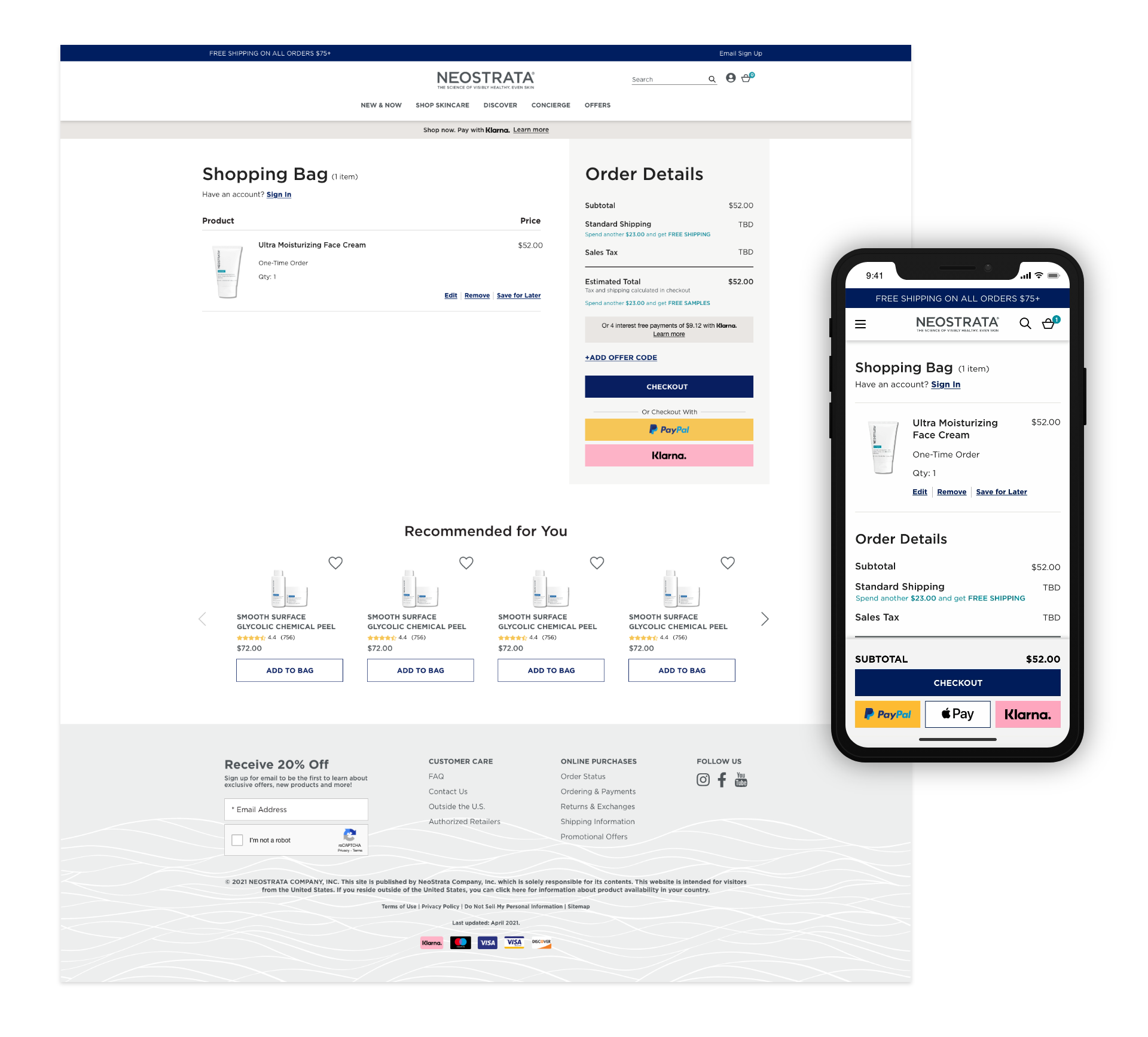
Updates:
- Item counter added to heading so user can see how many items they have in their bag.
- (Mobile) Created a sticky component that showed the subtotal, primary checkout button, and express payment options.
- Updated content slots within the Order Details section to allow the business to remind users of incentives.
- User is able to sign in through a modal via a link right underneath the heading of the page.
- Updated overall UI to match the current experience on the live site.
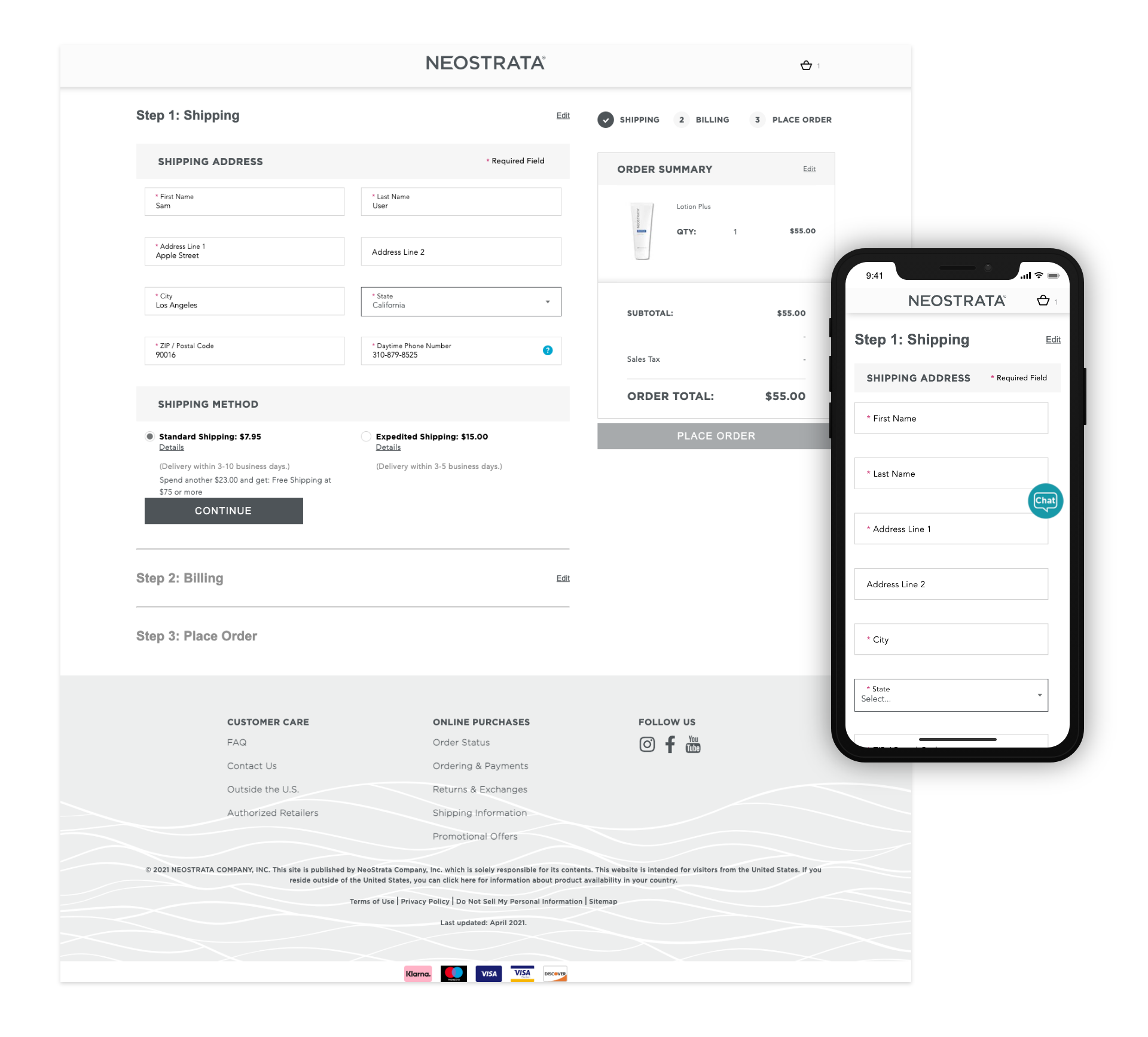
checkout flow: shipping.
Pain Points:
- After clicking the checkout button, users were asked to sign in or create an account, even when the purchase did not require an account to complete.
- Clicking the bag in the upper right hand corner of the nav menu brought the user back to the shopping bag. An unneeded exit point.
- (Mobile) User unable to see total or order details unless they scroll to the bottom of the page.
- Shipping methods weren't as prominent as they could be.
- Checkout flow had full footer, providing many exit points.
- Place Order CTA out of place.
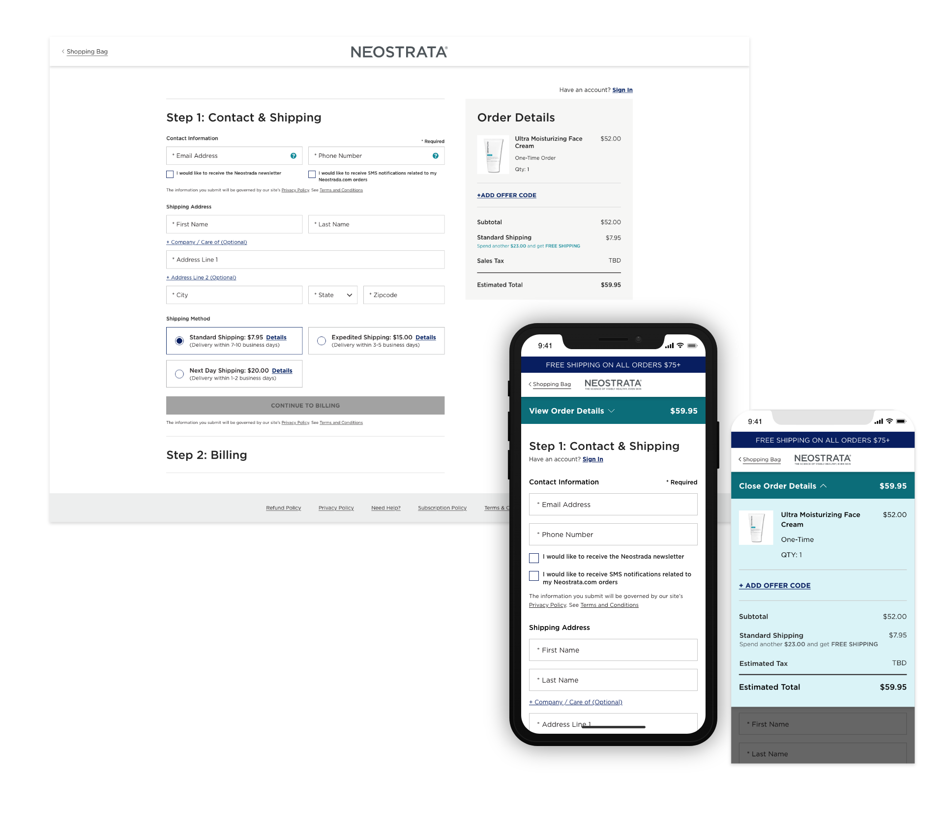
Updates:
- Removed the account sign in modal for guest users purchasing a product that did not require an account, creating a frictionless pathway to the shipping page.
- Removed the shopping bag in the upper right hand corner, instead providing a shopping bag labeled link that was more appropriate and standard to user expectations.
- Sectioned content into three different sections for easier scanning.
- Removed Place Order CTA.
- Extended Continue CTA to go across the row so it was easier to see.
- Added Email field to Contact section.
- Updated shipping method UI so options were easier to pick out.
- Simplified the checkout footer so it had only applicable or required links.
- (Mobile) Added a sticky View Order Details dropdown module. Price is always visible and user is able to see items that are about to purchase, along with the price breakdown and the ability to add an offer code.
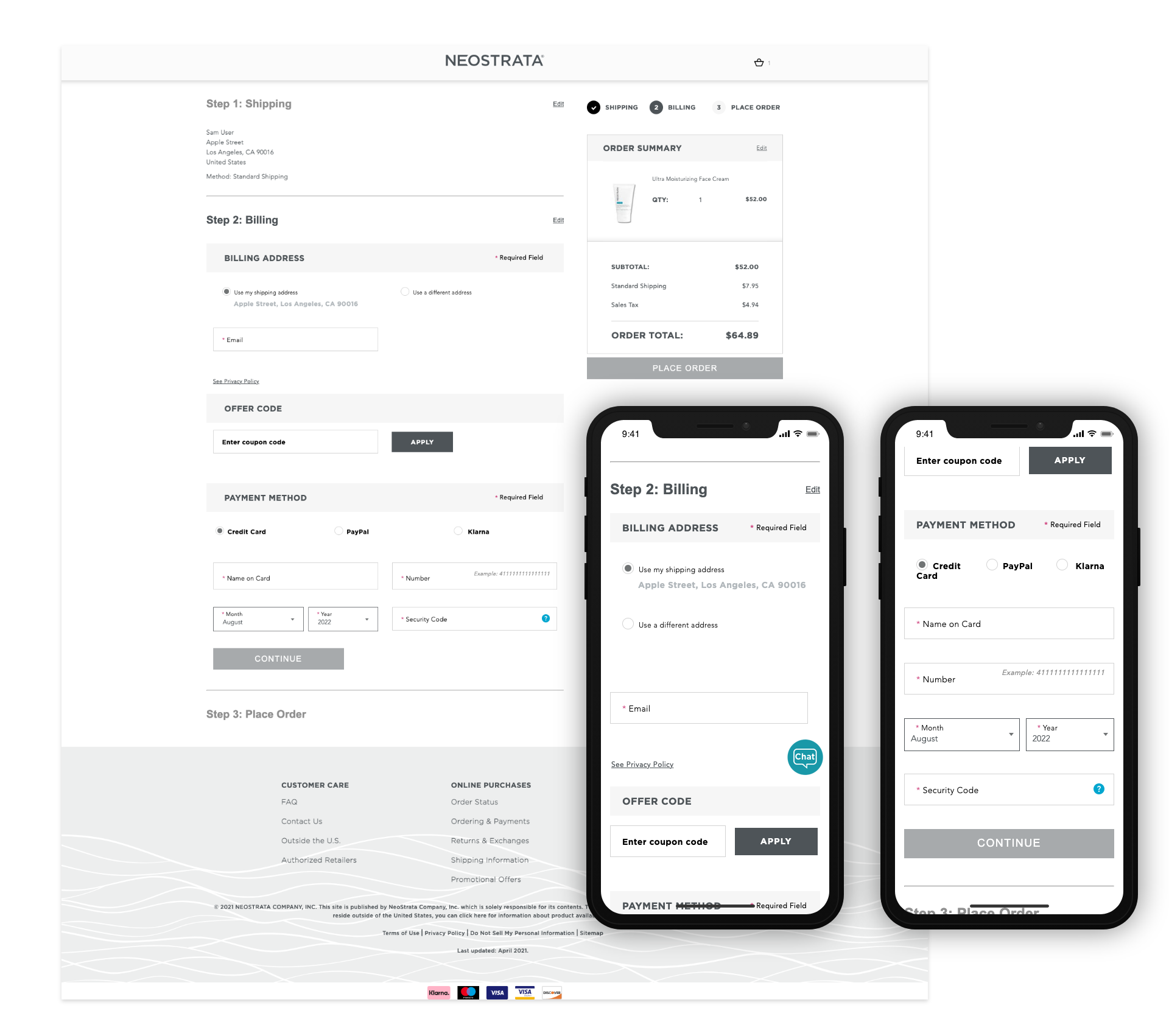
checkout flow: billing.
Pain Points:
- After clicking the checkout button, users were asked to sign in or create an account, even when the purchase did not require an account to complete.
- Clicking the bag in the upper right hand corner of the nav menu brought the user back to the shopping bag. An unneeded exit point.
- (Mobile) User unable to see total or order details unless they scroll to the bottom of the page.
- Shipping methods weren't as prominent as they could be.
- Checkout flow had full footer, providing many exit points.
- Place Order CTA out of place.
- After billing a user would have to redundantly confirm in Step 3: Place Order to place their order.
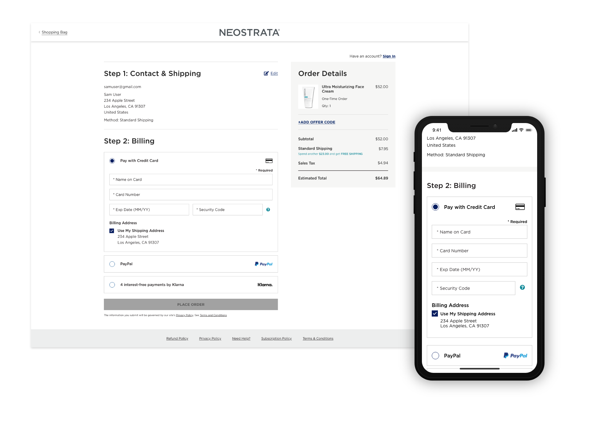
Updates:
- Removed the account sign in modal for guest users purchasing a product that did not require an account, creating a frictionless pathway to the shipping page.
- Removed the shopping bag in the upper right hand corner, instead providing a shopping bag labeled link that was more appropriate and standard to user expectations.
- Sectioned content into three different sections for easier scanning.
- Removed Place Order CTA.
- Extended Continue CTA to go across the row so it was easier to see.
- Added Email field to Contact section.
- Updated shipping method UI so options were easier to pick out.
- Simplified the checkout footer so it had only applicable or required links.
- (Mobile) Added a sticky View Order Details dropdown module. Price is always visible and user is able to see items that are about to purchase, along with the price breakdown and the ability to add an offer code.
- Removed redundant Step 3, once a user had successfully completed Steps 1 & 2, the Place Order CTA would be active to select at the end of Step 2.
initial results.
initial results.
After a few weeks, a report from our analytics team proved that the updates were a success, with still some room for more improvement.
Checkout Abandonment Rate:
- Desktop/Tablet: 57.25% down to 56.81%
- Mobile: 71% down to 62%
- Overall Rate: 65% down to 60%
Time Spent in Checkout Process:
- Desktop/Tablet: Reduced by 13%
- Mobile: Reduced by 20%
User Drop Off at "Billing" and "Place Order" in Flow:
- Desktop/Tablet: 11% down to 8%
- Mobile: 15% down to 8%
User Drop Off at Beginning of Checkout Stage
- Increase from 15% to 39%. This was expected due to the additional options for users to use the express payment options (Apply Pay, PayPal, Klarna).
Improvement Potential:
- An increase of drop off rate at the "Shipping" step. 22% to 35%.
live.
live.
The live checkout flow can be found on Neostrata.com.
conclusion.
conclusion.
A bit later we addressed the increase in drop-off rate at the "Shipping" step. We solved for this by reordering the content on the Shipping page. Pushing the Contact Information section to below the Shipping Information section.
A little over a year after launch, we were able to compare similar dates during an annual sale that the brand does. Post checkout flow and with the new update, we saw an increase in the number of people going from viewing their carts to starting the checkout flow. These increased sessions starting the checkout flow resulted in more transactions for the business.
% Completion:
- Old Checkout: 35%
- Post Checkout Launch: 63%
- Post Checkout after Update: 67%
% Cart Abandonment:
- Old Checkout: 65%
- Post Checkout Launch: 37%
- Post Checkout after Update: 33%
Transactions:
- Old Checkout: 841
- Post Checkout Lauch: 1,031
- Post Checkout after Update: 1,025
With successful results for Neostrata, this checkout flow was soon applied to Neostrata's sister brand, Exuviance. Then applied to Rogaine and Neutrogena.

