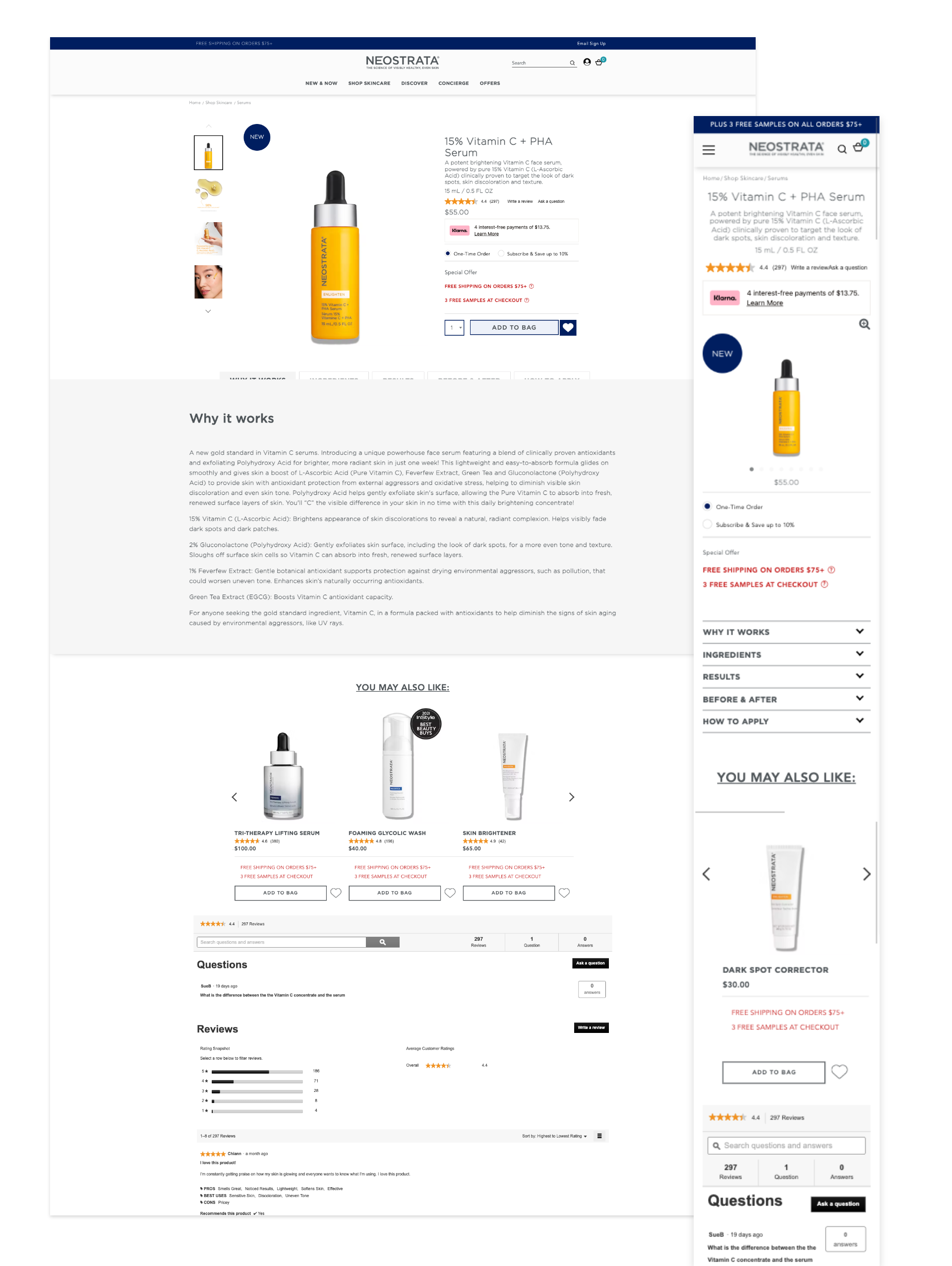
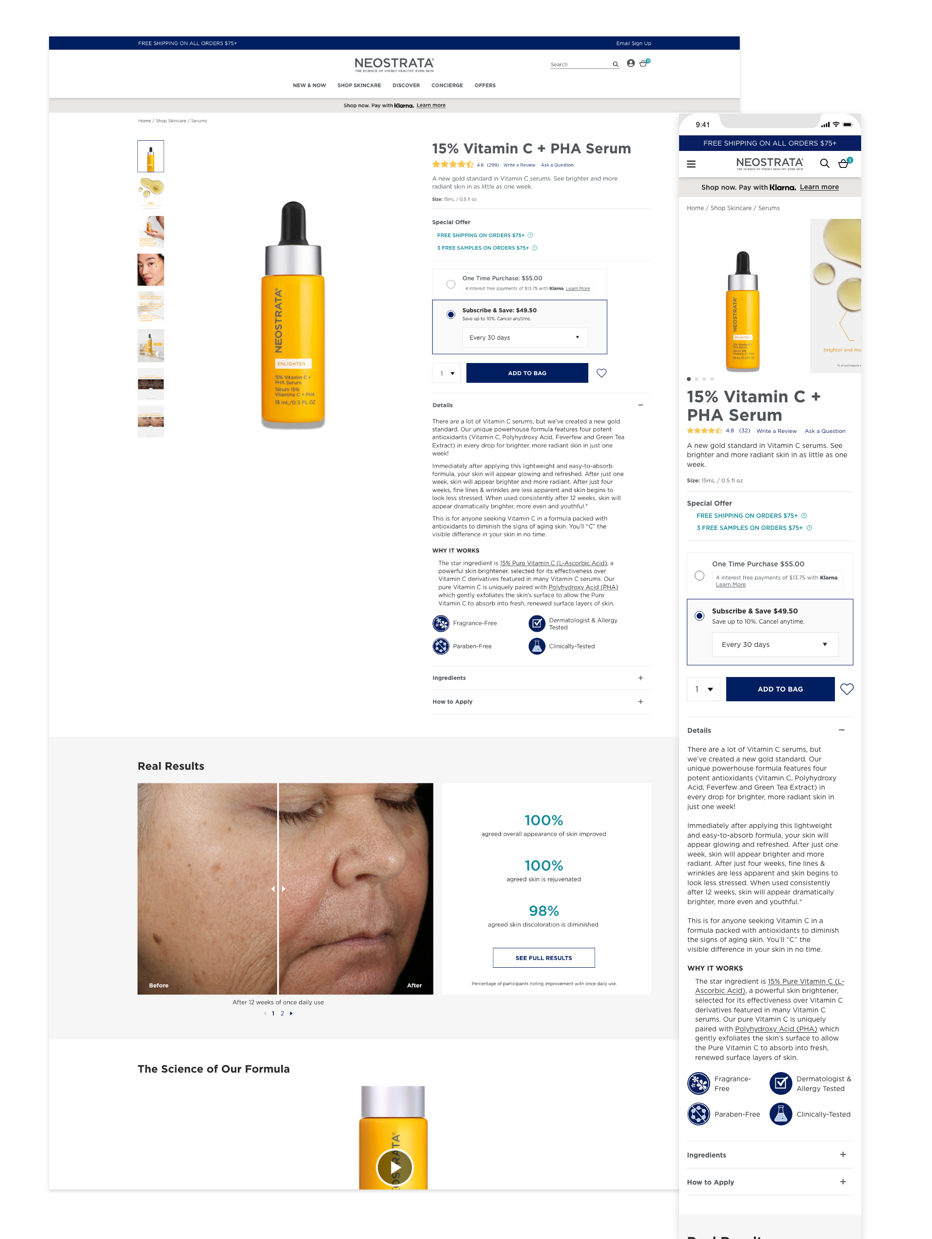
Kenvue: PDP Redesign
case study.
Kenvue: PDP Redesign
case study.
Product Detail Page redesign for Kenvue's direct-to-consumer brands Neostrata and Rogaine.
in a nutshell.
in a nutshell.
As the sole product designer, I solved key usability issues and revamped the visual style by utilizing competitive market and user testing research to improve conversion rates. Within the first year, the new design increase add to cart rates by 26.47% compared to a similar time the previous year, and conversion rate increased by 6.5%. After successfully piloting the design on Kenvue's luxury skincare brand, Neostrata, a simliar experience was also applied to Rogaine.
the client.
the client.
Kenvue is an American consumer health company. Formerly known as the Consumer Healthcare division of Johnson & Johnson, Kenvue is the proprietor of well-known brands like Neutrogena, Rogaine, Tylenol, and many more.
the challenge.
the challenge.
The Request: Redesign the product detail page for Neostrata's portfolio that increases conversion rates on Neostrata.com.
my role.
my role.
I led redesign of the product detail page and worked alongside a Product Manager, a third party development team, and assisted with Quality Assurance. I started and handed the designs off in Spring-Summer 2023, and was part of final review post development. The redesigned experience was launched for Neostrata in Fall 2023 on one of their flagship products.
research.
research.
Basic Goal: Discover user pain points on the existing product detail page.
user zoom, user testing.
I conducted a task-oriented user study to test ease of navigation to the product detail page, discovery of information and purchase options on the product detail page. User testing was conducted on mobile only since that is what makes up majority of our user device base.
Discoveries:
- 50%+ users did not interact with content hidden away in accordions even if it was far up the page.
- Users were confused with the content titles and wasn't sure if they had found what they needed.
- Users were confused as to how the subscription program worked for auto-delivery.
- Users were unsure how to find product benefits because of redundant heading labels.
hot jar, heatmaps.
I also was able to access Hot Jar for this project to see where our users were scrolling and what they were interacting most with.
Discoveries:
- 75% of users made it past the fold on mobile.
- Users interacted with the closed accordions.
- Of the users who interacted with the PDP, only 38.8% interacted with the content accordions.
update the ui.
Looking over the PDP, I knew we could also modernize and standardize the font weights, colors, and spacing so it would overall be a more pleasant interactive experience while still remaining within the brand guidelines.
the design.
the design.
updates.
- Bring product title to below image gallery.
- Consolidate all offers above CTA so users might be more motivated to add to cart.
- Update purchase options section so options are more clear and easier to understand.
- Add an Add to Bag CTA on page, as well as a sticky one that appears above when scrolling down the page.
- Relabel product content sections and update content within those sections.
- Take existing Before/After images and place them in an interactive Before/After Module.
- Emphasize study results.
- Add a Suggested Routine section showing how the product can work with other products in the brand portfolio.
- Add an FAQ section.
- (Desktop) Have gallery image scroll with user until next section is reached.
- Updated overall UI to match the current experience on the live site.
results.
results.
After a few weeks, a report from our analytics team proved that overall the updates were a success.
- Add to Cart Rate up by 26.47%
- Conversion Rate up by 6.5%
live.
live.
View the live PDP page below.
conclusion.
conclusion.
Due to a successful redesign, we applied similar changes to Rogaine.com. Overall the success of the project was due to the culmination of teamwork and a desire to bring a better experience to users and therefore profit to the business.


