A Better Checkout
We improved usability and refreshed the visual style using market research and user testing, reducing cart abandonment and increasing conversion rates by 28%. After its success on Neostrata, the redesign was adopted across Kenvue’s entire DTC portfolio.
Lead UX Designer @ Kenvue, Released November 2023
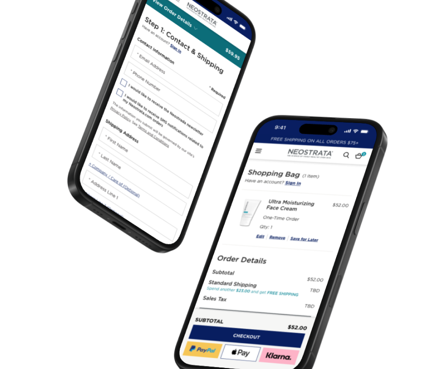
Earning trust as the third designer on the project.
The brand team saw it as outdated, and with new competitors entering the skincare market, failing to modernize it could impact market share.
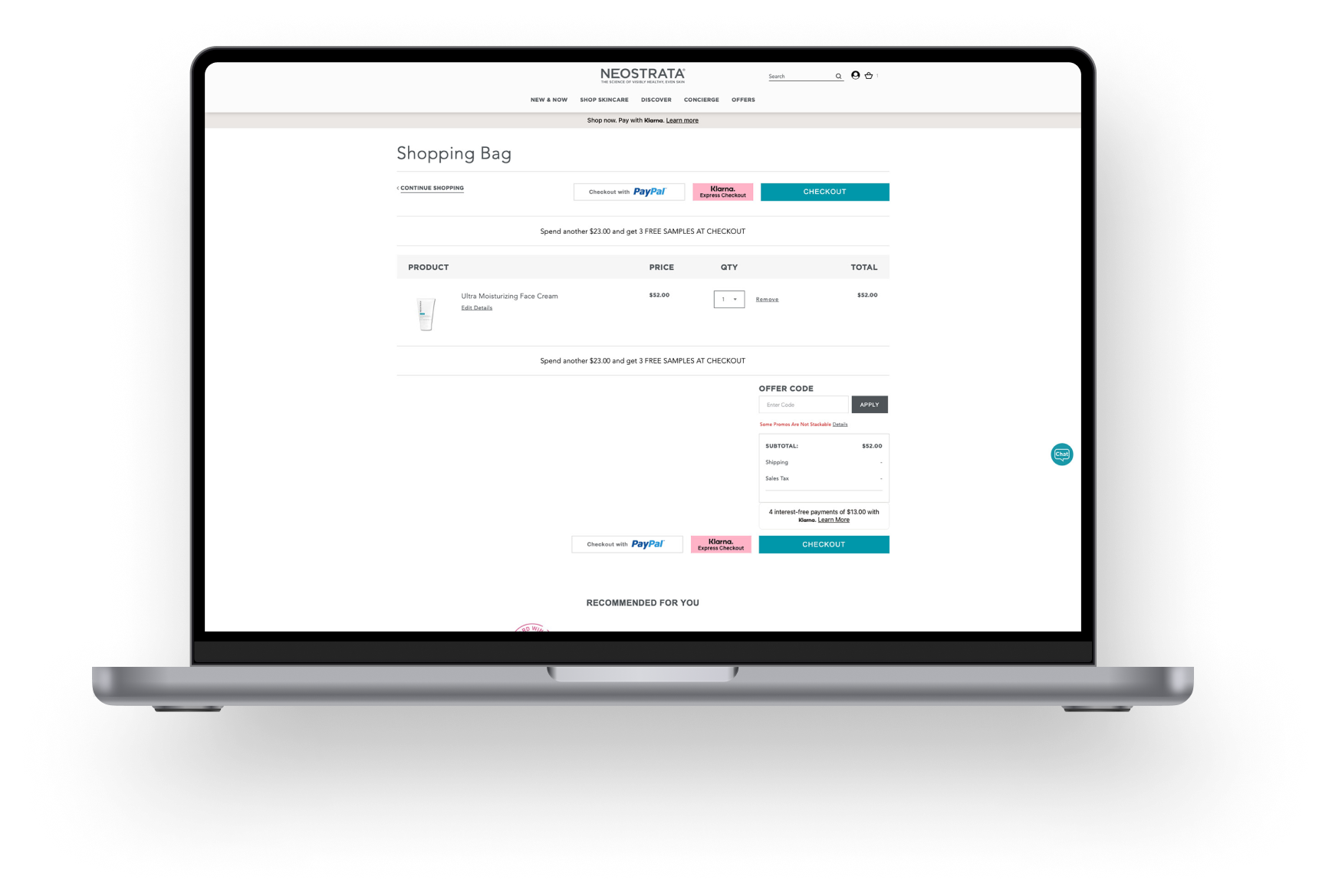
With the project already in motion, I had little flexibility to explore new directions.
The deadline was set, and progress needed to be made quickly.
Fortunately, I wasn’t starting from scratch—the previous designer had handed off a file. While it didn’t fully align with stakeholder expectations, it provided a foundation to refine and build upon rather than beginning anew.
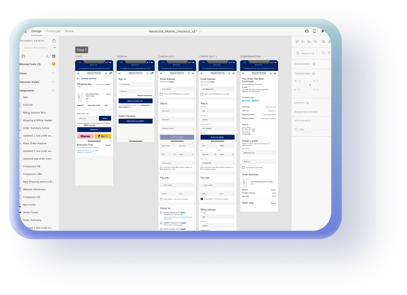
The team’s goal was to optimize the checkout flow in order to boost conversions and lower cart abandonment.
👩🏻 User Goal
Be able to quickly and easily purchase their item.
🎯 KPI
Checkout completion rate, time spent in checkout
💼 Business Goal
Reduce cart abandonment.
🎯 KPI
Cart abandonment rate
✨ Impact
A well-optimized checkout journey reduces friction, boosts conversions, and enhances customer trust, leading to higher revenue and repeat purchases.
My strategy was to prioritize low-hanging fruit that could deliver immediate impact.
Since the timeline was tight, I wanted to focus on quick wins. For the first couple of days, I collaborated with the Product Manager, reviewing her prior research and supplementing it with my own findings.
I identified pain points by comparing industry insights to our checkout flow.
I referenced Google and Baymard Institute studies to understand why users abandon their carts, then conducted a visual audit of our checkout journey to see what could be easily improved.
There were two standout friction points on our checkout journey that coincided with the Baymard cart abandonment study:
😵💫
18% of users in the Baymard study abandoned their cart due to complicated checkout flows
Friction Point: We had a interstitial account page that popped up prior to official checkout.
😶🌫️
Friction Point: We show the total cost at the very bottom of the page, where a user always has to scroll to find it.
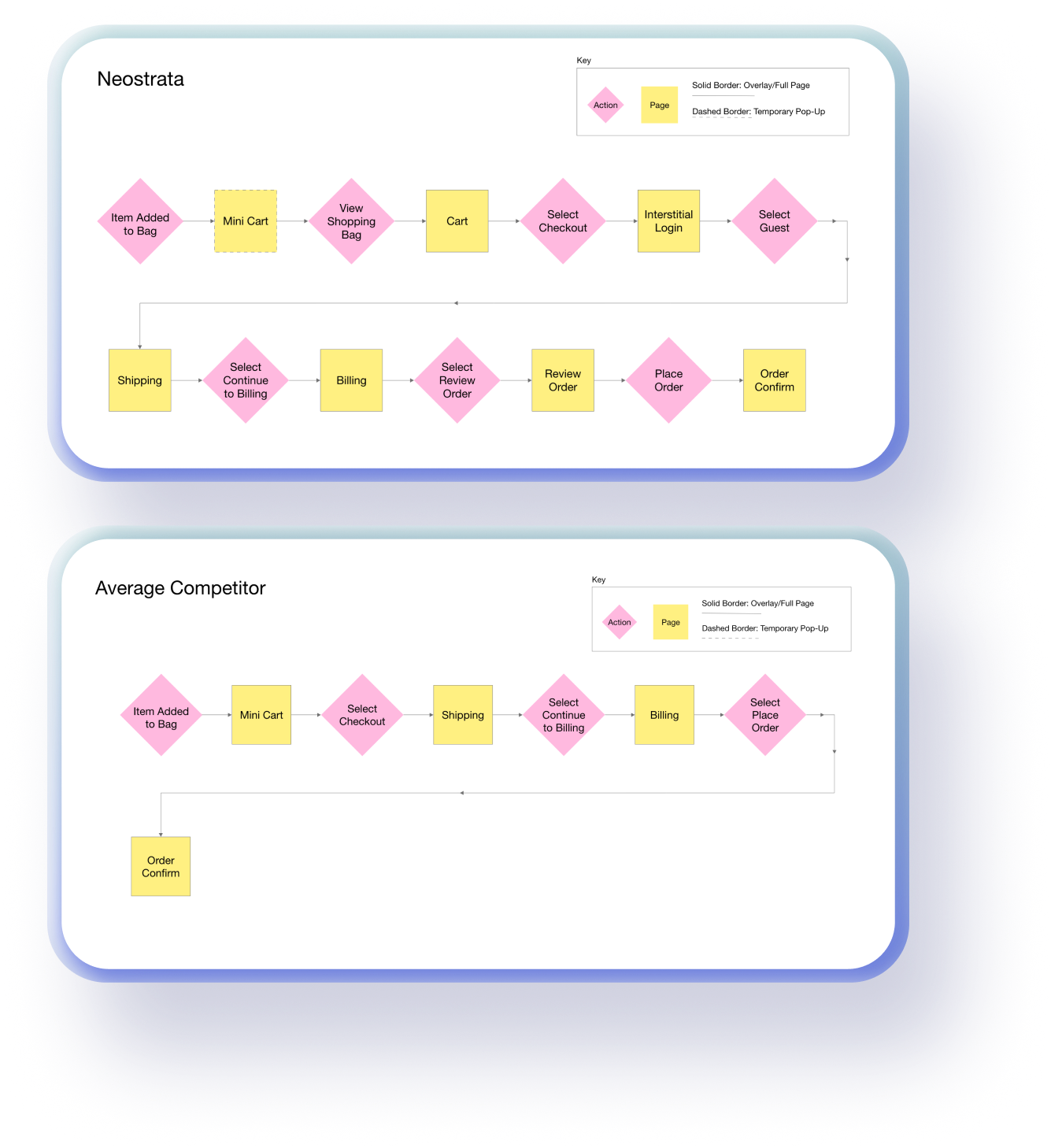
A flow chart was useful for competitor analysis and stakeholder buy-in.
I compared our checkout journey to competitors’ and found that majority of our competitors’ had flows that were shorter. Seeing the stark contrast helped align the team on why these changes were necessary--(I think I also won some trust points here).
Aligning with stakeholder preferences and the tight timeline, I shared and iterated on high-fidelity mockups.
There weren’t many iterations, but through close collaboration with stakeholders, product managers and engineers I did refine the designs, incorporating insights from a few discussions.
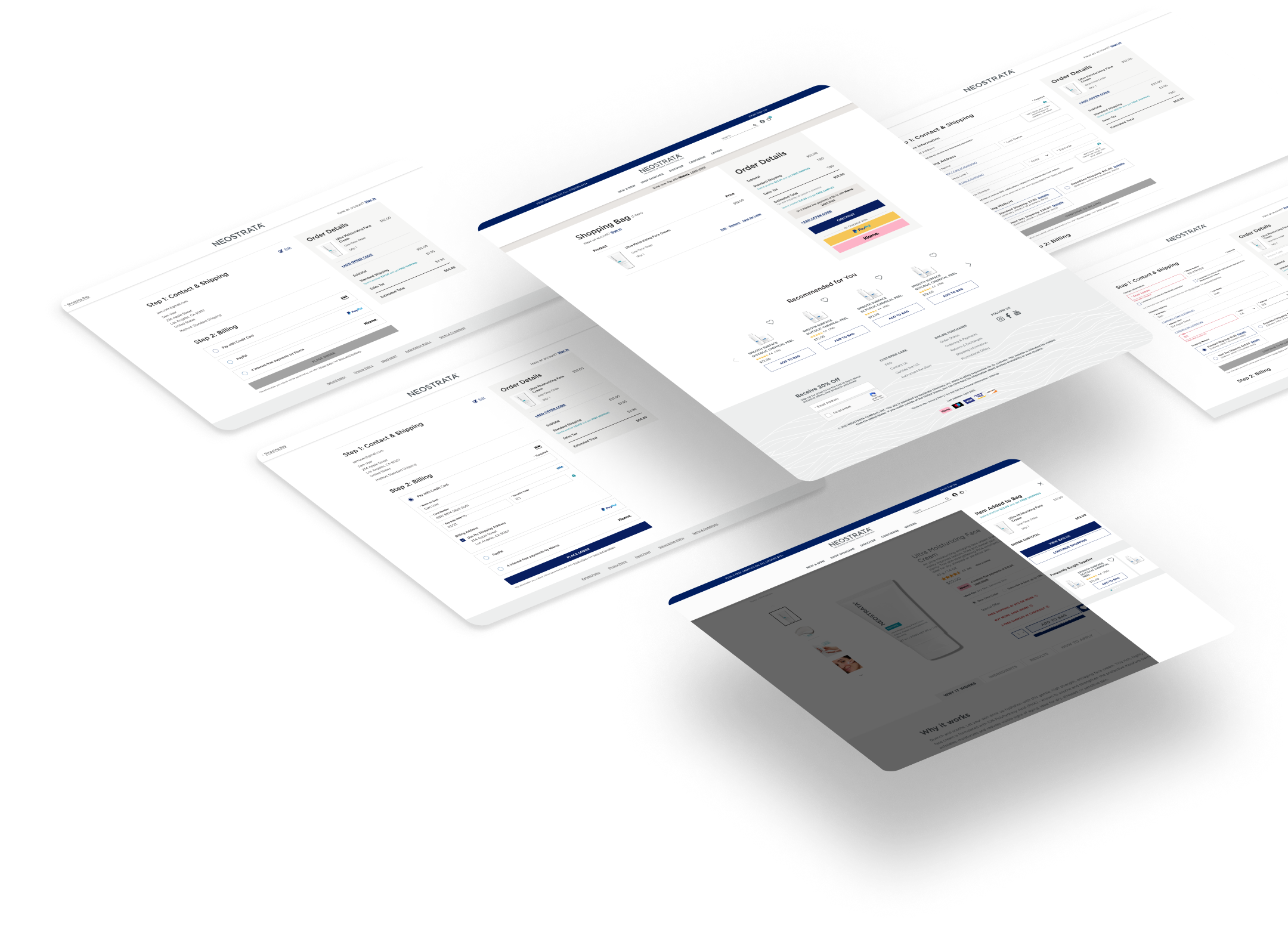
FINAL DESIGNS
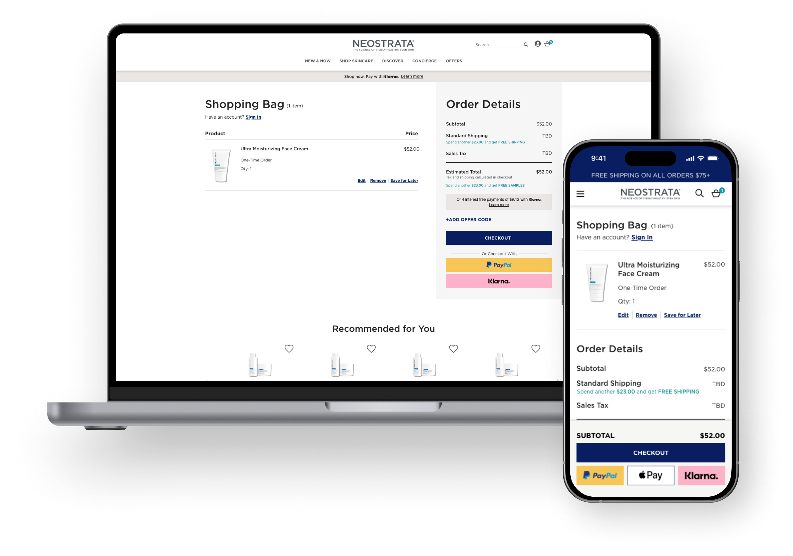
Improving price transparency.
Being unclear on the total cost was a common reason for cart abandonment. I moved the total cost above the fold and for mobile I designed a sticky module, this would keep the order summary and total cost visible at all times throughout the checkout process.
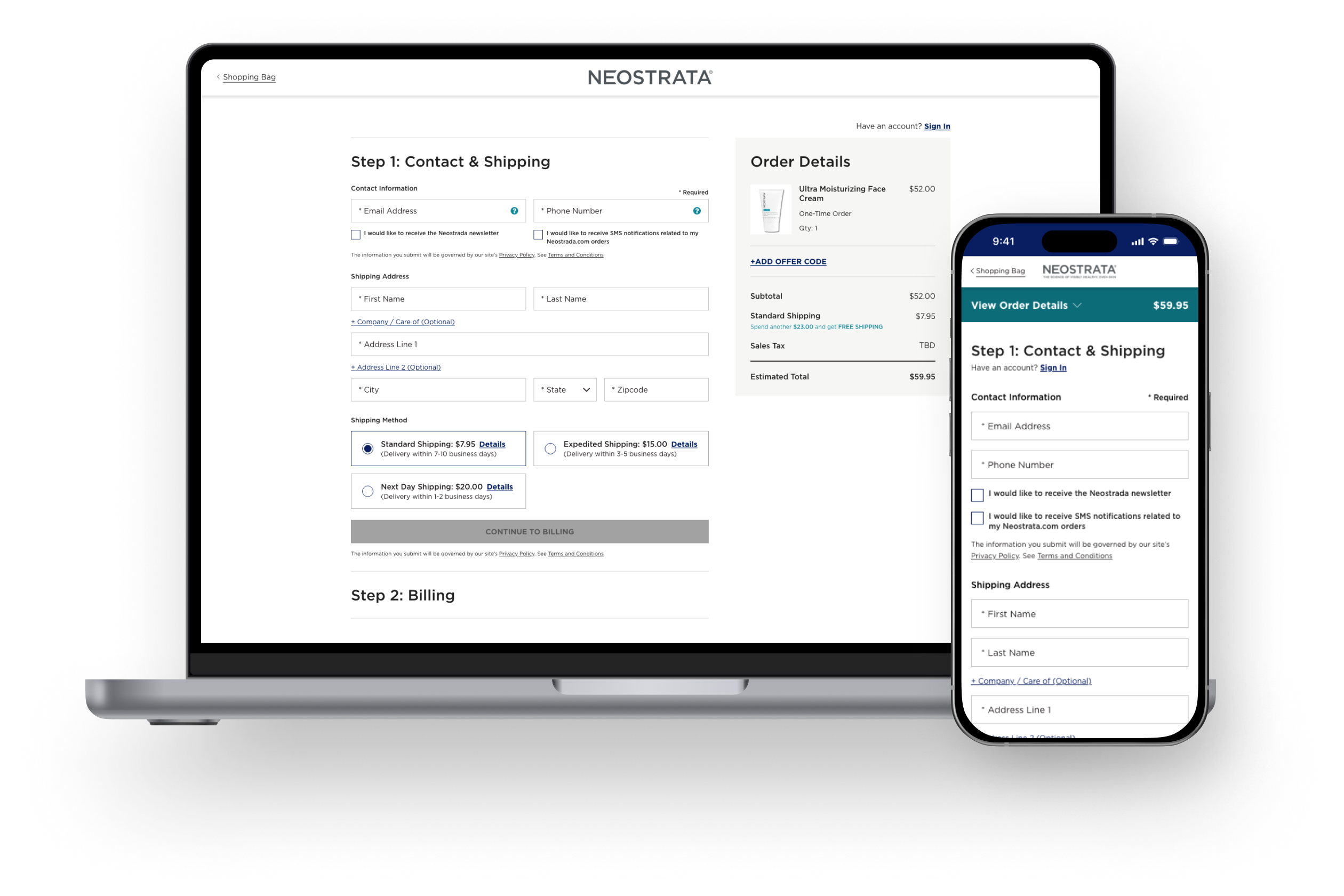
Simplifying the path to purchase.
Another common reason for cart abandonment was lengthy checkout flows. After clicking checkout, users encountered an interstitial screen prompting them to sign in or continue as a guest. I removed this step unless a subscription item was in the cart.
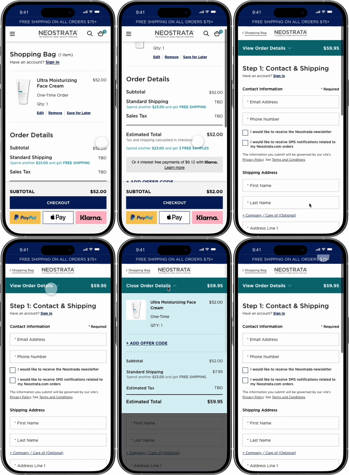
Reducing distraction and improve visual consistency and accessibility.
I removed redundant exit points by simplifying the footer and header.
I refined the billing section by making payment methods more visible and easier to select. Decided on full width CTAs to improve prominence and usability and standardized typographic hierarchy so information would be easier to process.
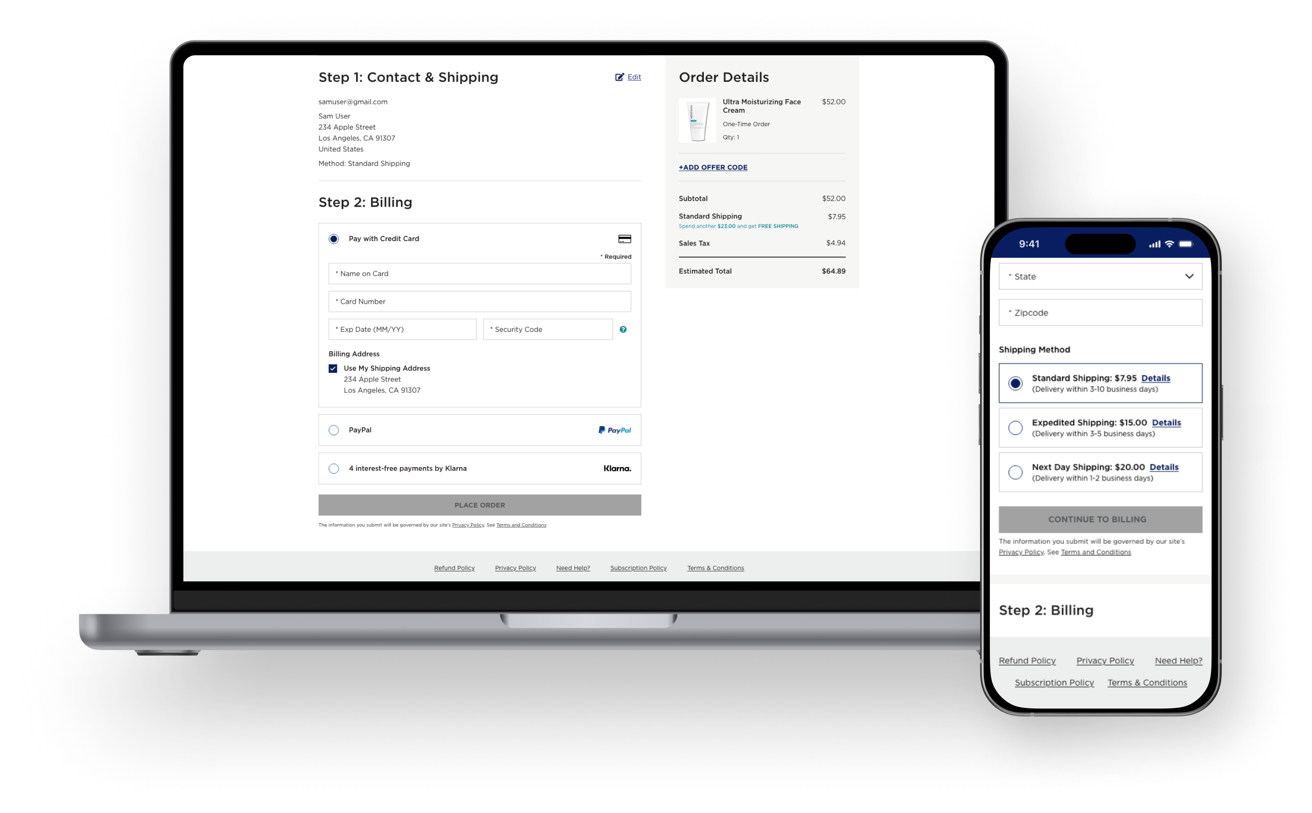
The new flow was launched in October of 2022 with positive results after the first month.
after 1 month.
👩🏻
Time Spent in Checkout
-17%
💼
Cart Abandonment Rate
-5%
A data observation lead to a quick iteration.
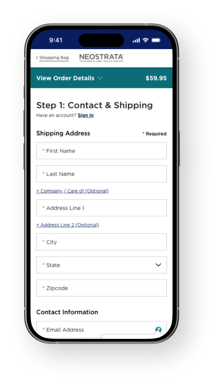
After the first month, there was an increase in drop-offs at the beginning of the flow. We did quick online research and found that users might be feeling wary of entering their contact information at the beginning, so we made a quick swap of the contact and shipping information sections.
after 1 year.
👩🏻
Average Time on Page
+67%
💼
Cart Abandonment Rate
-33%
✨
Conversion Rate
+20%
We eventually said Adieu to our impactful design.
The checkout redesign was a success, leading to its adoption across Neutrogena, Rogaine, and Exuviance.
However, in 2024, Kenvue migrated all DTC brands from Salesforce Marketing Cloud to Shopify, which uses a proprietary checkout system similar to the one we designed. As a result, this project was archived, but its impact shaped future eCommerce decisions.
PORTAL REFRESH
Modernizing the account portal.