Kaus
designing an ecommerce site for purchasing insurance policies online.
Kaus
designing an ecommerce site for purchasing insurance policies online.
Imagine this. You're checking out your bills, just the normal things until--'Wait, what is this? Have I always been paying this much for insurance? When was the last time I checked? This is way too high.'
Most of us have grumbled when hit with the realization that it was time to shop for a new insurance policy, but what exactly were we grumbling about? Just the fact that it was something we had to buy, or did we find the experience somewhat unpleasant?
Kaus, a large and reputable insurance company with over thirty years in the business, primarily did business using regional agents. With over 350 offerings, Kaus is able to provide quality insurance protection at a low price, however they had no online platform.
challenge.
challenge.
As the sole designer for this 8 week project, I knew I had a large task ahead of me. With an almost blank canvas to start from, my main priorities were the following:
- Design a responsive, mobile friendly website that was easy to buy an insurance policy on.
- Attract a younger market by modernizing the branding.
Kaus also had future plans to expand their business offerings online as well and I wanted to keep that in mind during this project.
let's begin.
let's begin.
I began with the following questions:
- How much does a typical user know about insurance?
- What are the typical pain points when buying a policy online?
Competitor Analysis & Interviews
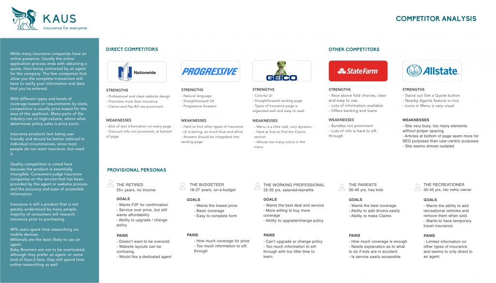
Not knowing a lot about the insurance industry and after a lot of general online research, I used competitor analysis in order to define some obvious strengths and weaknesses and provisional personas. I wanted to dive deeper, to see what else I could be missing, so I conducted a few interviews, both in-person and over the phone and discovered some interesting insights from their online shopping experiences.
Discoveries
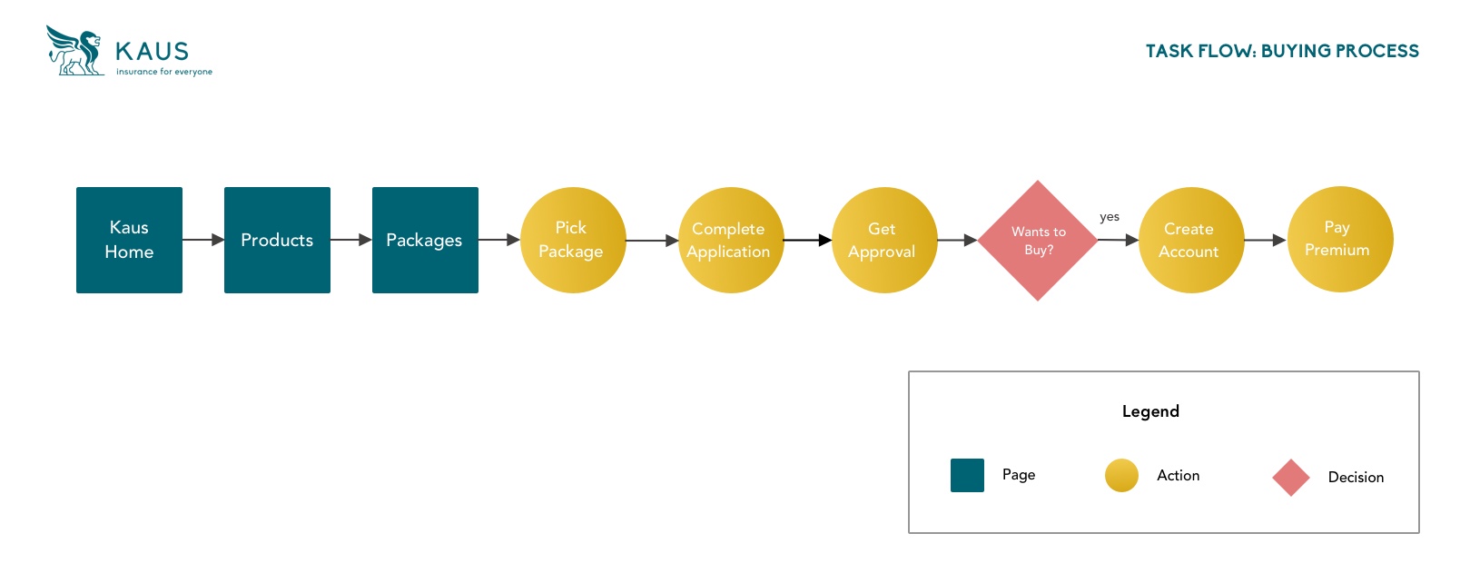
Users wanted a streamlined process where information had to be presented clearly. The interviews concluded with a resounding commonality that price was a motivating and deciding factor, and options like flexible payment plans and the ability to log into their own account was expected. All users expected to be able to shop not only online but using their mobile phones.
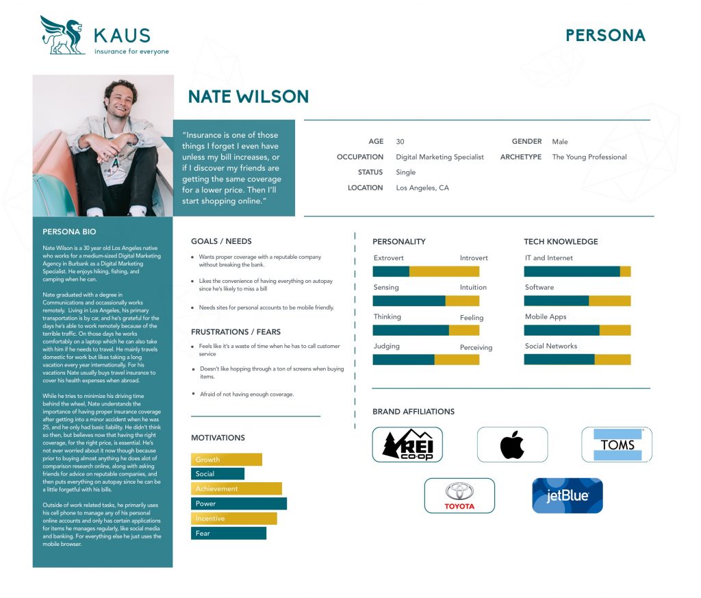
Going forward I kept these revelations in mind and developed my persona, Nate Wilson, and his storyboard.
data life.
data life.
Data gathered from the first set of interviews proved useful in defining what problems users were actually facing instead of what I saw through competitor analysis.
Card Sorting
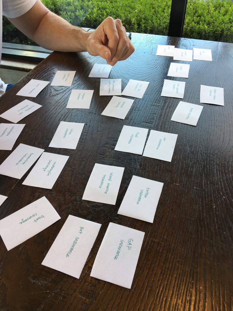
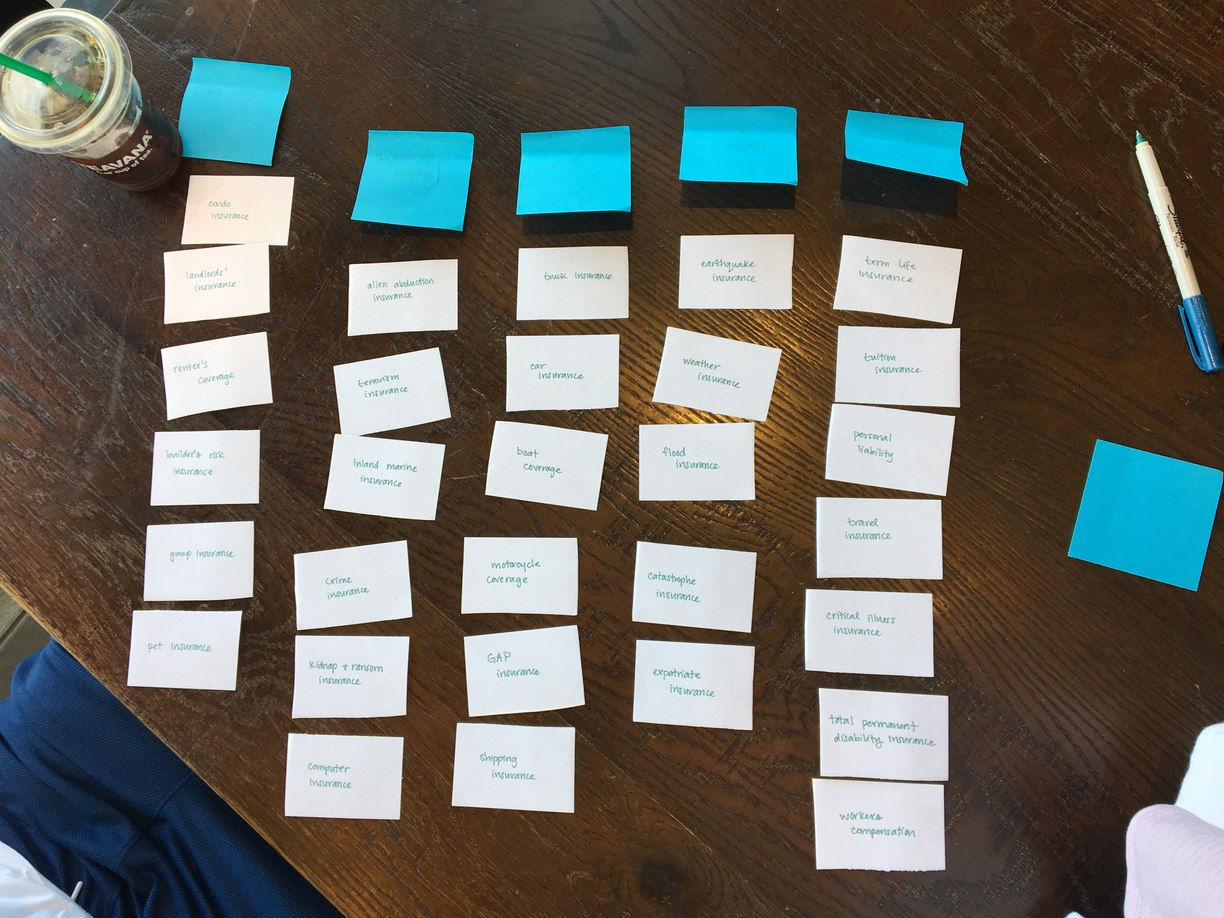
In the insurance industry there are countless types of coverage, and something users faced when shopping online was having to filter through those many options. In order to get a better understanding of how users categorized some insurance coverages, I conducted a few card sorting sessions.
More Discoveries
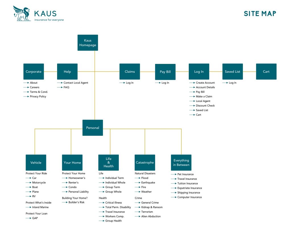
Interestingly enough, most of my participants categorized the insurance coverages based on how it would affect themselves, rather than the object. For example, all weather related coverages were generally put together, instead of under home coverage. I developed a site map based on my discoveries.
lo-fi frames.
lo-fi frames.
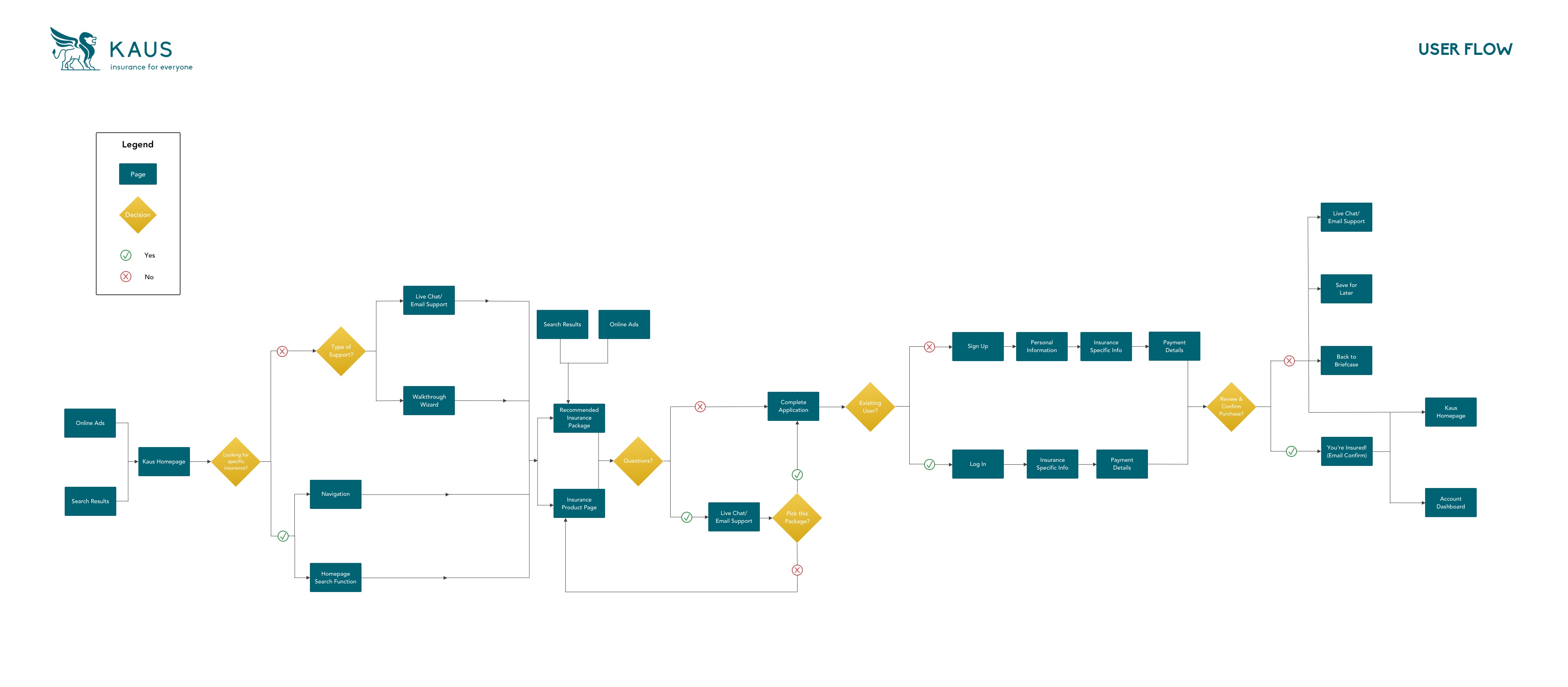
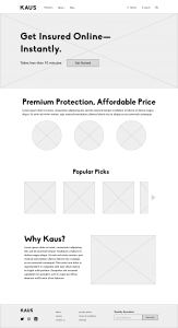
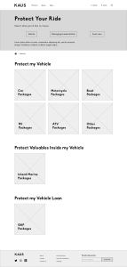
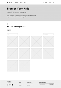
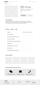
I started out with some sketches early on, and narrowed them down as I learned more about how users organized data. After a few do-overs I came up with some lo-fi wireframes, and threw them into a prototype to test the flows I had developed. This included a "wizard walkthrough" feature found at the top of the page, helping the user filter without actually having to click on a filter dropdown.
branding.
branding.
From my interviews it was clear that users expected some traditional feeling from a trustworthy company, security being a motivational feeling for who to choose when purchasing an insurance policy.
Color Palette
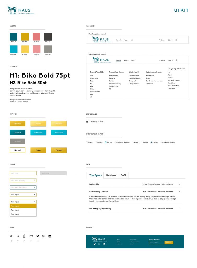
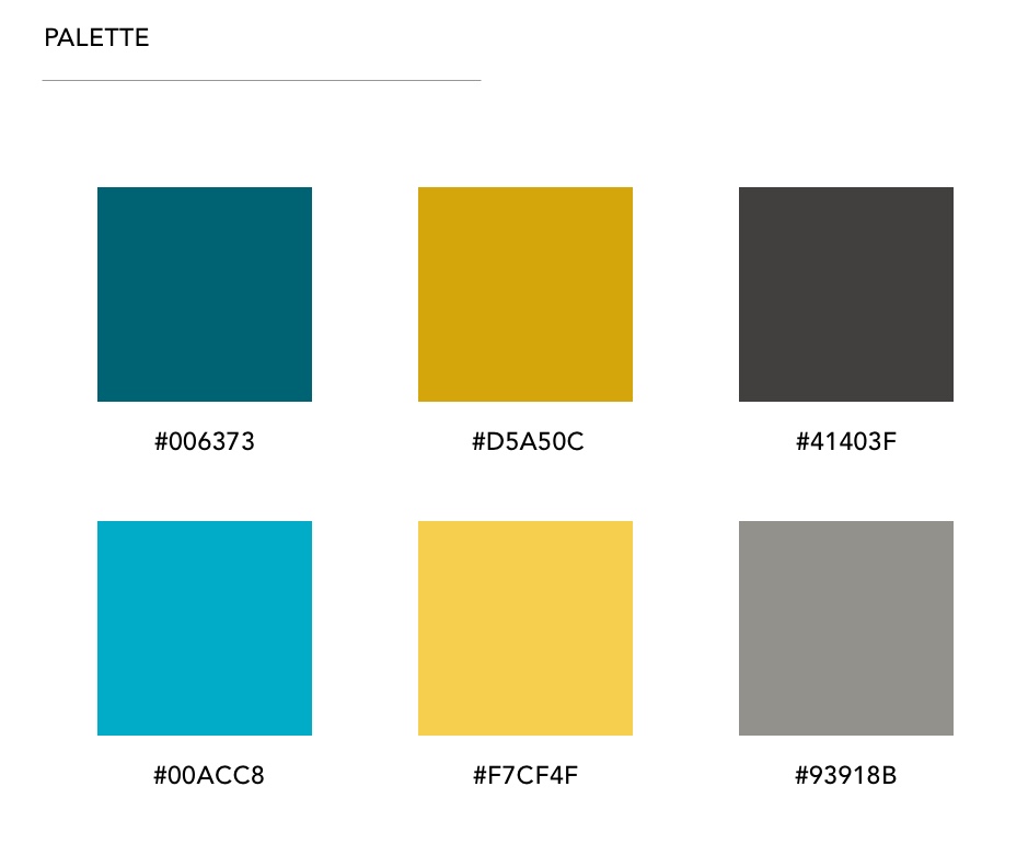
As a reputable company with over 30 years in the businesses, I wanted to bring a fresh sense to the feel of the brand without impeding on any feeling of security. This is why I chose the brand's base colors of teal and gold.
Logo
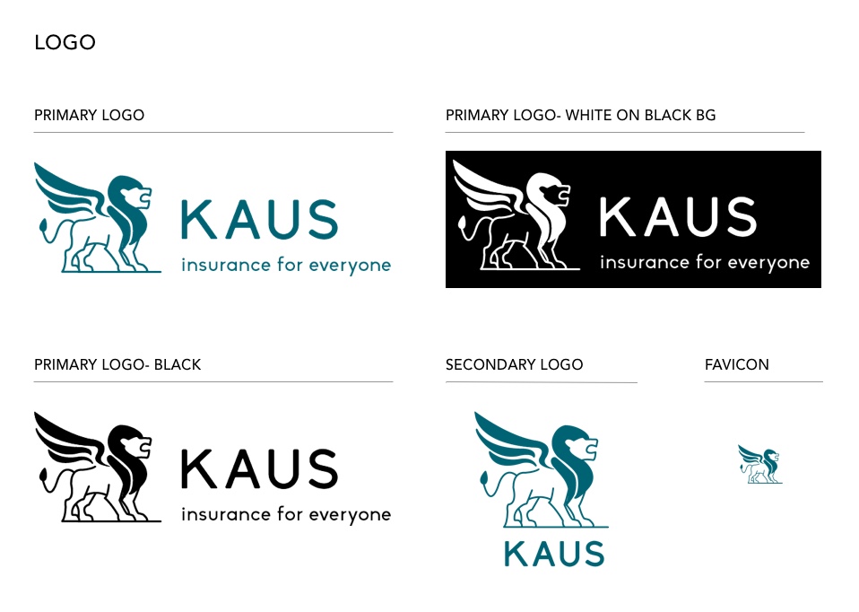
Keeping the security idea in mind, and after many iterations, I chose a winged lion as their logo icon to establish that sense of security upon first glance, and updated their slogan to 'insurance for everyone', to give the brand a friendlier message.
Typography, etc.
I chose Biko for the headings to convey a sense of bold playfulness, matching the branding of the winged lion and friendly slogan. For the body I wanted a clean and crisp text that was easy to read but still modern, and so I went with Avenir. The icons I overall kept fairly simple, having them filled in to match the bold headings.
To bring everything together in one document, I created a UI Kit. Illustrating the design patterns that I intended to include and CTA button styles.
hi-fi frames.
hi-fi frames.
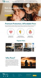
After a quick test of a prototype using the lo-fi wireframes, there were no major hiccups that made me iterate the design again. So I proceeded to apply the branding, to bring it hi-fi!
Can I get a Hi-Five?
Applying the colors, images, basically the visual design piece of any project was by far my favorite part of the whole process. I love watching my black and white frames come to life with color, to me it feels like I'm breathing that first sense of emotion into my project. It's such a warm feeling, particularly when it works out well, which it definitely did in this case.
testing.
testing.
After creating some high fidelity wireframes, I used InVision to build out a prototype so it could be tested.
What I wanted to answer:
- Is the overall design is easy to navigate?
- Is the checkout process straightforward and efficient?
- Did I miss any pain points?
In order to figure out the answers to my questions, I wanted my participants to complete two simple tasks:
- User must find a specific product.
- User must add product to cart and checkout.
To check out my prototype:
Discoveries
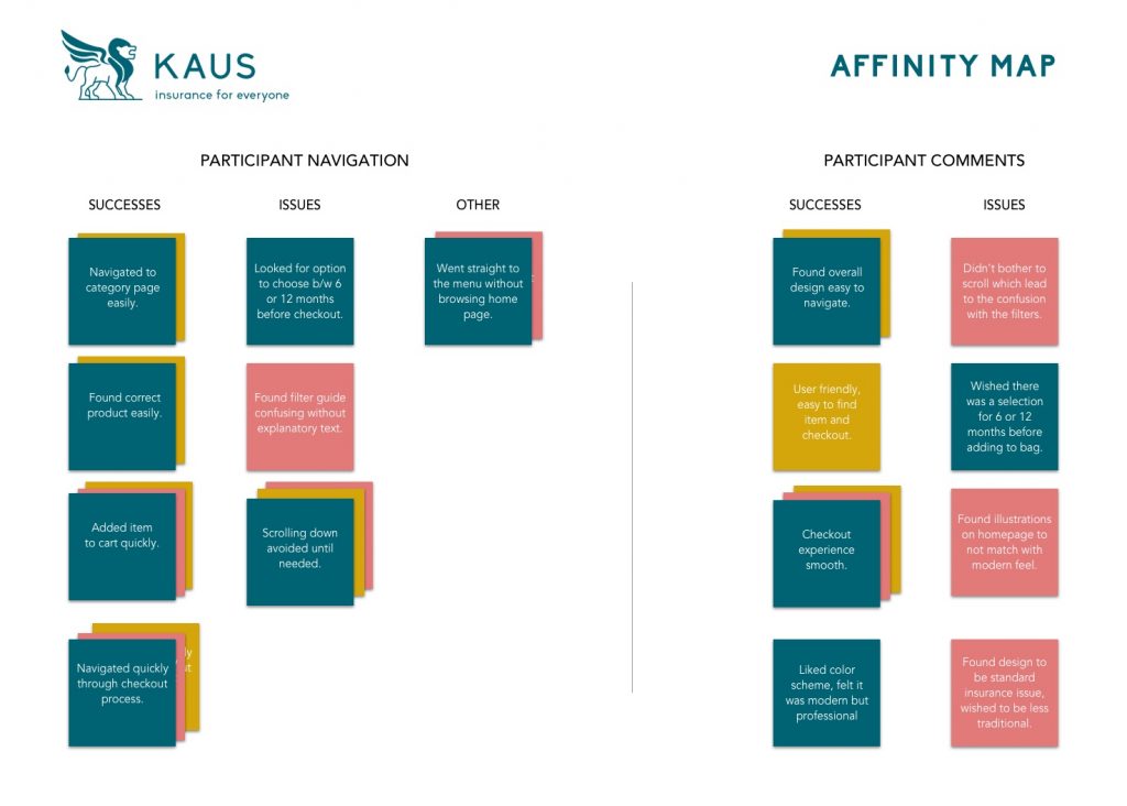
Overall the testing went well with a 100% completion rate and 66% error-free rate. Using an affinity map I was able to summarize the following.
PROS
- Design easy to navigate
- Checkout experience fast
- Design is nice and clean
CONS
- Wizard filter option needs some clarity
- Confused about when they could select length of policy
- Nobody scrolled
looking ahead.
looking ahead.
At the finale of 8 weeks, there was much learned and much accomplished. After getting the results from the prototype testing, I made the following revisions:
- Add text to clarify wizard filter
- Add option for policy length of time before checkout
Looking ahead I would want to make some additional updates like:
- Wizard walkthrough pop up option
- Mobile version with thumbprint login
Overall, the project was successful and the deliverables were ready for handoff.

