
Harbor Freight Tools: Self-Service Portal
case study.
Harbor Freight Tools: Self-Service Portal
case study.
Self-service portal redesign for Harbor Freight Tools eCommerce website.
in a nutshell.
in a nutshell.
In collaboration with the Senior UI Designer, I revamped the visual style to be more up to date with the current branding guidelines, as well as solved key usability issues and flows to improve sign up rates. After launch, there were hundreds of users signing up for a new account.
the client.
the client.
Harbor Freight Tools is a privately held retail giant that provides discount tools and equipment. Headquartered in Calabasas, California, the company operates over 1,100 retail stores in 48 states and maintains a mail-order and e-commerce business.
the challenge.
the challenge.
Harbor Freight Tools had recently undergone a massive redesign on their retail website. Their user account portal, known as "My Account", needed to match the new website so customers would be encouraged to create their own account.
This project spanned over a total of 4 months, off and on. As the lead UI Designer of this project, my initial goals were to:
- Create a new user account experience while staying consistent with the revamped website.
- Introduce any new experiences that would encourage user participation with their account.
my role.
my role.
I led redesign of the self-service or user account portal in collaboration with the Sr. UI Designer. I also collaborated with our development team and product management team.
research.
research.
My research started with the existing user account portal, I studied the features that had already been developed and worked with the Product Manager and Lead Developer to determine what new features could be added during this project.
Existing Implementations:
- Dashboard
- My Orders
- Address Book
- My List
- ITC Login
- Account Settings/Information
Desired Implementations:
- Wallet/Saved Payments - Where users can store credit cards or gift cards for future purchases.
- Log Out Button
After collaborating with the Product Manager and Lead Developer, I had some clear goals.
- Redesign the My Account UI in accordance with the updated style guide.
- Incorporate a Saved Payments page and Log Out button.
- Leave the Dashboard in the past, set up My Orders as the default page.
old dashboard.

the design.
the design.
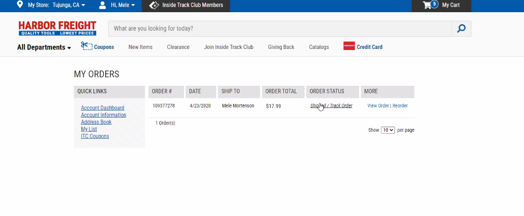
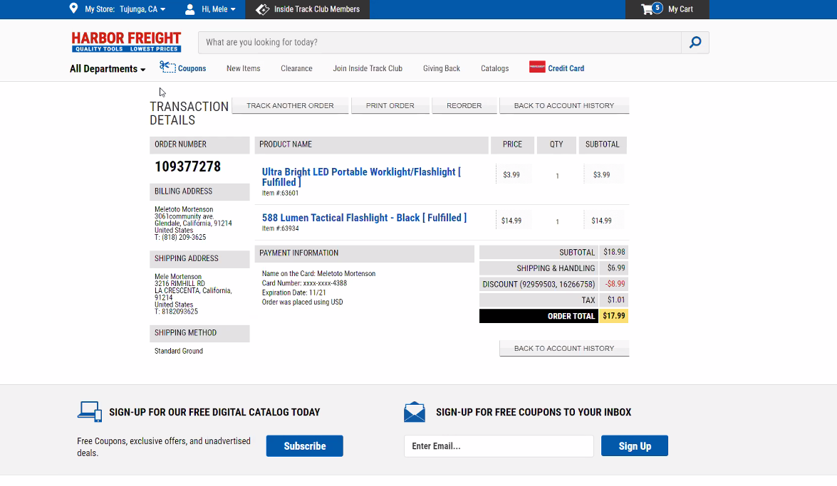
my orders & order details pages.
My Orders Page Updates:
- Added a way for customers to reach Customer Service easily.
- Designed orders to function as "cards", which made it easier for Development to code on our Bootstrap platform.
- Displayed products on cards so customers can visually see what they ordered.
- Cards were also easier to collapse into smaller responsive sizes.
- Organized cards by date.
- Added pronounced "Track Order" CTA, with "more" ellipses menu that will take a user to the Order Details page or be able to Order Again.
- If no orders have been placed, a message with CTA to encourage order placement is shown.
Order Details Page Updates:
- Individual items displayed with product image, quantity and price.
- Order Details page also displays Order Again and Print Order options with Payment, Shipping and Order Details.


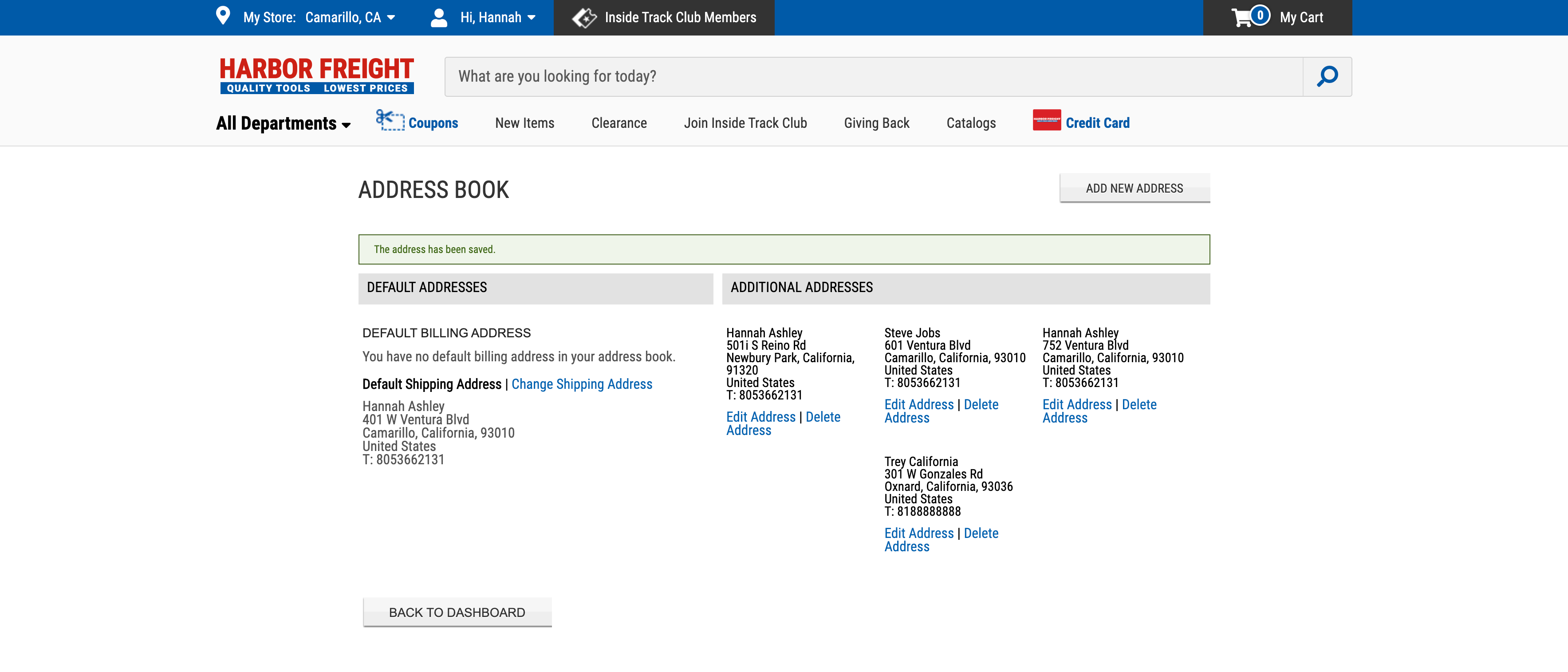
address book.
Updates:
- Incorporated the "mobile in mind" card design.
- On Default cards, Edit and Delete options are shown in More (ellipses) menu.
- On Non-Default cards, options to make the address a default shipping or billing address are shown.

payments.
Updates:
- Displayed credit card logos and last four digits of credit card number for visual cue.
- On Default cards, Edit and Delete options are presented in more menu.
- On Non-Default cards, option to select new default is presented.

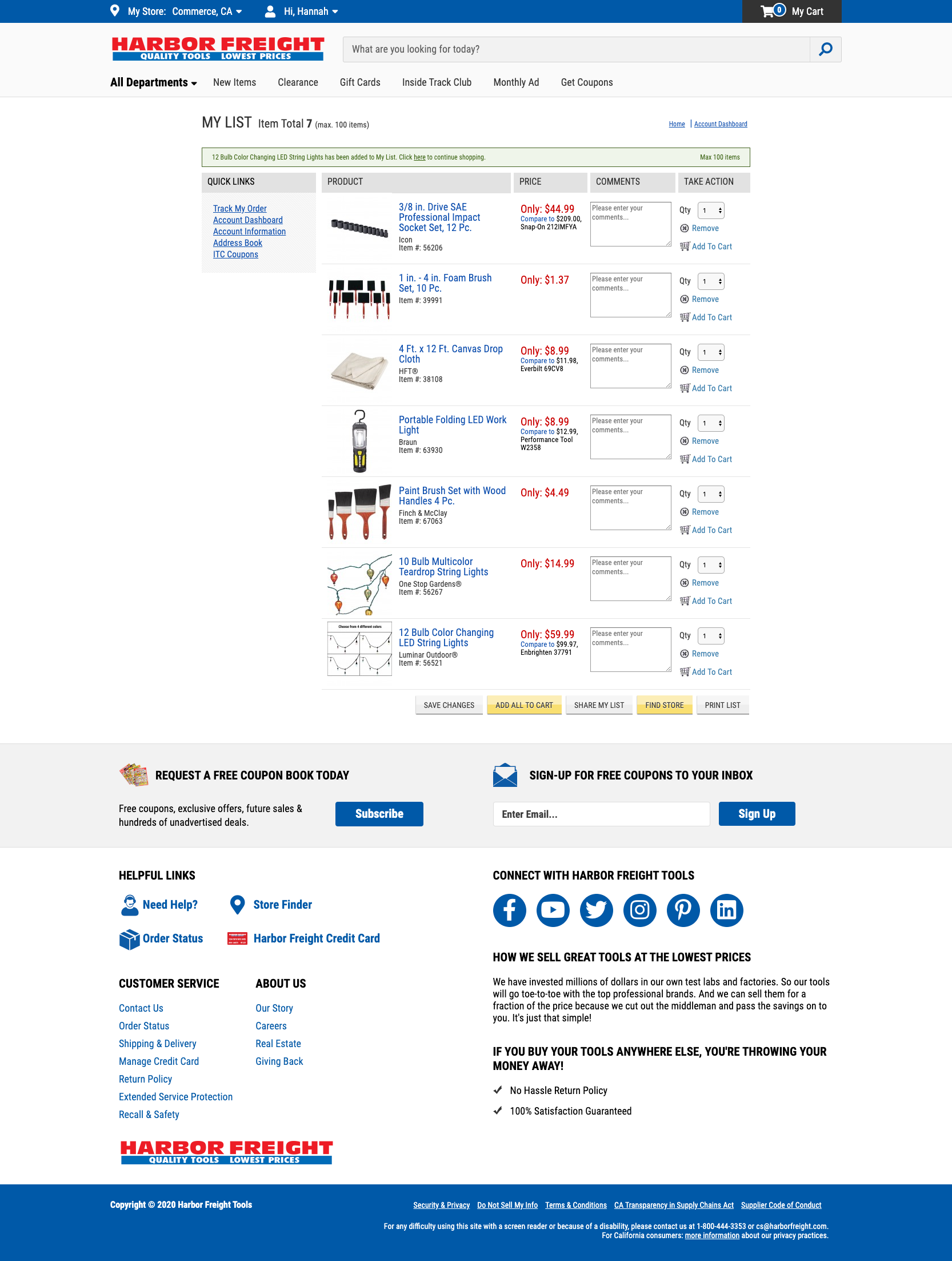
my list.
Updates:
- Applied similar card styling, improving legibility.
- Added functionality of seeing product status.
- "Add Comment" changed to link, text field appears after link is clicked. This feature was not used as much so it was minimized in importance.

results.
results.
After a few months, a report from our analytics team proved that overall the updates were a success. Account sign ups were constantly increasing.
live.
live.
View the live experience on harborfreight.com.
conclusion.
conclusion.
This project was a huge learning experience. Leading one of my first large-scale professional design projects, something I had not considered before was that not all projects or companies will have a budget for proper UX/UI processes like defining user personas, wireframing, or testing.
Although I found this lack of data to be frustrating, I learned that with limited resources, I could still be savvy enough to design an experience that brought the My Account portal up to par with the rest of the site.
Through the many hurdles and reviews, I was able to handoff my design to development, and am hoping that perhaps this will be the first step to creating an environment where the user/customer is championed above executive desire.