Full Hearts
end-to-end design of a volunteer listings mobile app
Full Hearts
end-to-end design of a volunteer listings mobile app
Whether they volunteer through work, school, or on their own, more and more people are interested in volunteering their time to help their local community. Full Hearts is a mobile app designed to help connect volunteers with specific opportunities that they find meaningful.
challenge.
challenge.
The timeline of this project spanned over 4-5 weeks. My goals for this project were to:
- Design a user friendly app that would attract and keep users engaged.
- Organize data/listings in a fashion that would be easy to filter through.
- Create a social feature to form a sense of community within the volunteer community.
market research.
market research.
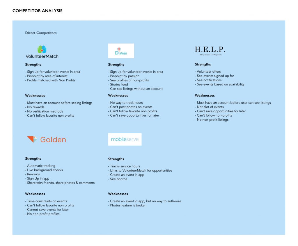
While there are quite a few volunteer website options and coinciding mobile applications, the robustness of features vary from application to application. Majority of the apps provide a listing of opportunities by working with bigger listing websites like VolunteerMatch, however, these apps are confined to the constraints of VolunteerMatch's event profile.
There are a few applications that offer a way to purely track the hours spent at an event. One application, Golden, offers an interesting feature: background checks. I could see how this was important for nonprofits, but it also made me ask the question: what about from the user's pov? How can the user tell if the nonprofit is legitimate?
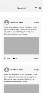
Something I wanted to integrate into Full Hearts that I did not see in any of the researched apps, was more information about the nonprofit. This could be expanded into favoriting nearby nonprofits in order for their news to populate a curated newsfeed in the app. Full Hearts would also have other robust features like photo upload and commenting, adding the event to calendar, map points, and sign ups.
goals.
goals.
With the market research complete, I had some goals that needed to be clarified further with interviews.
- What features are actually needed: will a social feature be used?
- What does the average volunteer look for in an opportunity?
- Why does one volunteer?
interviews.
interviews.
Within the week allotted for participant interviews, I created and sent a Google Survey and received several responses. I was also able to interview 5 participants both male and female. Participants' age ranged from 26-35 years old.
All participants commented that they volunteered their time for intrinsic reward. One person commenting that "a couple hours out of my day can be nothing to me, but can mean the world for someone else, and that's enough motivation for me to volunteer".
It was interesting to learn about various experiences that my participants had volunteering. Although all of them said that it was worth their time, some commented that they wish they could contribute their actual talents instead of doing something monotonous.
Most participants also stated that they would share photos between each other (if allowed) and wish there was more of a sense of community with the nonprofits that they worked with.
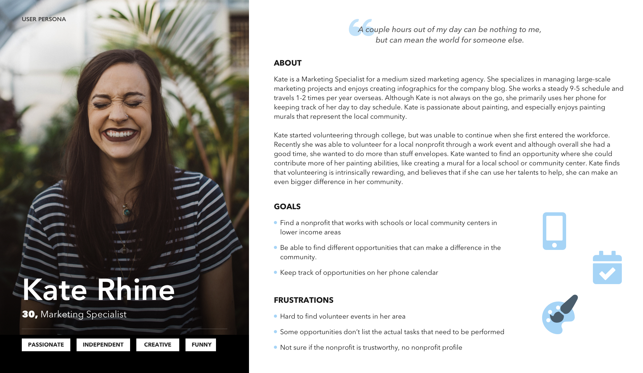
Putting everything together, I created Kate Rhine. Kate is a young professional who works a 9-5 schedule and is passionate about beautifying spaces in her local community by painting murals. She wants to find a nonprofit that works with schools or community centers because she feels she can make more of a difference if she can contribute more of her talents.
sign up flow.
sign up flow.
From my interviews I learned that a frustrating aspect of any onboarding process of a mobile app is one that forces the user to sign up for an account, before entering the main section of the app.
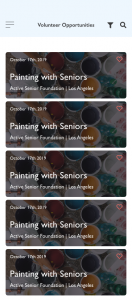
So I decided to use the onboarding process to enable the user to set up a couple filters, then established the account creation process later on when they found an opportunity they wanted to sign up for.
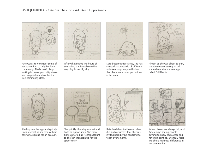
Although it would be ideal to have a user sign up for an account, it would be frustrating and unfortunate to have them go through an account creation process only to find out that there are no opportunities in their area.
wireframes.
wireframes.
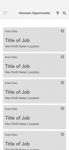
Following some pencil and paper sketches, I used Adobe XD to develop my wireframes. For this project I primarily focused on designing for the iPhone X. It was fun to navigate the longer screen lengths, and a great learning experience. After putting together a lo-fidelity prototype using InVision, I conducted a quick usability test to ensure there were no major structural changes that needed to be made, before moving on to the UI.
branding & ui kit.
branding & ui kit.
My marketing career has taught me to always tell a story that resounds with people and I kept this in mind as I was forming the storyline for Full Hearts. As I learned in my interviews, people volunteer for intrinsic reward, even if they don't see the direct results of what they're doing.
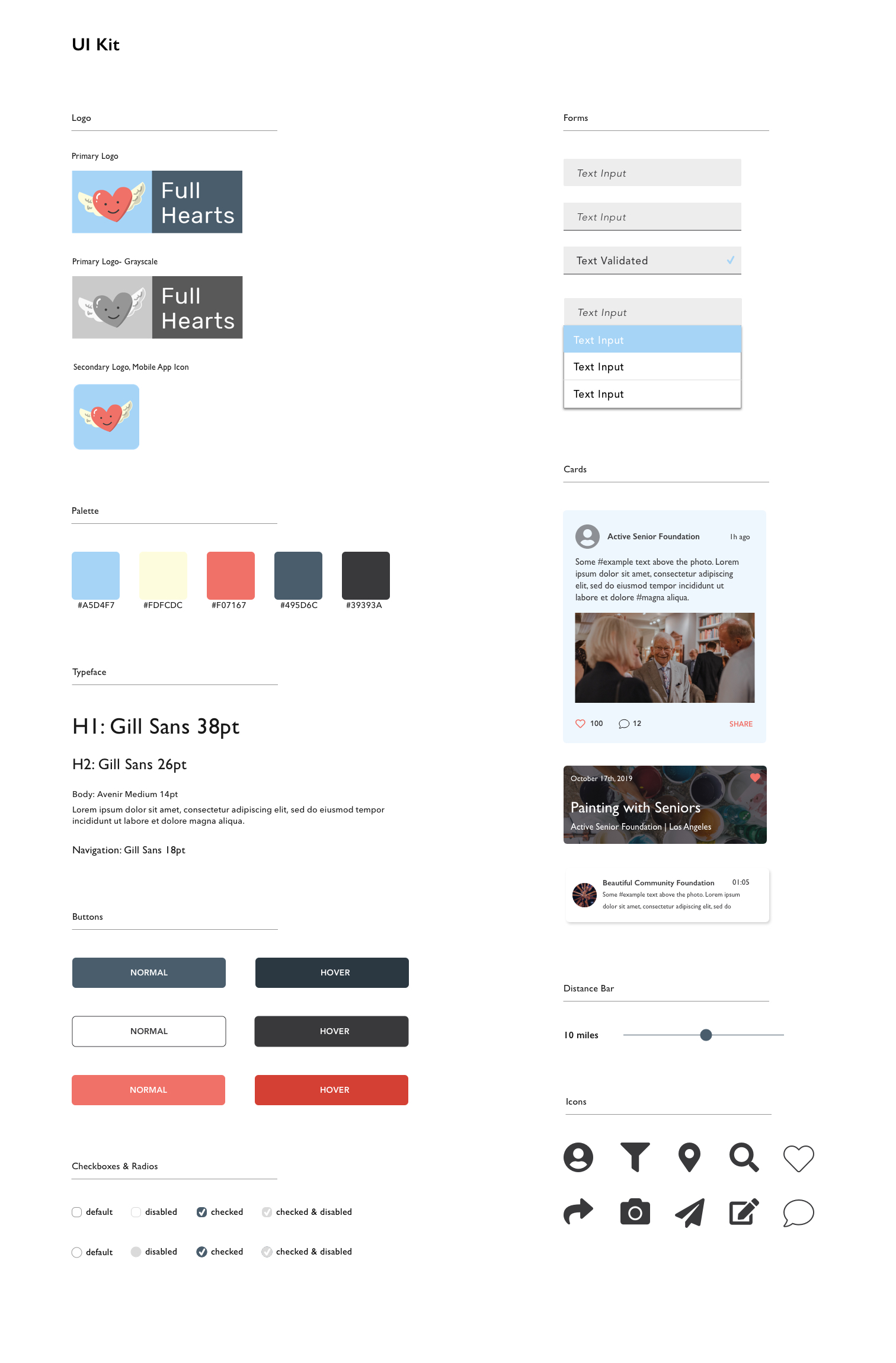
I decided to go with a friendly heart logo that had wings to signify a sense of enlightenment, or being uplifted. The colors came naturally as the logo took a life of its own. I started with a palette that was very bright, but with the logo the branding started to look more like it was oriented for kids. So I backed away from the brighter palette in the interest of keeping a sense of professionalism, but still be approachable, and was satisfied with the primary color results.
ui.
ui.
It took a few tries to integrate the red, blues and cream. I had to go through a couple iterations to figure out which colors would work best with the chosen logo. When I figured it out, it was awesome to see everything start to come together.
The blue brought about the sense of professionalism, but the red and cream kept the pages lively and engaging.
testing.
testing.
Using InVision to create my prototype I proceeded to start testing with the following questions in mind:
- How is the user flow?
- Can users complete their tasks without difficulty?
- How easily can a user sign up for an event?
In order to answers these questions, I tasked my participants with three tasks:
- Select 'Senior' as their volunteer interest during the onboarding process.
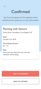
- Sign up for the first event that is filtered.
To check out my prototype:
Results
Testing went better than expected. I had 26 participants, with a 92.3% completion rate. 85% rated the design and ease of use a 7/10 or higher.
PROS
- Visual design makes it easy to flow through.
- Intuitive and easy to follow.
- Everything was easy to find.
CONS
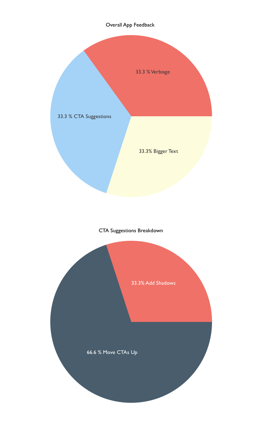
- CTA suggestions: add shadowing or move CTAs up.
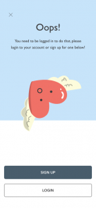
- Verbiage on 'Oops' page might be confusing.
- Would like bigger text.
For this project I used a pie chart to break apart the app issues that were found during testing. Overall, majority of these requests were personal preferences and suggestions.
finale.
finale.
Concluding the 5 week project, I successfully designed an application end-to-end, and learned how to manage my time efficiently.
My biggest hurdle with this project was learning how to bring an idea from abstract to almost tangible. I surprisingly had a lot of fun designing only for mobile. In my past works I would design for web and mobile, but the mobile seemed to be more of an extension of the web design.
This project put mobile first, and taught me how to see it from the perspective of a user who would not have any interaction with a full website.
In the future I would like to expand further on this app idea, as it has become an inspiring side project that I would love to see come to fruition.

