Portal Refresh
We updated the visual style to align with current branding and addressed key usability issues to improve account sign-up flows. Post-launch, the redesign resulted in hundreds of new user sign-ups.
UI Designer @ Harbor Freight Tools, Released January 2021
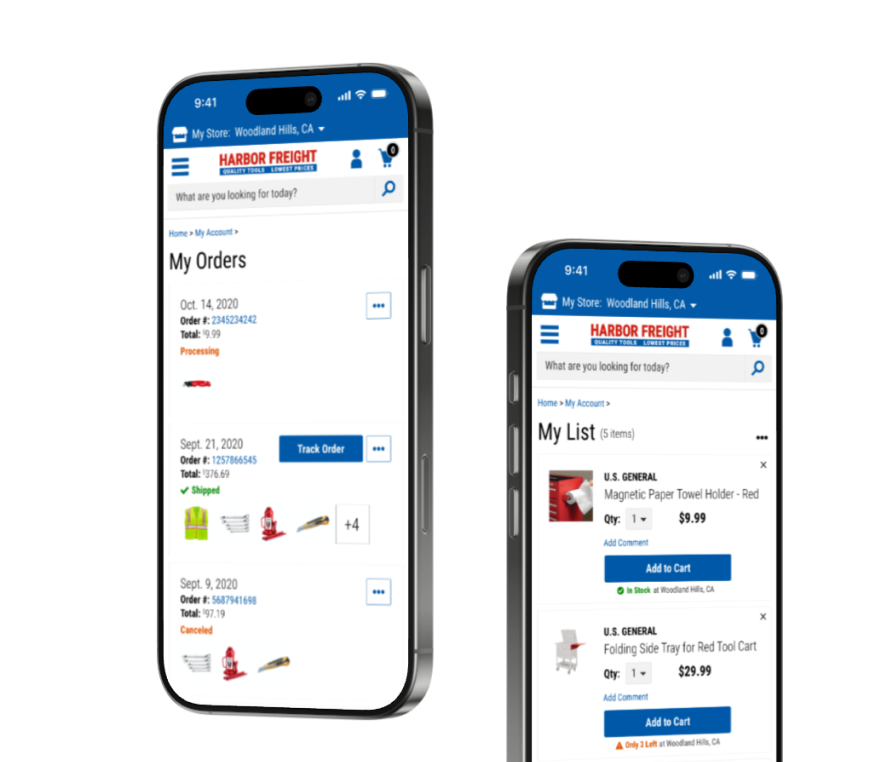
The customer portal was creating friction with its disjointed experience.
Harbor Freight Tools redesigned its retail site, but the "My Account" portal remained misaligned with the redesign, creating an inconsistent experience for users. Without a seamless portal, users barely engaged with the self-service portal which lead to more reliance on the customer support services.
As UI Designer, I collaborated with the Sr. UI Designer on this project.
Also a big thank you to our Product Manager and Lead Developer for helping define scope and bring the designs to life.
The goal was to modernize the customer portal to be seamless with the existing site.
👩🏻 User Goal
Be able to easily use the account portal for self-service items.
🎯 KPI
Time spent managing account.
💼 Business Goal
Increase account sign-ups.
🎯 KPI
Number of account sign-ups.
✨ Impact
A modernized customer account experience improves usability, builds trust and drives customer loyalty.
We primarily used competitor analysis to determine most probable pain points.
I conducted a visual audit and documented inconsistent font weights and styles which created a weak typographic hierarchy. This would make it harder for users to scan and prioritize information.
Since we did not have access to data analytics tools, we utilized a visual audit and competitive analysis to determine probably friction points.
The portal was not mobile friendly.
The pages were not responsive, making UI elements look broken and making it hard to navigate.
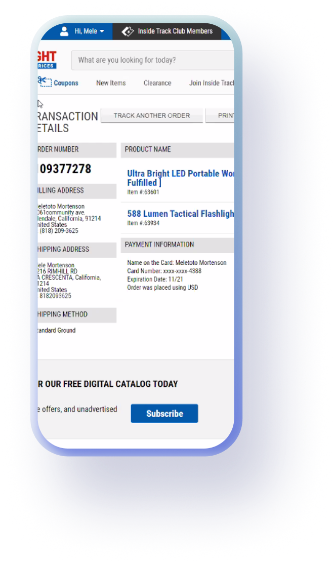
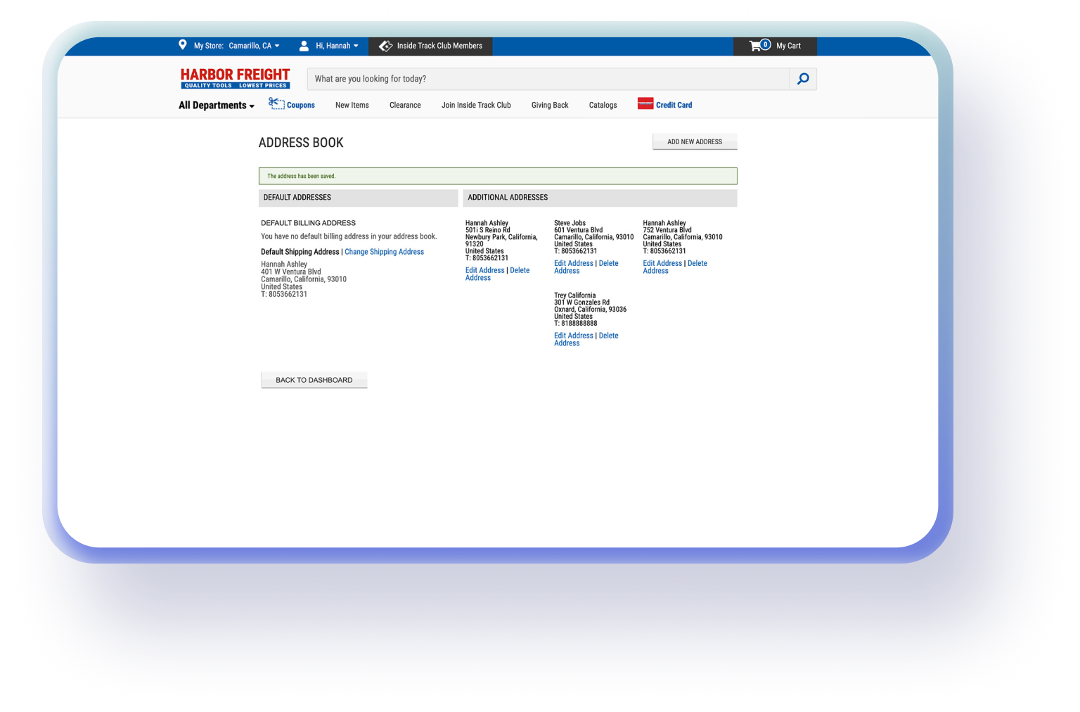
Users could save addresses but not their preferred payments for future use.
Users manually entering payment details for every purchase could have been adding friction and frustration to the checkout process. This could have been leading to a loss in conversions, with users potentially abandoning purchases due to the extra effort.
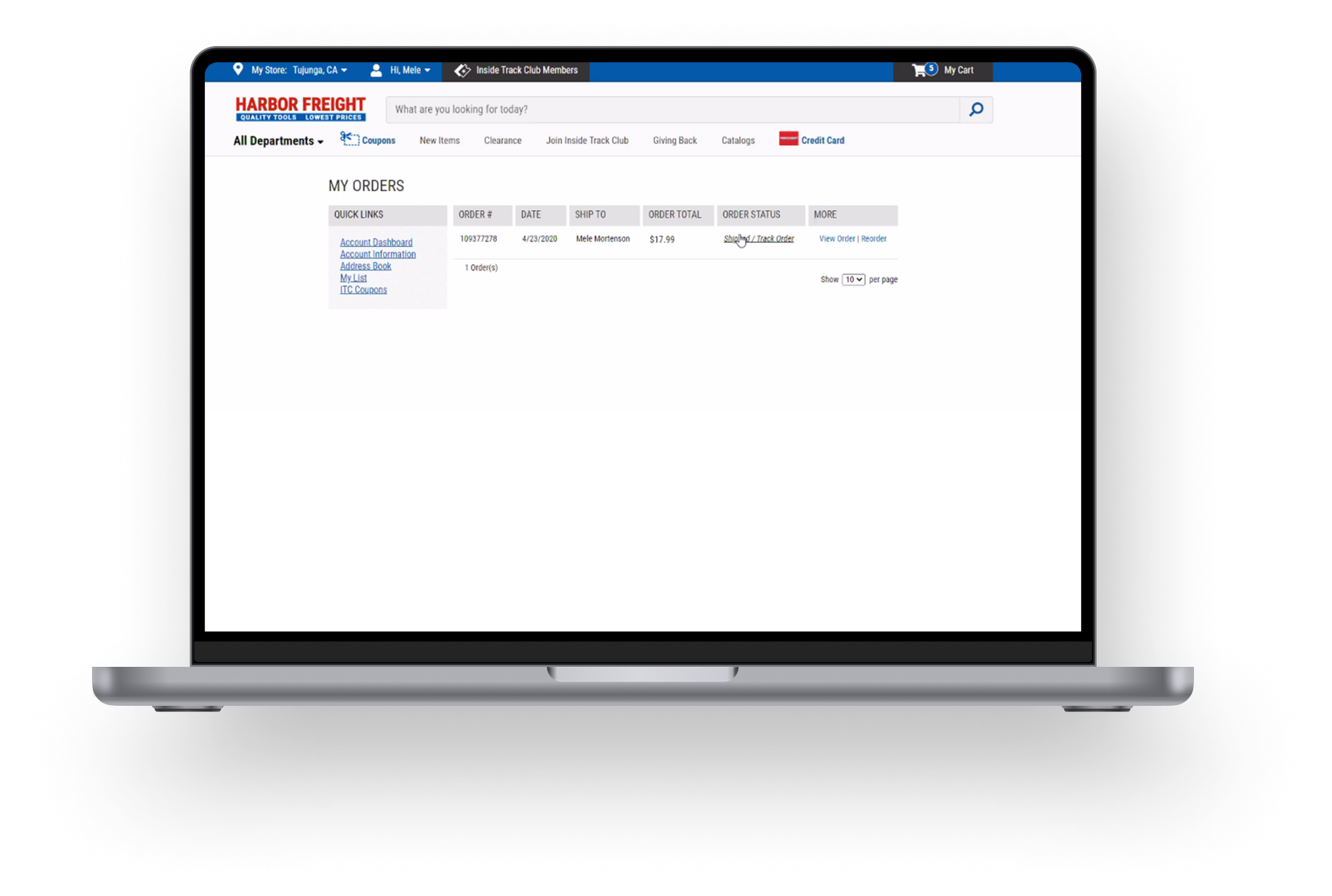
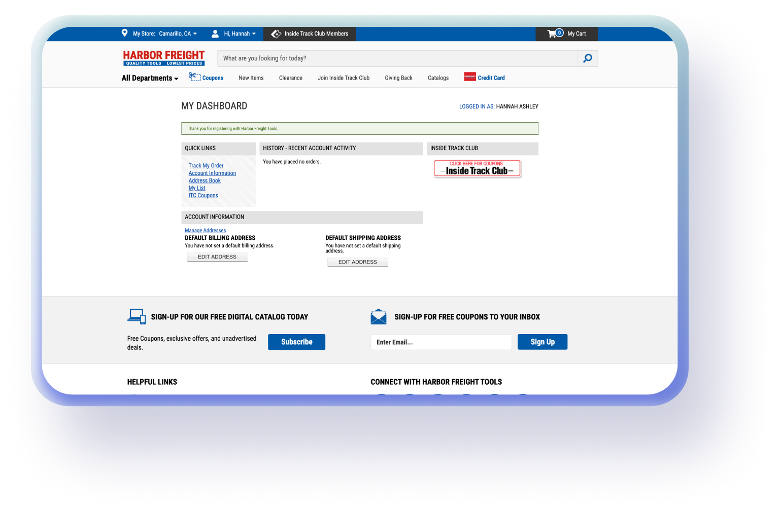
Unnecessary dashboard page delayed access to orders.
Users logging in to check their orders were first directed to a dashboard page, adding an extra step before reaching the needed information. We determine this could be removed if we ensured a intuitive navigation to other portions of the account.
Aligning with business preferences, I shared and iterated on high-fidelity mockups.
Through close collaboration with the Sr. UI Designer, I iterated several times to make sure the designs were pixel perfect.
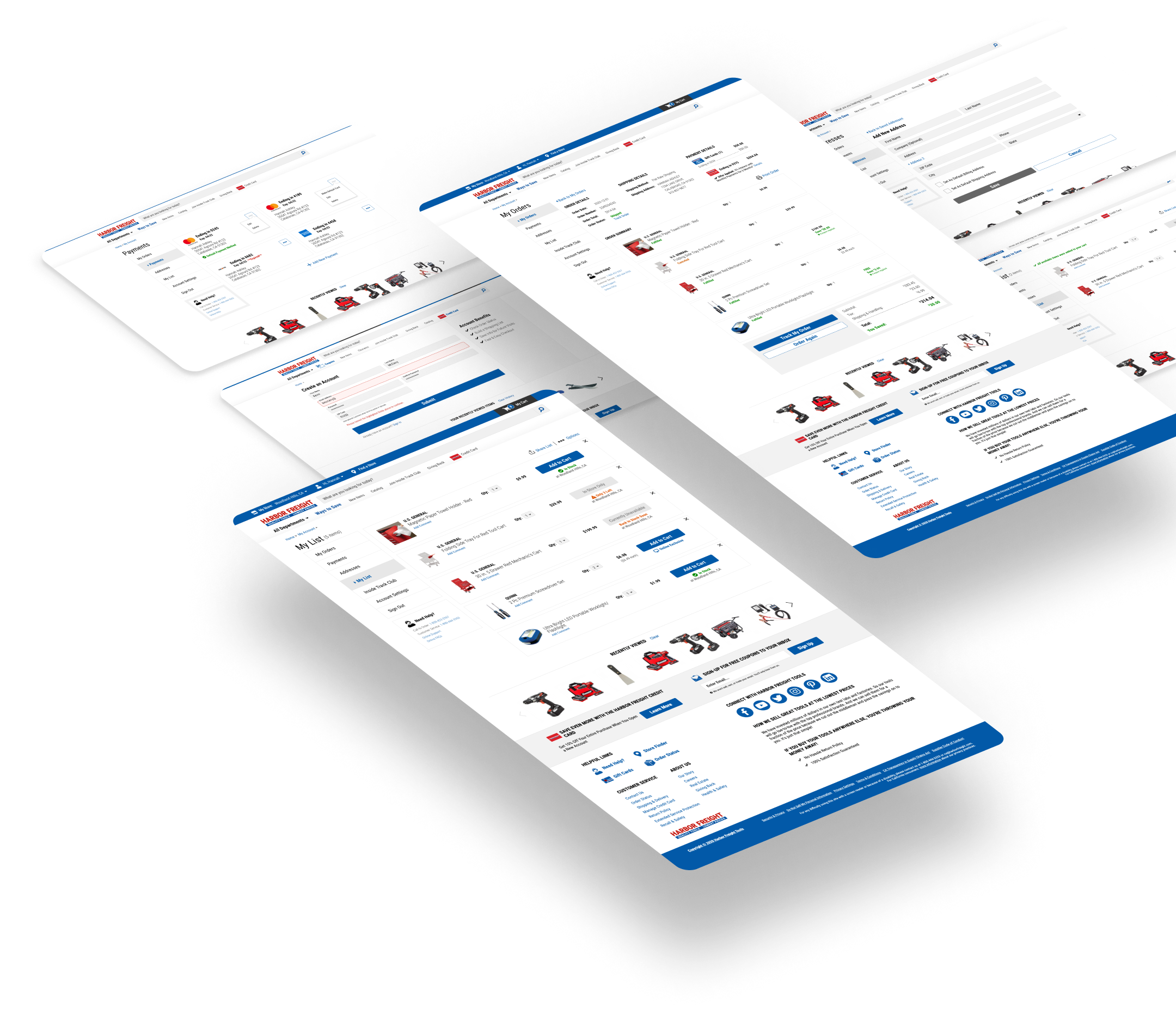
FINAL DESIGNS
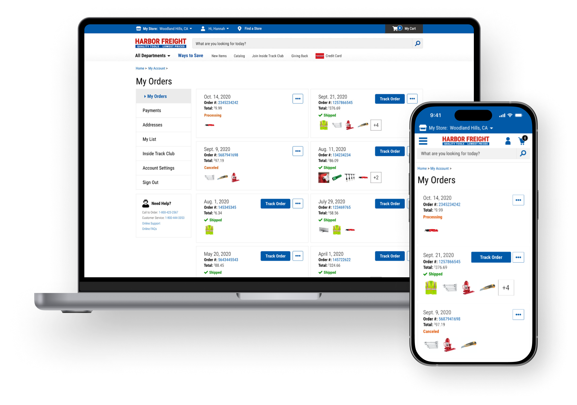
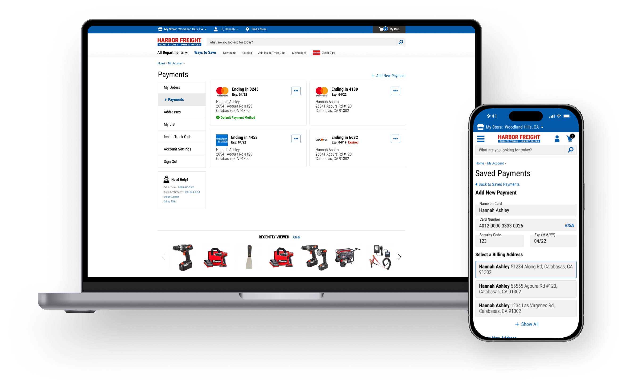
Making it mobile friendly and updating the UI.
Users could now conveniently access their account on their mobile or tablet devices, checking on their order statuses on the go.
To ensure users felt like they had not left the site, we updated the UI to be consistent with the redesigned site.
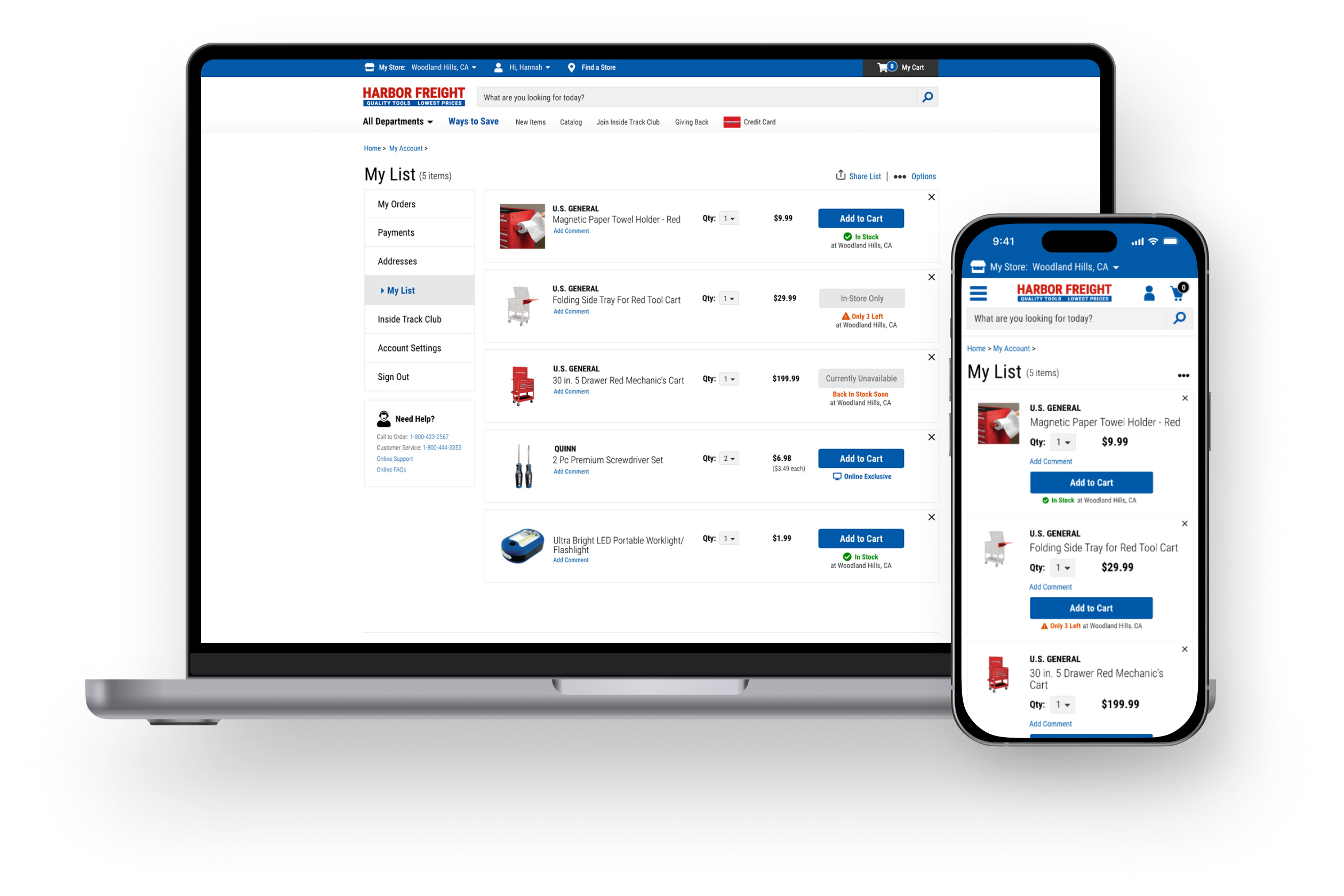
Simplifying the path to needed information.
We directed users to the Order page upon logging into the account and got rid of the Dashboard page. We also made sure that navigating through the account pages was intuitive.
Providing the option for a more friction-free purchase experience.
We added the ability to save payment methods so a customer could purchase easily again in the future. These options to save preferences were also made available during the checkout journey.
The portal was launched in January of 2021 and was an invaluable learning experience.
As one of my first large-scale professional design initiatives, this project taught me that being adaptable and finding creative solutions when ideal UX/UI processes --such as defining user personas, analyzing data, wireframing or testing--weren’t feasible due to business constraints. While the lack of data was frustrating, it pushed me to rely on resourcefulness and collaboration with my teammates who were facing the same constraints.
Despite the challenges, I found that this project helped served as a stepping stone toward encouraging an environment where user needs and customer experience are prioritized, paving the way for more user-centered design practices.
ABOUT
Interesting in working together?