Neostrata is a derm-backed skincare brand. I redesigned their cart and checkout experience, reducing checkout abandonment by 49% and nearly doubling completion rates. The design was scaled across 4 brands.
Role
Lead UX/UI Designer


Results
Tracked with Google Analytics


The problem
Checkout abandonment was costing revenue
When I joined the project in August 2022, Neostrata's checkout abandonment rate was 65%, meaning 2 out of 3 users who added items to their cart never completed purchase. The shopping bag and checkout flow hadn't evolved with e-commerce best practices, and the experience had friction at every stage.
Two designers had already worked on this project without satisfying stakeholders. I had a tight timeline, 2 weeks for research and design, then development through November launch. I needed to focus on high-impact changes that would move the needle on abandonment.
Cart issues:
- Total price wasn't visible on mobile without scrolling
- Express payment options (Apple Pay, PayPal) weren't prominent
- UI didn't match current branding, feeling disconnected from the site
- No item counter to show bag contents at a glance
Checkout flow issues:
- Interstitial sign-in screen interrupted flow, even for guest purchases that didn't require accounts
- 3-step checkout process (Shipping → Billing → Place Order confirmation)
- Hidden order total on mobile, users had to scroll to bottom
- Full header/footer with exit points created distractions
- Shopping bag icon in nav was an unnecessary exit point
- Unclear shipping method selection
- Payment options weren't prominently displayed
The challenge:
Optimize the full purchase journey, make it easy to start checkout from the cart and easy to complete checkout through the flow, all within a compressed timeline.

Original shopping bag: outdated design, cluttered express payment on desktop, no mobile sticky CTA
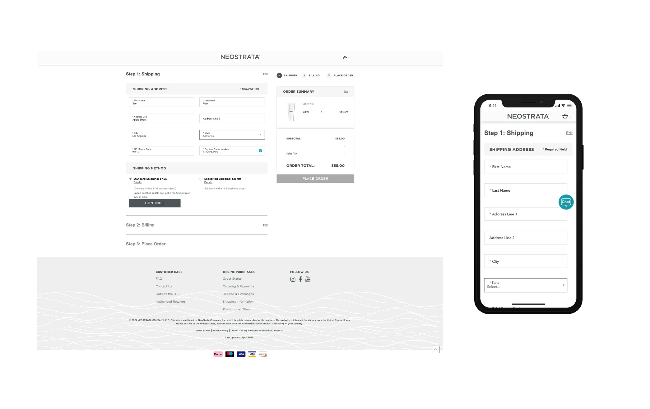
Original checkout: 3-step flow, interstitial sign-in, hidden pricing on mobile
Research & Discovery
Finding high-impact friction points fast
With only 2-3 days for research, I focused on identifying friction points backed by industry data that I could fix quickly.
Collaborating with the Product Manager
I reviewed research the PM had gathered, then added my own competitive and industry analysis to build a complete picture of where users were dropping off.
Baymard Institute insights
Baymard's checkout abandonment research showed the top reasons users drop off:
- 18% abandon due to complicated checkout flows → We had a 3-step process plus interstitial sign-in
- 17% abandon when unclear on total cost → Our order total was at the bottom of mobile checkout
- 24% abandon when forced to create accounts → Our interstitial appeared for all users, even guests
These weren't hypothetical, they directly matched our experience.
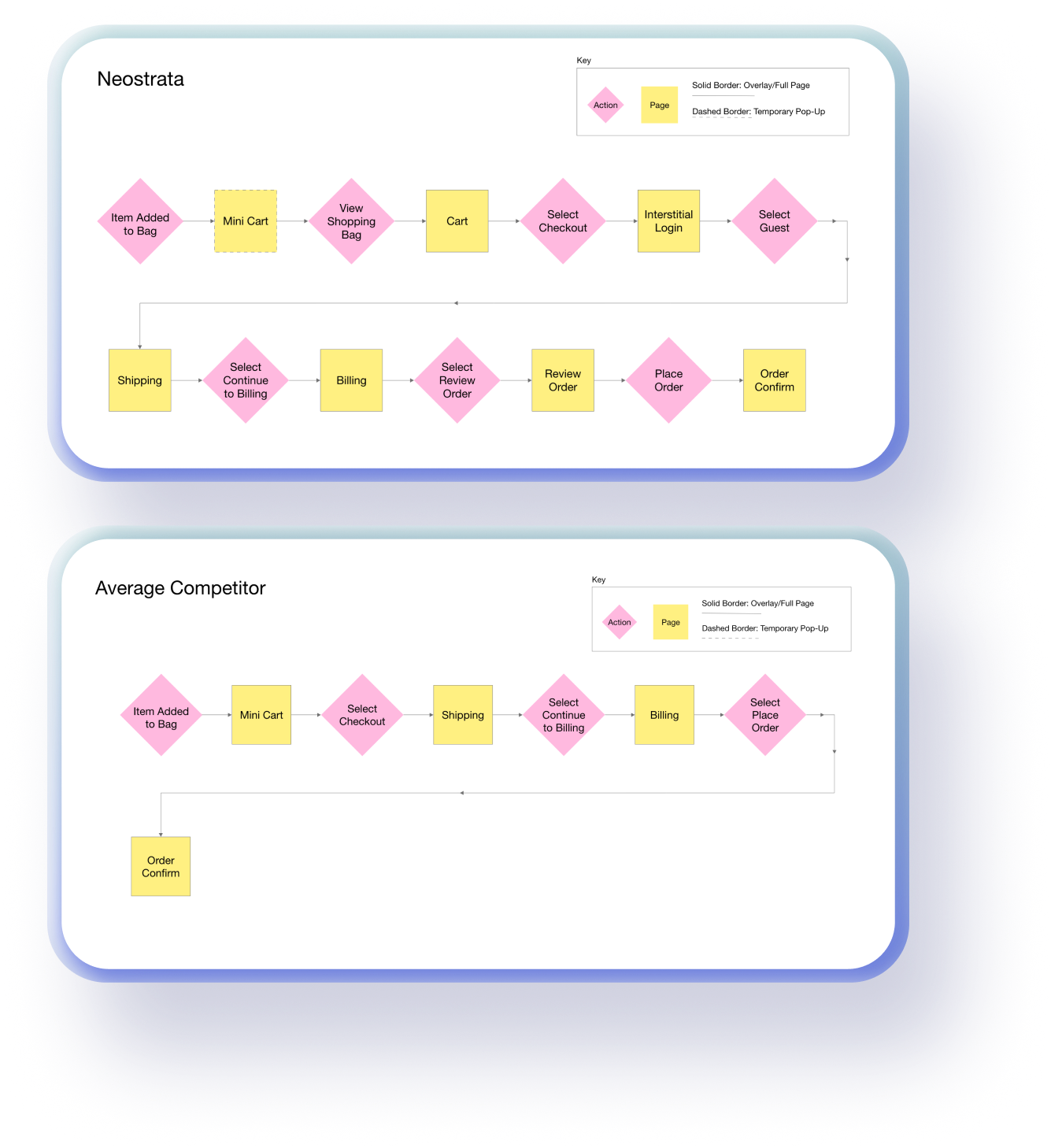
Competitive flow analysis
I mapped our purchase journey against major DTC competitors.
Cart findings:
- Competitors had prominent express payment options (we buried ours)
- Most had persistent/sticky mobile CTAs (we didn't)
- Modern, branded cart designs (ours felt outdated)
Checkout findings:
- Most had 2-step flows; we had 3 steps (Shipping → Billing → Place Order)
- We had an interstitial sign-in screen that competitors skipped for guest purchases
- Competitors showed order total prominently; ours was buried on mobile
Visual flow comparison
I created a flow chart comparing our journey to competitors. This showed stakeholders that our checkout was nearly twice as long as competitors, helped earn trust as the new designer and aligned the team on the scope of the problem.
The insight
Friction existed across the entire purchase journey, from cart to checkout completion. I needed to optimize both to reduce the 65% abandonment rate.
Design Strategy
Optimizing the full purchase journey
With a tight timeline, I focused on high-impact improvements across both shopping bag and checkout that would directly address the abandonment drivers from research.
Cart improvements
1. Surface express payment options
The problem: Apple Pay, PayPal, and Klarna weren't prominent, users didn't see quick checkout options.
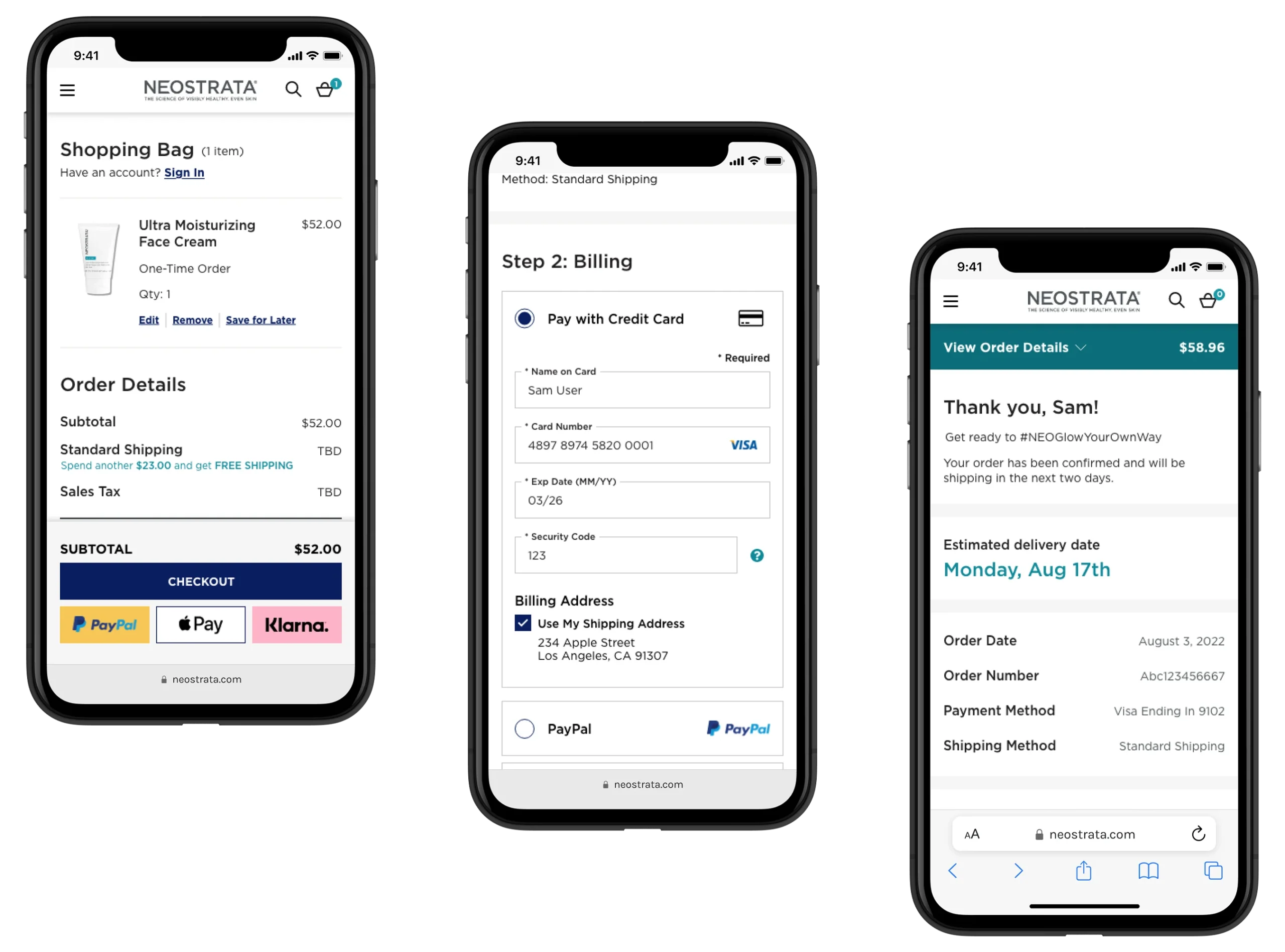
The solution: Created a sticky mobile module featuring subtotal, primary checkout button, and express payment options, always visible while browsing cart.
Why it mattered: Gave users multiple paths to purchase, reducing friction for those wanting to skip traditional checkout.
2. Add item counter and improve visibility
The problem: Users couldn't see how many items were in their bag without opening it.
The solution: Added item counter to cart heading and improved overall cart visibility.
Why it mattered: Helped users track their selections at a glance.
3. Modernize cart UI
The problem: Cart design didn't match current site branding, felt outdated and disconnected.
The solution: Updated visual design to align with current brand standards, added content slots for incentive messaging.
Why it mattered: Visual consistency builds trust; outdated design undermines credibility.
4. Simplify sign-in
The problem: Sign-in was a separate interstitial interruption.
The solution: Added sign-in option via modal directly on cart page, no page navigation required.
Why it mattered: Reduced steps for returning customers wanting to sign in.
Checkout flow improvements
5. Remove interstitial sign-in for guest purchases
The problem: All users, even guests, hit a sign-in/create account screen after clicking checkout. Unnecessary friction for guest purchases.
The solution: Skip interstitial for guest purchases; only show for subscription orders requiring account management.
Why it mattered: Eliminated a major drop-off point, streamlined path to checkout.
6. Reduce from 3 steps to 2 steps
The problem: Checkout required 3 steps: Shipping, Billing, then a redundant "Place Order" confirmation.
The solution: Merged Place Order into Billing step. After completing Shipping and Billing, users could immediately place order.
Why it mattered: 33% reduction in checkout length = less abandonment opportunity.
7. Surface order total on mobile
The problem: Mobile users had to scroll to bottom to see total cost, hidden pricing drives abandonment.
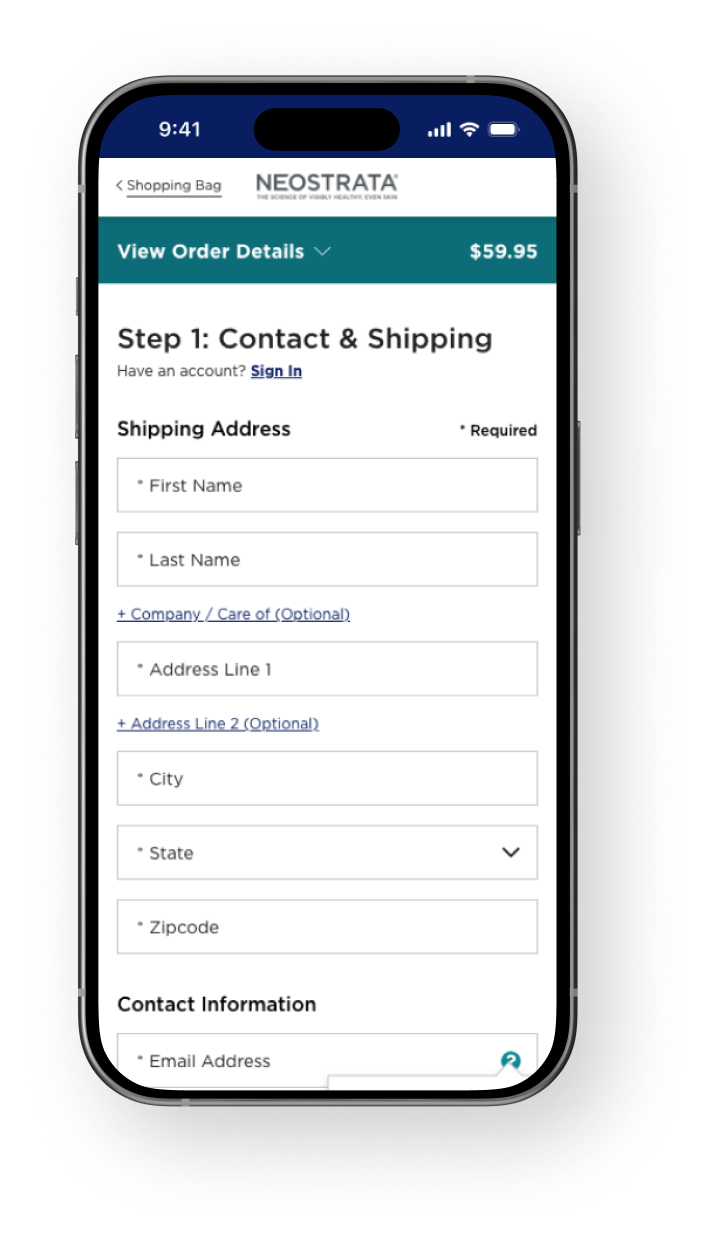
The solution: Created sticky "View Order Details" dropdown module showing price, items, and offer code option, always visible throughout checkout.
Why it mattered: Price transparency throughout the flow builds trust and prevents surprise abandonment.
8. Remove distractions and exit points
The problem: Full header with shopping bag icon and full footer with many links created exit opportunities.
The solution: Removed shopping bag icon from nav (replaced with text link), simplified footer to essential links only, kept users focused on checkout.
Why it mattered: Fewer distractions = higher completion rates.
9. Improve scannability and usability
The problem: Content hierarchy wasn't clear; shipping methods and payment options were hard to find.
The solution: Sectioned shipping page into 3 clear areas, updated shipping method UI for visibility, made payment options prominent, extended CTAs to full width for better mobile usability.
Why it mattered: Clear hierarchy reduces cognitive load and decision fatigue.
The rationale
Cart improvements drove checkout entries (express payment + sticky CTAs). Checkout improvements drove completion (2 steps, visible pricing, reduced friction). Together, they optimized the full purchase funnel from 65% abandonment to 33%.
Final Design
From 65% abandonment to 33%—a complete purchase flow transformation
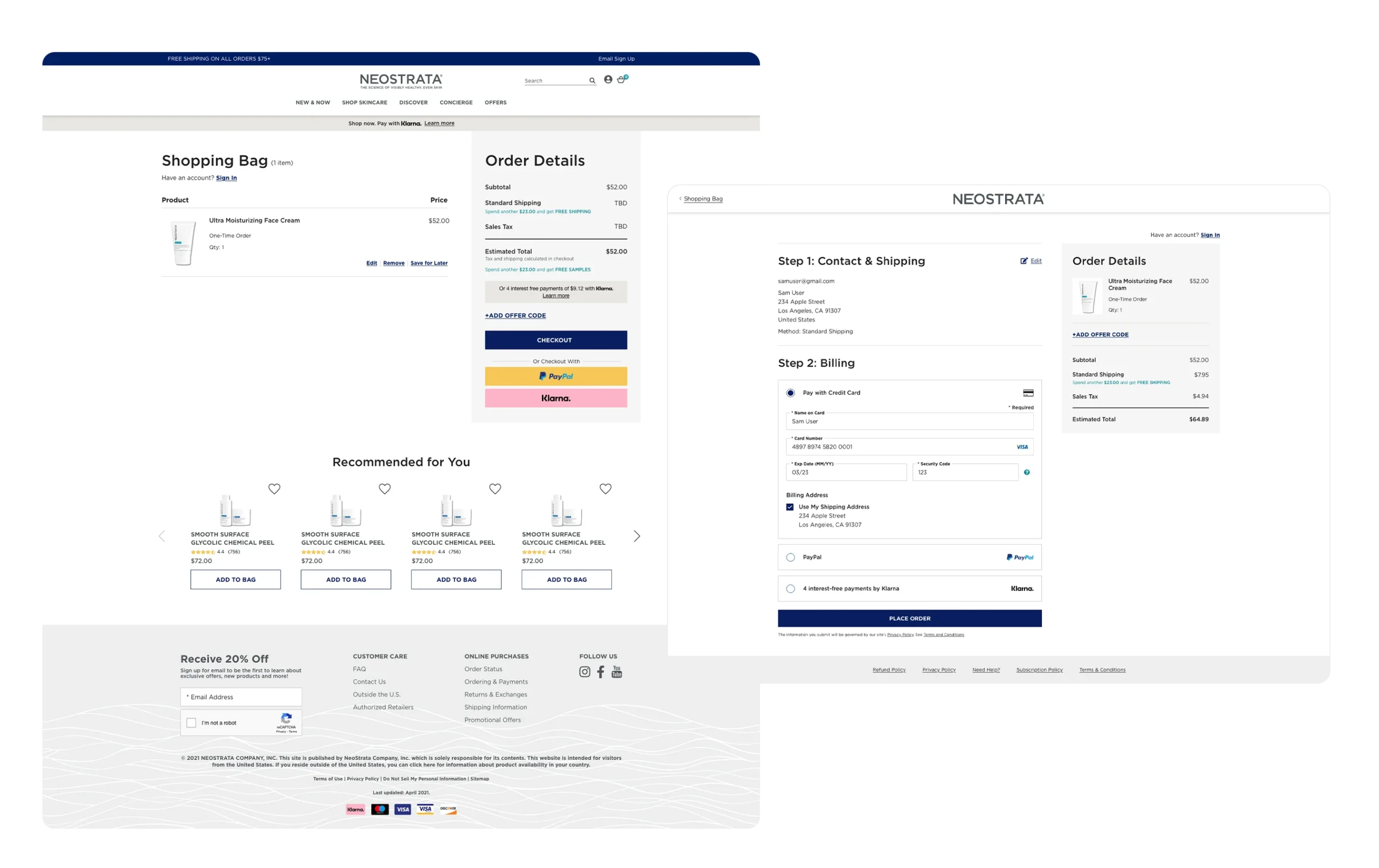
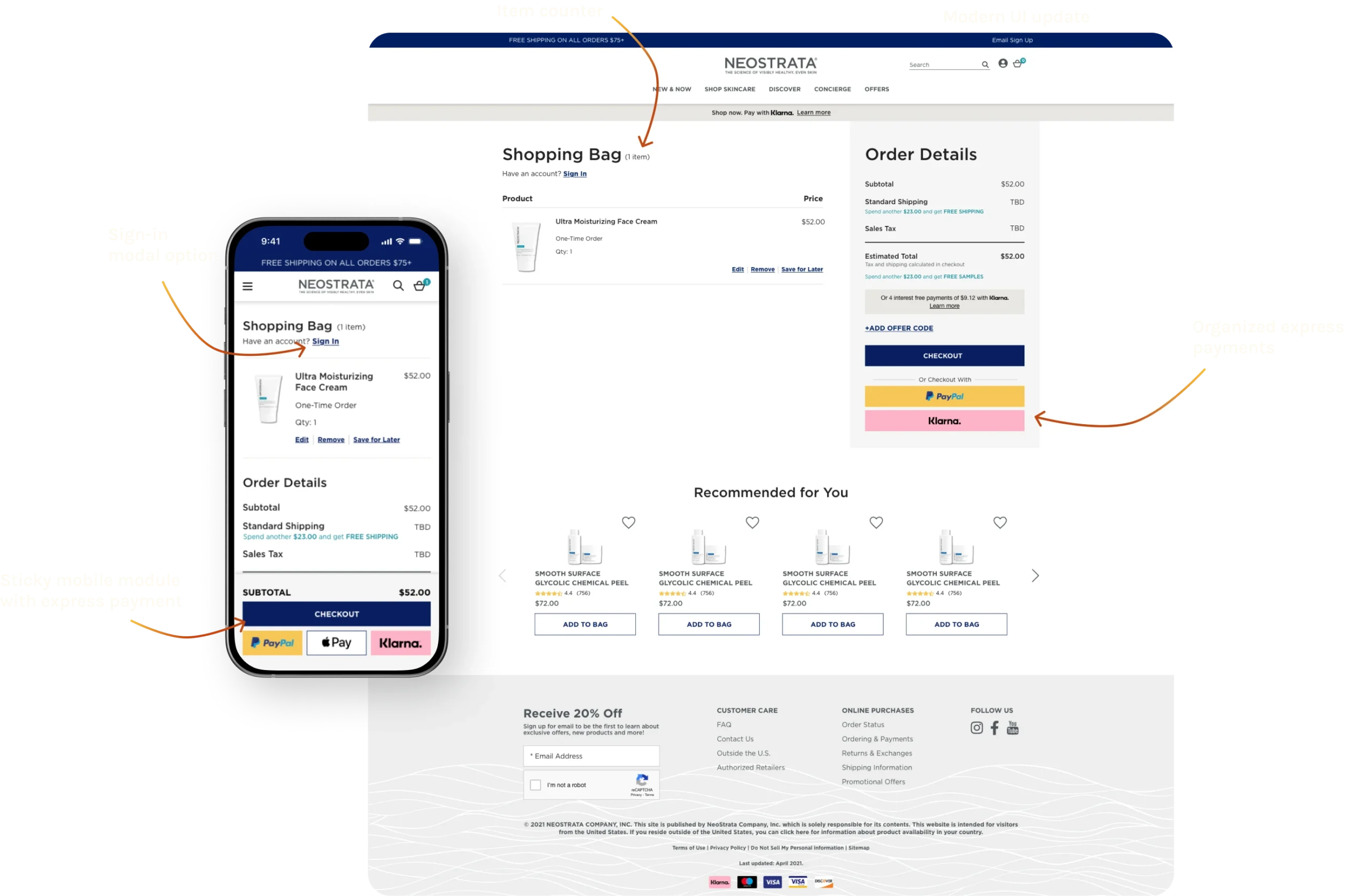
Shopping Bag (Cart) improvements
Modern, branded cart design
Updated UI to match current site standards, building trust through visual consistency.
Item counter in heading
Shows number of items at a glance, no need to open cart to check.
Express payment prominence
Apple Pay, PayPal, and Klarna featured in sticky mobile module alongside traditional checkout CTA.
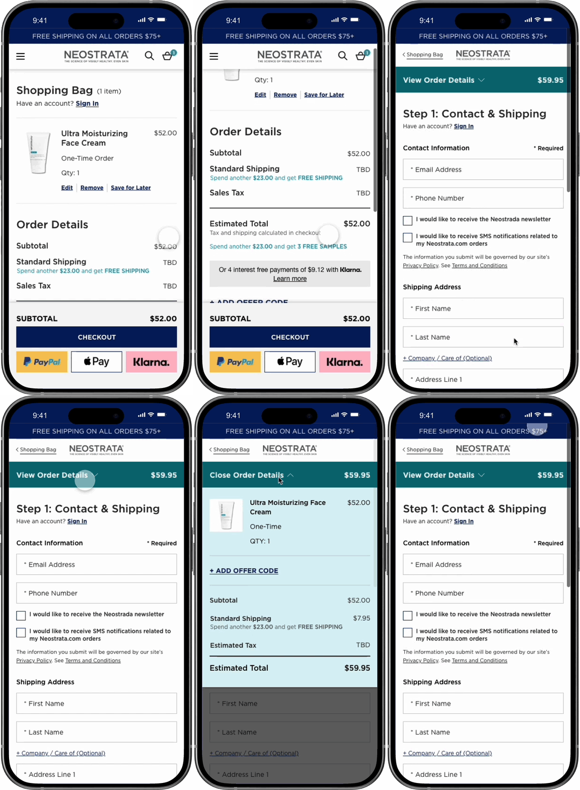
Sticky mobile checkout module
Keeps subtotal, checkout CTA, and express payment options always visible while browsing cart.
Sign-in via modal
Returning customers can sign in directly from cart, no page navigation required.
Incentive content slots
Business can highlight promotions (free shipping, discounts) directly in cart.
Checkout flow improvements
1. Removed interstitial sign-in for guests
Users go directly from cart to checkout (unless subscription item requires account). Eliminated major friction point.
2. Streamlined from 3 steps to 2
Merged "Place Order" into Billing step, reduced checkout length by 33%.
3. Sticky mobile order summary
"View Order Details" dropdown keeps pricing, items, and offer code option visible throughout mobile checkout (70%+ of traffic).
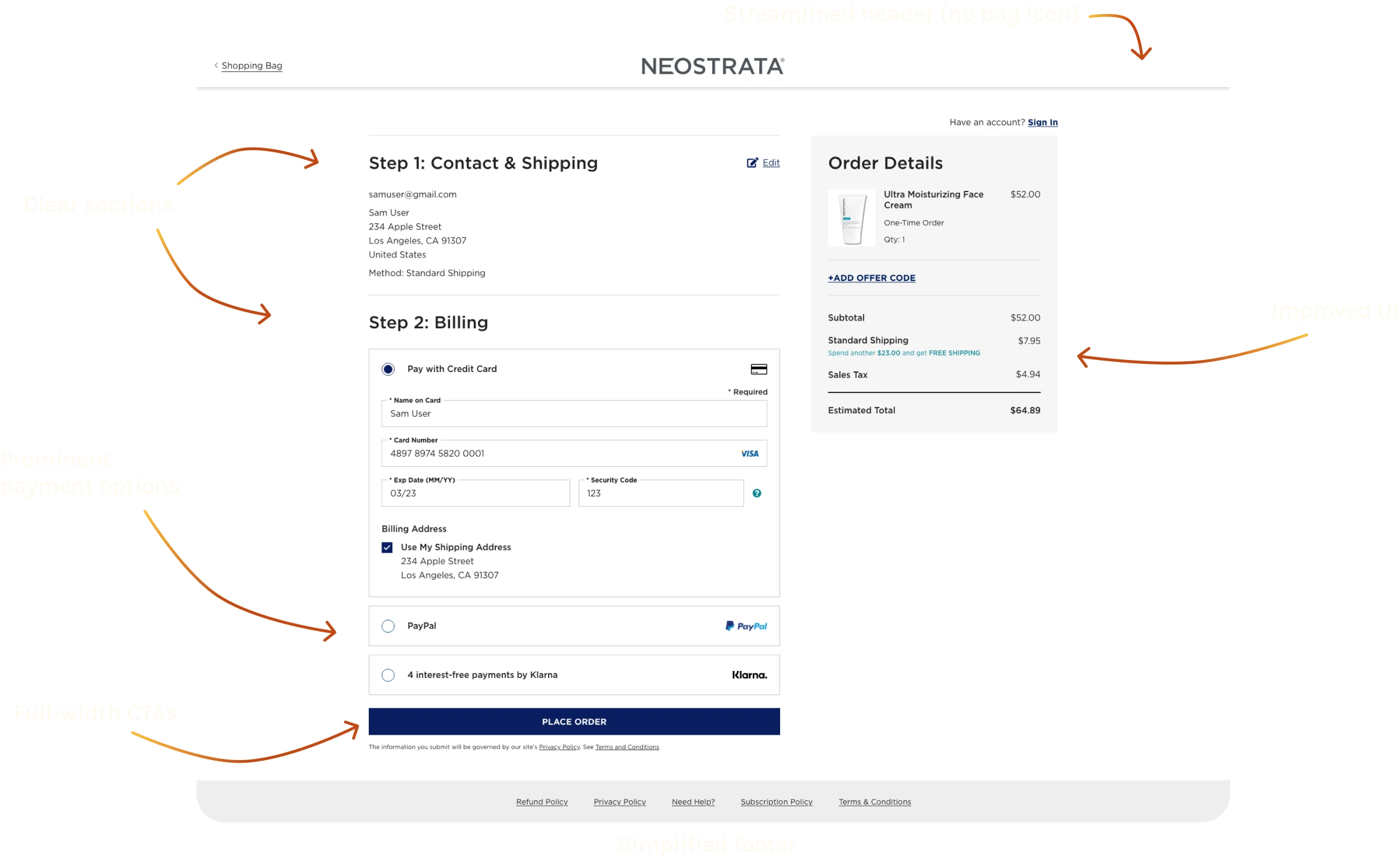
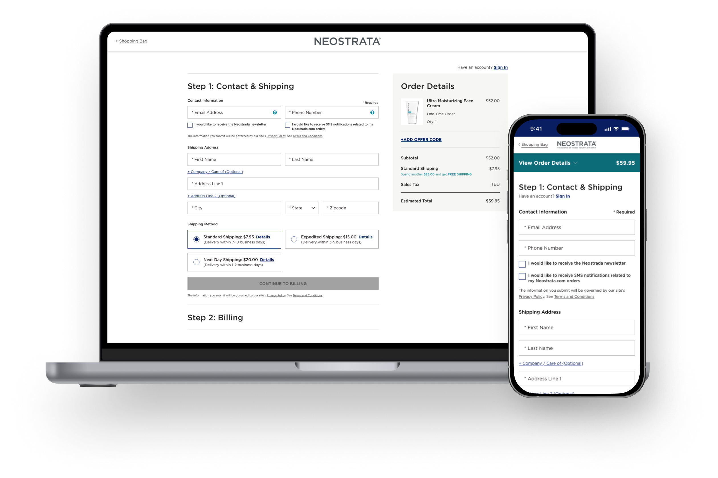
4. Clear content sections
Shipping page organized into 3 scannable sections: Contact, Shipping Info and Shipping Method, with improved visual hierarchy.
5. Prominent payment options
Improved visibility and mobile usability, easier to tap, harder to miss.
6. Full-width CTAs
Full-width CTAs are easier to see or tap.
7. Simplified header and footer
Removed shopping bag icon from nav (exit point), minimal footer with essential links only, keeps focus on checkout.
Early iteration based on data
After launch, we noticed drop-off at the Shipping step increased from 22% to 35%. Quick research suggested users felt wary entering contact info first so we swapped the Contact and Shipping sections, guiding users to first enter their Shipping information. That small change improved flow and contributed to the final 67% completion rate.
The Results
Quick wins and scaling success
A few weeks after launch:
🐇
17%
faster checkout average
Desktop: 13% faster
Mobile: 20% faster
👍🏼
5%
checkout abandonment reduction
Overall: 65% → 60%
Mobile: 71% → 62%
✅
5%
improved drop-off rate average
Desktop Billing Drop-off : 11% → 8%
Mobile Billing Drop-off: 15% → 8%
🛒
24%
expected spike in cart drop-off
15% → 39% at cart stage, driven by new express payment options giving users more choices upfront
After 1 year (November 2023)
👍🏼
49%
checkout abandonment improvement
65% → 33%
32 percentage point reduction
👀
91%
completion rate improvement
35% → 67%
completion rate nearly doubled
✨
22% increase in actual sales
real revenue impact
During comparable annual sale periods:
Old checkout: 841 transactions
New checkout: 1,025 transactions
What this meant for the business
The cart and checkout redesign didn't just improve metrics, it drove measurable revenue. By optimizing the full purchase journey (express payment at cart + streamlined 2-step checkout + mobile experience), we reduced abandonment by nearly half and doubled completion rates.
Scaled across the Kenvue DTC portfolio
- Exuviance (Q1 2023): I QA'd the implementation in February 2023
- Neutrogena and Rogaine (Fall 2023): Adopted the checkout template
The cart and checkout became the standard for Kenvue's DTC brands until the 2024 Shopify migration. Shopify's proprietary checkout was similar to what we designed, validating our strategic approach.
Reflection
What a 49% abandonment reduction taught me
1. Design the entire funnel, not just one page
This started as a "checkout project," but cart abandonment happens at multiple points. By optimizing both shopping bag AND checkout, I addressed the full purchase journey. The express payment options at cart gave users quick paths to purchase, while the streamlined 2-step checkout improved completion. Systems thinking delivered exponentially more impact than fixing checkout alone.
2. Simplification compounds
Every reduction matters: removed interstitial sign-in (1 fewer step), merged Place Order into Billing (3 steps → 2), simplified header/footer (fewer exit points). Each change alone might seem small, but together they reduced abandonment from 65% to 33%. Small improvements compound into transformative results.
3. Not all impact shows up immediately in expected ways
The initial cart drop-off increase (15% → 39%) looked concerning, but it was actually positive, users were choosing express payment options instead of traditional checkout. The overall completion and transaction numbers proved it worked. Sometimes you need to look at the full picture, not just individual step metrics.
4. Post-launch iteration is critical
The contact/shipping swap happened after we saw 22% → 35% drop-off at shipping. We researched, hypothesized users were wary entering contact info first, swapped the sections, and improved flow. Treating launch as a learning opportunity, not the final state, made the experience stronger over time.
5. Quick research can drive confident decisions
With only 2-3 days for research, I relied on Baymard Institute data and competitive analysis to identify high-impact friction points. This validated approach let me move fast without extensive user testing. When timelines are tight, lean on proven research and industry benchmarks.
6. Scaling validates the design quality
When Exuviance, Neutrogena, and Rogaine adopted the cart and checkout template, it proved the solution was robust and flexible, not just a one-off fix for Neostrata. Good design scales.
What I'd do differently
Run lightweight usability testing on both cart and checkout before launch. While industry research guided strong decisions, real user feedback would've caught the contact/shipping issue earlier and potentially revealed other friction points we didn't anticipate.
The bigger lesson
Senior design means thinking in systems, not isolated pages or features. The shopping bag and checkout are one continuous purchase journey. Optimizing the entire funnel, not just pieces of it, is what drove results from 65% abandonment to 33%. That systems thinking and the ability to execute it under tight constraints is what separates good design from transformative design.
Creating & Scaling Design Systems
Building design systems for 4 brands and creating a scalable foundation